I will try to keep it simple.
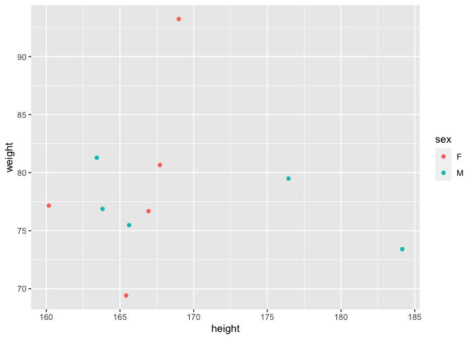
I have a mock dataset in R, for a certain group of people. There are four columns: 'Name,' 'Sex,' 'Height,' Weight'.
The Name is essentially just a categorical variable: 'A1, A2, A3...' and can be conveniently ignored.
Sex is either 'M' or 'F'.
I need to make a scatterplot of 'Height' and 'Weight,' but where the points for both males and females are displayed with a different symbol or colour. Can you please help me out?
I am using
plot(Weight ~ Height, data = Students, col = "blue", xlim = c(min(Height), max(Height)), ylim=c(0, 100)).
It generates a graph alright, but I cannot see Males and Females in a different colour (the cells for 'Sex' mention M or F for males or females respectively).
