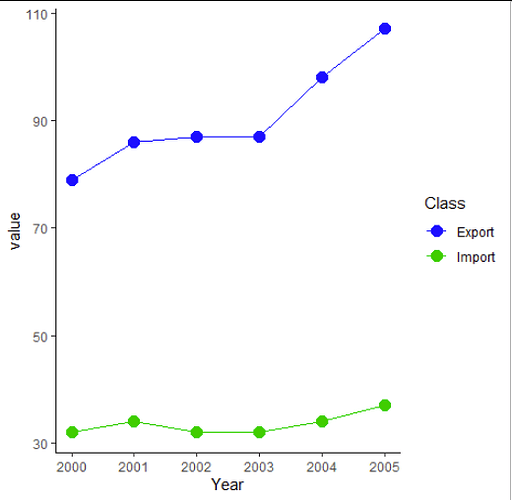
Have you tried it at all? 
Some inspiration: Line chart | the R Graph Gallery
For your dataset it might be done like this:
df = tribble(
 ~Year, ~Export, ~Import,
 2000,  79,     32,
 2001,  86,     34 ,
 2002,  87,     32,
 2003,  87,     32,
 2004,  98,     34,
 2005,  107,    37)


ggplot(df, aes(x = Year)) +
  #add one line for Export
  geom_line(aes(y = Export), colour = "blue") +
  # add another line for Import
  geom_line(aes(y = Import), colour = "lawngreen") +
  theme_classic()
However, usually it is better to have the data in the so-called long format. In this case you don't have to add each line individually, but instead can just say "colour = category")
# convert the dataset to long format
df2 = pivot_longer(df,     # the dataset we want to convert
                   -Year,  # keep column year as it is
                   names_to = "Cat",
                   values_to = "value")
df2
# A tibble: 12 x 3
    Year Cat    value
   <dbl> <chr>  <dbl>
 1  2000 Export    79
 2  2000 Import    32
 3  2001 Export    86
 4  2001 Import    34
 5  2002 Export    87
 6  2002 Import    32
 7  2003 Export    87
 8  2003 Import    32
 9  2004 Export    98
10  2004 Import    34
11  2005 Export   107
12  2005 Import    37

ggplot(df2, aes(x = Year,
                y = value,
                colour = Cat)) +
  geom_line() +
  #let's add some plots, just because we can
  geom_point(size = 3.5) +
  theme_classic() +
  scale_colour_manual(values = c("blue", "green3"))
