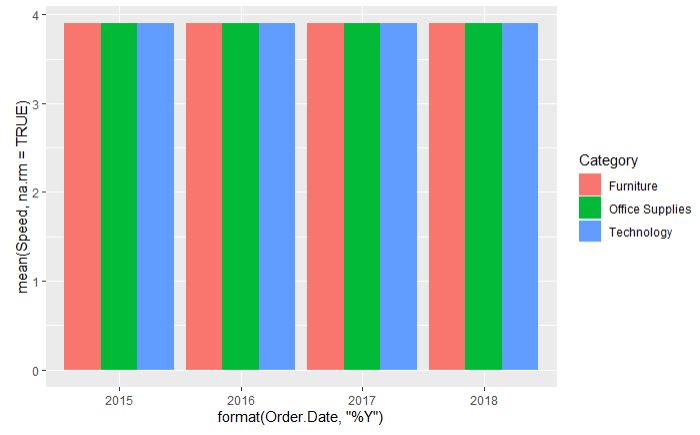
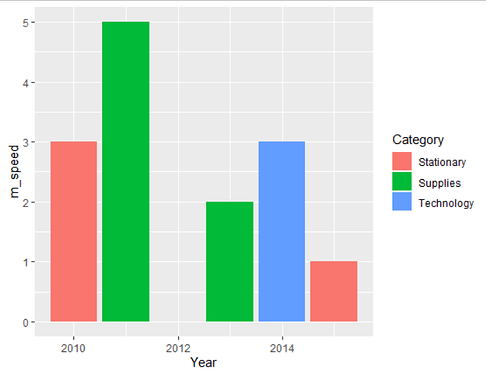
I'm trying to make a bar chart to show the average speed of shipping per category per year. my data set is like the following
Category | Order.Date | Speed
Stationary | 2010-5-6 | 3
Supplies | 2011-5-6 | 5
Technology | 2014-5-6 | 3
Supplies | 2013-5-6 | 2
Stationary | 2015-5-6 | 1
I want to make a chart that looks like the following where y-axes are the speed, x-axes are the years, and the color is the category.
I've tried the following code but it returns the same values for y
ggplot(westData, aes(
  fill=Category,
  y=mean(Speed,na.rm = TRUE),
  x=format(Order.Date,"%Y"
           ))) +
    geom_bar(position="dodge", stat="identity")
And I get this message after I run it
"Don't know how to automatically pick scale for object of type difftime. Defaulting to continuous."
I tried to change the Y value to the following
group_by(westData,Category) %>% summarise(avgShippingSpeed=mean(Speed,na.rm = TRUE))
But it returns an error of "Error: Aesthetics must be either length 1 or the same as the data (9553): y"
You need to provide a reproducible example:
Like this:
westData <- tibble::tribble(
     ~Category, ~Order.Date, ~Speed,
  "Stationary",  "2010-05-06",      3,
    "Supplies",  "2011-05-06",      5,
  "Technology",  "2014-05-06",      3,
    "Supplies",  "2013-05-06",      2,
  "Stationary",  "2015-05-06",      1
  )
2 Likes
DavoWW
3
Is this the sort of output you want?
library(tidyverse)
library(lubridate)

westData <- tibble::tribble(
     ~Category, ~Order.Date, ~Speed,
  "Stationary",  "2010-05-06",      3,
    "Supplies",  "2011-05-06",      5,
  "Technology",  "2014-05-06",      3,
    "Supplies",  "2013-05-06",      2,
  "Stationary",  "2015-05-06",      1
  )

# Create a column for just year; calculate means for Category x Year; plot means
westData %>%
  mutate(Year = year(Order.Date)) %>%
  group_by(Category, Year) %>%
  summarise(m_speed = mean(Speed, na.rm=TRUE)) %>%
  ggplot(., aes(x=Year, y=m_speed, fill=Category)) +
    geom_col()
Your bigger dataset will produce a more complete plot.
HTH
1 Like
This is exactly what I needed. I didn't know that I should make a column for just the year.
Thank you!
system
Closed
5
This topic was automatically closed 7 days after the last reply. New replies are no longer allowed.

