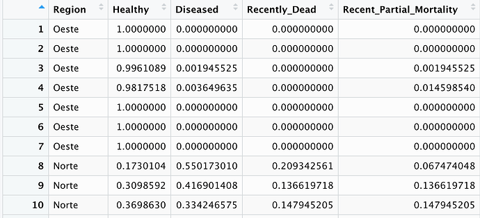
I would like to plot stacked columns using the data from an Excel sheet where I have multiple columns with values. The x-axis would be the Regions and the y-axis would be the value given by the columns named "Healthy", "Deseased", and "Recently_Dead".
Hi, there are some examples here:
This tutorial explains how to create a stacked barplot in R, including several examples.
Est. reading time: 2 minutes
By the way, next time provide a reproducible example instead of a screenshot:
A minimal reproducible example consists of the following items:
A minimal dataset, necessary to reproduce the issue
The minimal runnable code necessary to reproduce the issue, which can be run
on the given dataset, and including the necessary information on the used packages.
Let's quickly go over each one of these with examples:
system
May 3, 2022, 7:50am
3
This topic was automatically closed 21 days after the last reply. New replies are no longer allowed.
