Hi,
Need help in plotting specific values of Y-axis in ggplot in R.
for eg: in a line plot, how to mention only the min and max values for Y-axis.
Thanks
If I understand your question correctly, you can use scale_y_continuous() and set the limits argument:
library(ggplot2)

dat <- data.frame(x = 1:10,
                  y = 20:11)

ggplot(dat) +
  geom_line(aes(x, y)) +
  scale_y_continuous(limits = c(0, 50))
If you mean draw a line with two points, maybe something like that is closer to your needs?
dat2 <- data.frame(x = c(dat$x[which.min(dat$y)], dat$x[which.max(dat$y)]),
                   y = range(dat$y))

ggplot(dat2) +
  geom_line(aes(x, y))
#Plotting "Graph1" - "Date" vs "Price" in R.
Graph_1 <- ggplot(Data,aes(x=dates, y=Price,color))+
geom_line()+geom_smooth(se=F)+
labs(title="XXXX",subtitle="From XXXX to XXXX",x="Year", y="Price: USD/bbl")
Graph_1
Above is the code which i have written. I need the graph to display only the min and max values of "Price".
Do you mean you only want two labels on the y-axis?
Yes. I need only the min and max values of "Price" to be displayed in the line plot.
If t is tibble with columns x and y
t |> ggplot(aes(x,y)) + geom_line()+scale_y_continuous(breaks=c(min(y),max(y)))
Does my second code block not do what you want?
Alex,
Thanks for the message.
I'm unable to get what i want.
I will reproduce the codes below so that u will be able to better understand.
###################################
#Import file "D.csv" into R.
D <- read.csv("D.csv", header = T)
#To check dimensions of "D.csv"
dim(D) #Ans: 248 2.
#To check class.
class(D$Date) #Ans: "character"
class(D$Price) #Ans: "numeric"
#Changing date format.
D_Date <- as.Date(D$Date,format="%Y-%m-%d")
#Changing "Price" to Time Series.
D_Ts <- ts(D$Price,frequency=7)
#Calling "ggplot" function.
library(ggplot2)
#Plotting "Graph1" - "Date" vs "Price" in R.
Graph_1 <- ggplot(D,aes(x=D_Date, y=D_Ts,color))+
geom_line()+geom_smooth(se=F)+
labs(x="Month", y="Price")
Graph_1
#############################
I'm able to plot the graph but unable to display min and max value of Price which are 90 and 180 respectively. I need only these values (min & max) to be displayed in the graph.
Thanks
Pramod
It's still not clear to me what you mean with " I need only these values (min & max) to be displayed in the graph."
Maybe another guess: you want the full line to be displayed, and you want the values of min and max to be written out as additional points? In that case, try code like this:
D <- read.csv("D.csv", header = T)

D$Date <- as.Date(D$Date,format="%Y-%m-%d")
D$Price <- ts(D$Price,frequency=7)

D_min_max <- D |>
  filter(Price == max(Price) | Price == min(Price))

ggplot(D,aes(x=Date, y=Price, color))+
  geom_line() +
  geom_smooth(se=F) +
  geom_point(data = D_min_max) +
  geom_text(aes(label = Price), data = D_min_max) +
  labs(x="Month", y="Price")
For better understand the plot you could draw in paint ?
Maybe is well.
Alex,
Grazie Millie.
It finally worked with slight modification of the code you shared.
Min and Max values are getting displayed in ggplot.
Code given below.
#######
D_min <- D | > filter(Price==min(Price))
D-max <- D%>% filter(as.logical(Price==max(Price)))
D%>%
ggplot(aes(x=Date,y=Price,label=Price))+
geom_point()+
geom_text(data=D_max)+
geom_text(data=D_min)
Pramod
Great.
Note that there is no reason to create separate dataframes for min and max, as in my code you can keep them together.
Note 2: if you install the package {ggrepel}, you can use geom_text_repel()which will avoid writing the value on top of the point; it often looks nicer.
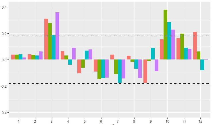
@pramod.kunnath You mean add reference line at specific value of Y-axis as the picture shows? Though it's not a line plot.
Not a reference line. Specific values viz the 'min' and 'max' values of Y-axis.
This topic was automatically closed 42 days after the last reply. New replies are no longer allowed.
If you have a query related to it or one of the replies, start a new topic and refer back with a link.