Plotting simple quarterly financial summary harder than thought.

Hi there,

I've been exploring and summarizing a dataset and I have a the financial position the original dataset contains 149 variables and approximately 50k observations.

Bellow the table output which I want to plot:

# tibble which represents the output of a larger dataset:
quarter_tbl2 <-  tibble(
  Quarters = c("2019.1", "2019.2", "2019.3", "2019.4", "2020.1"),
  Tot.Income = currency(c("$10,566,152.63", "$8,722,398.82",  "$8,851,412.04", "$6,066,070.54", "$1,209,047.17")),
  Tot.Expense = currency(c("$9,335,033.37", "$7,755,142.94", "$7,961,638.86", "$5,252,027.79", "$986,271.78")),
  Tot.Profit = currency(c( "$1,231,119.26", "$967,255.88", "$889,773.18", "$814,042.75","$222,775.39")),
  Count = c("3025", "2871", "2675", "2082", "472")
)

str(quarter_tbl2)
# Tried geom_line() instead of geom_point(), geom_line() gave me no plot.
 ggplot(data = quarter_tbl2) +
  geom_point(aes(x= `Quarters`, y=`Tot.Income`), color ="Blue") +
  geom_point(aes(x = `Quarters`, y= `Tot.Profit`), color = "purple") +
  geom_point(aes(x = `Quarters`, y= `Tot.Expense`*-1), color = "Red")  +
  labs(
    title = "Quarterly Total Expenses, Income & Proift",
    y = "$"
    ) # +
   #scale_y_continuous(labels = comma)
# noticed that even though the plot isn't exactly what I was going for, I tried
# adjusting the scale which resulted in something with no avail.

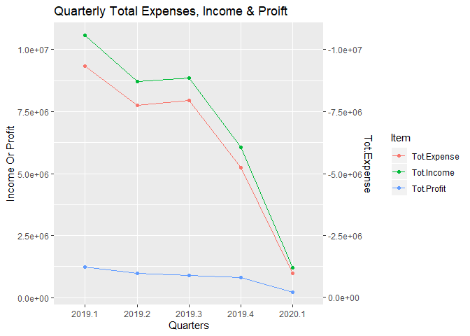
Initially I wanted to have the plot with 3 lines, Tot.Income, Tot.Profit on the same x, y axis and the cost as a secondary y axis as in MS Excel. Positive Y axist for the Total.Income & Tot.Profit on the left and then a secondary Y axis inverted (or not) with pretty scales for the Y axis.

Not online a line plot but I would like to understand how to approach the same as a bar graph as well since I believe the structure should be the same.

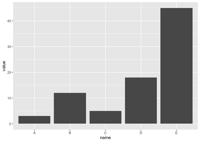
Something like this which I found online, althought could not understand the stat = where the "identity" comes from.

# Create data
data <- data.frame(
  name=c("A","B","C","D","E") ,  
  value=c(3,12,5,18,45)
  )

# Barplot
ggplot(data, aes(x=name, y=value)) + 
  geom_bar(stat = "identity", width=0.2) 

Bar plot reference:

Any feedback or insight would be greatly appreciated.
Thank you for your time.
Best regards,
LF.
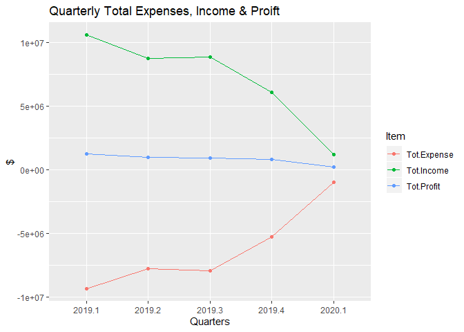
Are either of these plot similar to what you are trying to get? I am not sure from what package you got the currency function. I did not used it and wrote a little code to clean the data of dollar signs and commas so I could plot it.

library(ggplot2)
library(tibble)
library(stringr)
library(tidyr)
library(dplyr)

quarter_tbl2 <-  tibble(
  Quarters = c("2019.1", "2019.2", "2019.3", "2019.4", "2020.1"),
  Tot.Income = c("$10,566,152.63", "$8,722,398.82",  "$8,851,412.04", "$6,066,070.54", "$1,209,047.17"),
  Tot.Expense = c("$9,335,033.37", "$7,755,142.94", "$7,961,638.86", "$5,252,027.79", "$986,271.78"),
  Tot.Profit = c( "$1,231,119.26", "$967,255.88", "$889,773.18", "$814,042.75","$222,775.39"),
  Count = c("3025", "2871", "2675", "2082", "472")
)

#Clean the data
quarter_tbl2 <- quarter_tbl2 %>% mutate_all(str_remove_all, "\\$|,") %>% 
  mutate_at(.vars = 2:5, as.numeric)  

#Make a tall data frame where Expense is negative
quarter_tbl3 <- quarter_tbl2 %>% 
  mutate(Tot.Expense = Tot.Expense * -1) %>% 
  gather(key = "Item", value = "Value", Tot.Income:Tot.Profit)
  
ggplot(data = quarter_tbl3, aes(Quarters, Value, group = Item, color = Item)) +
  geom_line() + geom_point() +
  labs(
    title = "Quarterly Total Expenses, Income & Proift",
    y = "$"
  )


#Make a tall data  frame where with positive Expense and a second y axis showing
#negative values.
quarter_tbl4 <- quarter_tbl2 %>% 
  gather(key = "Item", value = "Value", Tot.Income:Tot.Profit)

ggplot(data = quarter_tbl4, aes(Quarters, Value, group = Item, color = Item)) +
  geom_line() + geom_point() +
  labs(
    title = "Quarterly Total Expenses, Income & Proift",
    y = "Income Or Profit") + 
  scale_y_continuous(sec.axis = sec_axis(~.* -1, name="Tot.Expense"))

Created on 2020-03-31 by the reprex package (v0.3.0)

1 Like
library(ggplot2)
dat <- data.frame(
  name=c("A","B","C","D","E") ,  
  value=c(3,12,5,18,45)
)
ggplot(dat) + geom_col(aes(name,value))

Created on 2020-03-31 by the reprex package (v0.3.0)

1 Like

@technocrat thank you for your reply.

You got the idea spot on!

I'm trying to make this a little more appealing and tried adding color and adjusting the y-axis .

#Libs:
libs <-c("lubridate","tidyverse","modelr","gapminder",
         "broom","formattable")
lapply(libs, require, character.only = TRUE)
rm(libs)

# formattable has the currency()
# Sample data output for reporting.
quarter_tbl2 <-  tibble(
  Quarters = c("2019.1", "2019.2", "2019.3", "2019.4", "2020.1"),
  Tot.Income = currency(c("$10,566,152.63", "$8,722,398.82",  "$8,851,412.04", "$6,066,070.54", "$1,209,047.17")),
  Tot.Expense = currency(c("$9,335,033.37", "$7,755,142.94", "$7,961,638.86", "$5,252,027.79", "$986,271.78")),
  Tot.Profit = currency(c( "$1,231,119.26", "$967,255.88", "$889,773.18", "$814,042.75","$222,775.39")),
  Count = c("3025", "2871", "2675", "2082", "472")
)

# Bar Plot 1: ---------------------------------------------------------------

ggplot(data = quarter_tbl2) +
  geom_col(aes(x= `Quarters`, y=`Tot.Income`), fill = "dodgerblue3") +
  geom_col(aes(x = `Quarters`, y= `Tot.Expense`), fill = "deeppink3") +
  geom_col(aes(x = `Quarters`, y= `Tot.Profit`), fill = "lightgreen") + 
  scale_y_continuous(labels = comma) 

I couldn't figure out how to add an additional secondary axis, for example on the real dataset the expenses are negative values, how would I add a secondary axis on the right side for example. I know the plot would look dumb but it is more of an exercise for me to translate something I would easily do in excel but now with R's super powers steroids.

How should I add the labels for each color?
Below is as far as I got:

# Pimp my Plot:
ggplot(data = quarter_tbl2) +
  geom_col(aes(x= `Quarters`, y=`Tot.Income`/1e6), fill = "dodgerblue3") +
  geom_col(aes(x = `Quarters`, y= `Tot.Expense`/1e6), fill = "deeppink3") +
  geom_col(aes(x = `Quarters`, y= `Tot.Profit`/1e6), fill = "lightgreen") + 
  scale_y_continuous(labels = comma) +
   labs(
     title = "Quarterly Total Expenses, Income & Proift",
     y = "$ in Millions"
   )
   

So if I figure out how to add a secondary axis and the labels I'm fully junior pimped. But I do feel that I did this the dumb way, instinctively based on what I've read/ seen there should have been a smarter way of plotting this without repeating geom_col() each time and some how that would make the coloring in 3 different shades would be " automated".

Or I'm just being neurotic and this is the way to go. :man_shrugging:

Thanks for any input and assistance as always mate.
encyclo - @technocrat :star_struck:
Best regards,
LF.

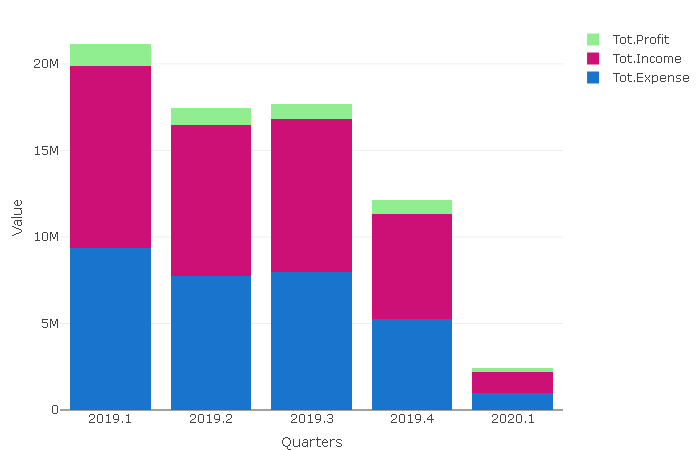
Plotly package has its quirks but can have a pleasing syntax also.

library(plotly)
p <- plot_ly(data=long_quarter_tbl2,
             x = ~Quarters,
             y = ~ Value,
             name = ~Item,
             color = ~ Item,
             colors = c("dodgerblue3","deeppink3","lightgreen"),
             type = "bar") %>% layout(
            barmode = 'stack')
p

2 Likes

The geom_col on this data set returns values in dat for each name. What I think you'd prefer is that it also return a second value, which requires a pair of names for each. (A at a given height can't be both +1.23 and -4.56 at the same time if we're limited to using only one bar.)

This post illustrates my recommended way to build up a ggplot to avoid getting tied up in knots by trying to do it all in one pass.

I don't have Winston Chang's R Graphics Cookbook to hand, and don't do this type of plot often enough to have a snippet, but I'll come back if I find it.

Hi @nirgrahamuk,

Thank you for your assistance. Unfortunately I was not able to replicate your plot, the long_quarter_tbl2, did you pivot_longer() not quite sure I follow what was done.

>  plot_ly(data= quarter_tbl2,
+          x = ~Quarters,
+          y = ~ Value,
+          name = ~Item,
+          color = ~ Item,
+          colors = c("dodgerblue3","deeppink3","lightgreen"),
+          type = "bar") %>% layout(
+            barmode = 'stack') 
Error in eval(expr, data, expr_env) : object 'Value' not found```

Above is the error I get, all I did was change back to the actual data, since I didn't know what was the long_quarter_tbl2 if it was just a transformation or what.

Thank you for your time and assistance.
Best regards,
LF.

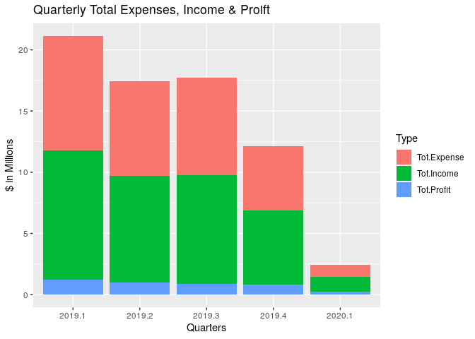
This would be the ggplot2 option.

library(tidyverse)

quarter_tbl2 <-  tibble(
    Quarters = c("2019.1", "2019.2", "2019.3", "2019.4", "2020.1"),
    Tot.Income = c("$10,566,152.63", "$8,722,398.82",  "$8,851,412.04", "$6,066,070.54", "$1,209,047.17"),
    Tot.Expense = c("$9,335,033.37", "$7,755,142.94", "$7,961,638.86", "$5,252,027.79", "$986,271.78"),
    Tot.Profit = c( "$1,231,119.26", "$967,255.88", "$889,773.18", "$814,042.75","$222,775.39"),
    Count = c("3025", "2871", "2675", "2082", "472")
)

quarter_tbl2 %>% 
    mutate_at(vars(starts_with("Tot.")), parse_number) %>% # This is just for me to avoid installing an aditional package
    mutate(Quarters = factor(Quarters)) %>% 
    gather(Type, Amount, -Quarters, -Count) %>%
    mutate(Amount = Amount / 1e6) %>% 
    ggplot(aes(x = Quarters, y = Amount, fill = Type)) +
    geom_col() +
    labs(
        title = "Quarterly Total Expenses, Income & Proift",
        y = "$ in Millions"
    )

Note: Try to narrow down your reprex to just the essential part and avoid using unnecessary packages.

2 Likes

My apologies.
I forgot to include. But my dataset as input was FJCCs

quarter_tbl2 %>% 
  gather(key = "Item", value = "Value", Tot.Income:Tot.Profit)
1 Like

Thanks @andresrcs once again.

Learned a lot from your example, but a few questions arose:

This type of plot, where bars are stacked on top of one another, although I understand it I believe that most people won't understand what this represents. Leading them to believe that there was ~ $21 MM being as Expense with only another ~$10 MM in income. So how do you get Profit? I understand, the bars are stacked, but I'm unsure others will have the same quick interpretation.

I have the layout the way I believe it will make interpretation easier, althought I believe there would be a more elegant solution for this.


library(tidyverse)
# Sample Data
quarter_tbl2 <-  tibble(
  Quarters = c("2019.1", "2019.2", "2019.3", "2019.4", "2020.1"),
  Tot.Income = currency(c("10,566,152.63", "8,722,398.82",  "8,851,412.04", "6,066,070.54", "1,209,047.17")),
  Tot.Expense = currency(c("9,335,033.37", "7,755,142.94", "7,961,638.86", "5,252,027.79", "986,271.78")),
  Tot.Profit = currency(c( "1,231,119.26", "967,255.88", "889,773.18", "814,042.75","222,775.39")),
  Count = c("3025", "2871", "2675", "2082", "472"))


# Bar Plot:
ggplot(data = quarter_tbl2) +
  geom_col(aes(x= `Quarters`, y=`Tot.Income`/1e6), fill = "cornflowerblue") +
  geom_col(aes(x = `Quarters`, y= `Tot.Expense`/1e6), fill = "maroon") +
  geom_col(aes(x = `Quarters`, y= `Tot.Profit`/1e6), fill = "gold2") + 
  scale_y_continuous(labels = comma) +
   labs(
     title = "Quarterly Total Expenses, Income & Proift",
     y = "$ in Millions",
     color = "x"
   )
# What's missing is a key of some sort for the color.

I was also wondering on you example, which I will quite possibly use for other things, how would I control the desired colors of the fills? Since it seems R does the choosing based on fill = Type which if I understood was generated on the gather() base on the column names. Can it be done individually or 1 color has to be picked and it would have to be shades of that color because R.

Thank you very much for your input and time.
Best regards,
LF.

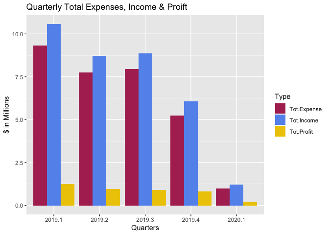
In case it's helpful, here's an alternative that's a tweak of @andresrcs's solution; it uses 'dodge' for geom_col()'s position argument (the default value is 'stacked'), and uses scale_fill_manual() to set the colors:

library(tidyverse)
quarter_tbl2 <-  tibble(
  Quarters = c("2019.1", "2019.2", "2019.3", "2019.4", "2020.1"),
  Tot.Income = c("$10,566,152.63", "$8,722,398.82",  "$8,851,412.04", "$6,066,070.54", "$1,209,047.17"),
  Tot.Expense = c("$9,335,033.37", "$7,755,142.94", "$7,961,638.86", "$5,252,027.79", "$986,271.78"),
  Tot.Profit = c( "$1,231,119.26", "$967,255.88", "$889,773.18", "$814,042.75","$222,775.39"),
  Count = c("3025", "2871", "2675", "2082", "472")
)

quarter_tbl2 %>% 
  mutate_at(vars(starts_with("Tot.")), parse_number) %>% # This is just for me to avoid installing an aditional package
  mutate(Quarters = factor(Quarters)) %>% 
  gather(Type, Amount, -Quarters, -Count) %>%
  mutate(Amount = Amount / 1e6) %>% 
  ggplot(aes(x = Quarters, y = Amount, fill = Type)) +
  geom_col(position = 'dodge') +
  labs(
    title = "Quarterly Total Expenses, Income & Proift",
    y = "$ in Millions"
  ) +
  scale_fill_manual(
    values = c(
      'Tot.Income' = 'cornflowerblue', 
      'Tot.Expense' = 'maroon', 
      'Tot.Profit' = 'gold2'
    )
  )

Created on 2020-04-01 by the reprex package (v0.3.0)

2 Likes

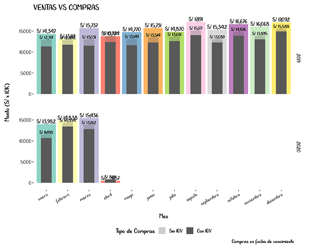
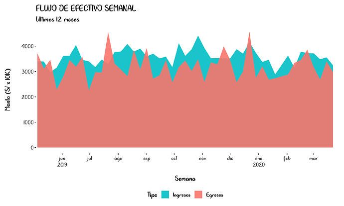
For this task, I personally like to use this kind of plots, let me know if you find one useful and I will give it a try with your sample data


2 Likes

@andresrcs thank you very much!

I believe both plot designs would be very useful for me. Since the sample data I provided was from the already processed data, I recreated a little better what the original data would look like.

library(tidyverse)

dt <- tibble( `Shipment ID` = c("S00023613", "S00023614", "S00023615", "S00023616", "S00023617", "S00023618", "S00023619", "S00023622", "S00023623", "S00023624", "S00023625", "S00023626", "S00023627", "S00023628", "S00023629", "S00023630", "S00023631", "S00023632", "S00023633", "S00023634", "S00023635"),
              `Job.Recog.Date` = c("2018-04-01", "2018-08-01", "2018-10-01", "2018-02-01", "2018-04-01", "2019-05-16", "2019-04-02", "2019-03-21", "2019-03-26", "2019-03-30", "2019-07-12", "2019-08-07", "2019-03-28", "2019-04-09", "2020-03-28", "2020-04-03", "2020-03-16", "2020-11-29", NA,"2020-12-31", "2020-04-19"),
              `Total Income (Recognized+Unrecognized REV+WIP)` = c(2490.00, 2490.00, 2490.00, 2490.00, 2490.00, 4381.10, 4076.40, 3000.00, 4939.72, 3300.00, 4476.71, 6970.53, 1350.00, 3751.42, 1845.00, 3210.00, 1128.05, 1382.00, 0.00, 130.00, 549.06),
              `Total Expense (Recognized+Unrecognized CST+ACR)` = c(-2195.45, -2239.64, -2139.64, -2139.64, -2239.64, -4020.97, -3658.90, -2597.32, -4881.32, -3078.94, -3823.71, -5574.53, -1221.00, -3929.92, -1724.00, -3064.00, -735.44, -1267.00, 0.00, 8.00, -337.85),
              `Job Profit` = c(294.55, 250.36, 350.36, 350.36, 250.36, 360.13, 417.50, 402.68, 58.40, 221.06, 653.00, 1396.00, 129.00, -178.50, 121.00, 146.00, 392.61, 115.00, 0.00, 138.00, 211.21)
                )

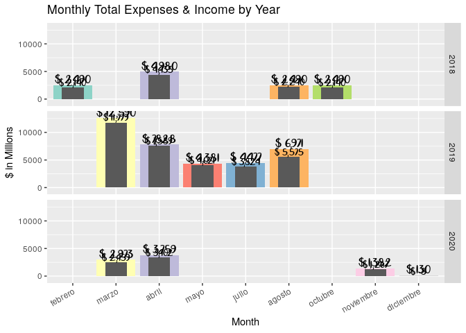
This would need to be custom-tailored to make it look better, but this will give you a starting point

library(tidyverse)
library(tibbletime)
library(lubridate)
library(scales)

dt <- tibble( `Shipment_ID` = c("S00023613", "S00023614", "S00023615", "S00023616", "S00023617", "S00023618", "S00023619", "S00023622", "S00023623", "S00023624", "S00023625", "S00023626", "S00023627", "S00023628", "S00023629", "S00023630", "S00023631", "S00023632", "S00023633", "S00023634", "S00023635"),
              `Job_Recog_Date` = c("2018-04-01", "2018-08-01", "2018-10-01", "2018-02-01", "2018-04-01", "2019-05-16", "2019-04-02", "2019-03-21", "2019-03-26", "2019-03-30", "2019-07-12", "2019-08-07", "2019-03-28", "2019-04-09", "2020-03-28", "2020-04-03", "2020-03-16", "2020-11-29", NA,"2020-12-31", "2020-04-19"),
              `Total_Income` = c(2490.00, 2490.00, 2490.00, 2490.00, 2490.00, 4381.10, 4076.40, 3000.00, 4939.72, 3300.00, 4476.71, 6970.53, 1350.00, 3751.42, 1845.00, 3210.00, 1128.05, 1382.00, 0.00, 130.00, 549.06),
              `Total_Expense` = c(-2195.45, -2239.64, -2139.64, -2139.64, -2239.64, -4020.97, -3658.90, -2597.32, -4881.32, -3078.94, -3823.71, -5574.53, -1221.00, -3929.92, -1724.00, -3064.00, -735.44, -1267.00, 0.00, 8.00, -337.85),
              `Job_Profit` = c(294.55, 250.36, 350.36, 350.36, 250.36, 360.13, 417.50, 402.68, 58.40, 221.06, 653.00, 1396.00, 129.00, -178.50, 121.00, 146.00, 392.61, 115.00, 0.00, 138.00, 211.21)
)

dt_monthly <- dt %>%
    drop_na(Job_Recog_Date) %>% 
    mutate(Job_Recog_Date = as.Date(Job_Recog_Date),
           Total_Expense = -Total_Expense) %>% 
    arrange(Job_Recog_Date) %>% 
    as_tbl_time(index = Job_Recog_Date) %>% 
    collapse_by("1 month", side = "start", clean = TRUE) %>%
    group_by(Job_Recog_Date) %>% 
    summarise_if(is.numeric, sum, na.rm = TRUE) %>%
    mutate(month = as.factor(month(Job_Recog_Date,
                                   label = TRUE,
                                   abbr = FALSE))) %>%
    ungroup()

dt_monthly %>% 
    ggplot(aes(x = month)) + 
    geom_col(aes(y = Total_Income, fill = month), show.legend = FALSE)  + 
    geom_text(aes(y = Total_Income,
                  label = number(Total_Income,
                                 prefix = "$ ",
                                 accuracy = 1,
                                 decimal.mark = ".",
                                 big.mark = ",")),
              vjust = -0.2,
              family = "Cloud Calligraphy", size=5) +
    geom_col(aes(y = Total_Expense),
             width = 0.5) +
    geom_text(aes(y = Total_Expense, 
                  label = number(Total_Expense,
                                 prefix = "$ ",
                                 accuracy = 1,
                                 decimal.mark = ".",
                                 big.mark = ",")),
              vjust = -0.2, 
              size = 4,
              family = "Cloud Calligraphy") +
    facet_grid(year(Job_Recog_Date)~.) +
    scale_y_continuous(expand = c(0.1,0)) +
    scale_fill_brewer(palette = "Set3") +    
    labs(
        title = "Monthly Total Expenses & Income by Year",
        y = "$ in Millions",
        x = "Month"
    ) + 
    theme(axis.text.x = element_text(angle = 30, hjust = 1, vjust = 1)) +
    NULL


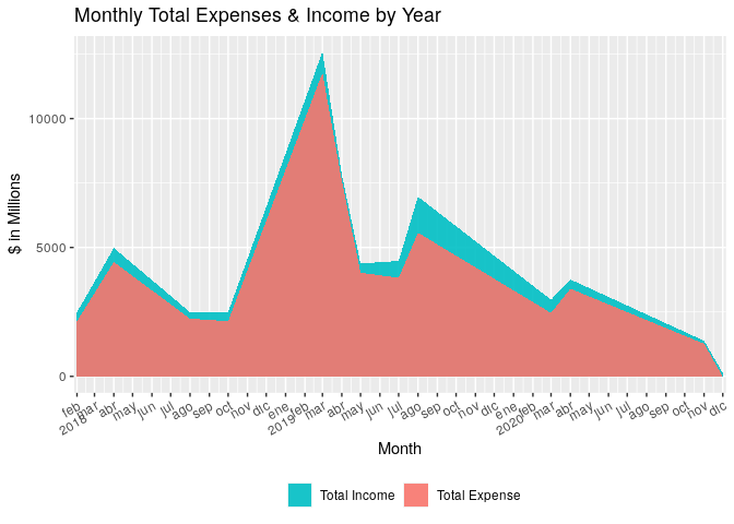
dt_monthly %>%
    select(Job_Recog_Date, Total_Income, Total_Expense) %>% 
    gather(Total, amount, -Job_Recog_Date) %>% 
    ggplot(aes(x = Job_Recog_Date, y = amount, fill = factor(Total, levels = c("Total_Income", "Total_Expense")))) + 
    geom_area(position = "identity", alpha=0.9) +
    scale_x_date(date_breaks = "1 month",
                 labels = label_date_short(),
                 expand = c(0.005,0.005)) +
    scale_fill_manual(values = c("#00BFC4", "#F8766D"),
                      labels = c("Total Income", "Total Expense")) +
    labs(
        title = "Monthly Total Expenses & Income by Year",
        y = "$ in Millions",
        x = "Month",
        fill = ""
    ) +
    theme(legend.position = "bottom",
          axis.text.x = element_text(angle = 30, hjust = 1, vjust = 1)) +
    NULL

1 Like

This topic was automatically closed 7 days after the last reply. New replies are no longer allowed.