I want to plot probit regression model with ggplot2.
I have been able to plot logit model with ggplot2 but unable to do for probit regression.
Here is reproducible example for logit model:
library(tidyverse)
#> -- Attaching packages ------------------- tidyverse 1.2.1 --
#> v ggplot2 2.2.1     v purrr   0.2.4
#> v tibble  1.4.2     v dplyr   0.7.4
#> v tidyr   0.8.0     v stringr 1.3.0
#> v readr   1.1.1     v forcats 0.3.0
#> -- Conflicts ---------------------- tidyverse_conflicts() --
#> x dplyr::filter() masks stats::filter()
#> x dplyr::lag()    masks stats::lag()

logr_vm <- glm(vs ~ mpg, data=mtcars, family=binomial(link="logit"))

#summary(logr_vm)

ggplot(mtcars, aes(x=mpg, y=vs)) + geom_point() +
  stat_smooth(method="glm", method.args=list(family="binomial"), se=TRUE)
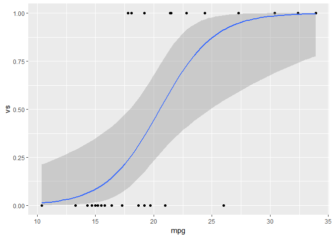
How to do similar thing for probit model?
In addition I expect the graph to show the value for 0.5 along x-axis (similar graph as shown below).
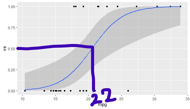
Any help on this?