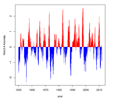
Hi, I would like to generate a temperature anomalies graph with a trend line which looks almost like this:
This is my reprex:
library(ggplot2)
library(lubridate)
library(tidyverse)
df <- data.frame(stringsAsFactors = FALSE,
Date = c(1981, 1982, 1983, 1984, 1985, 1986, 1987, 1988, 1989, 1990, 1991, 1992, 1993,
1994, 1995, 1996, 1997, 1998, 1999, 2000, 2001, 2002, 2003, 2004, 2005, 2006,
2007, 2008, 2009, 2010, 2011, 2012, 2013, 2014, 2015, 2016, 2017),
Temp = c(-0.2, -0.1, -0.2, -0.7, -0.3, -0.4, -0.7, -0.8, -0.8, -0.2, 0.2, -0.4, 0.1,
-0.1, 0.2, -0.1, 0.4, 0.5, 1.0, 0.2, 0.2, 0.2, 0.1, -0.6, 0.6, 0.6,
0.2, 0.2, 0.5, 0.2, 0.3, 0.3, 0.2, 0.4, 0.0, 0.6, 0.5))
df %>%
mutate(Date = dmy(paste("01-01-", Date))) %>%
ggplot(aes(x = Date, y = Temp)) +
geom_line() + geom_area(colour = "red",size = 1)+theme_bw()+
scale_x_date(date_labels = "%Y",
date_breaks = "1 year",
minor_breaks = "1 year") +
theme_minimal() +
theme(axis.text.x = element_text(angle=45, hjust=1, vjust = 1))
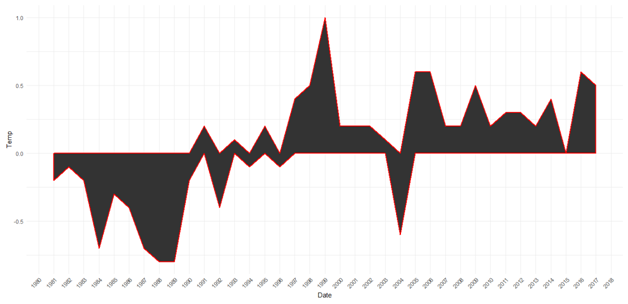
I have the following graph:
I need some help with this. Thanks
If you're OK with base R solution, here you go:
df <- data.frame(Date = c(1981, 1982, 1983, 1984, 1985, 1986, 1987, 1988, 1989, 1990, 1991, 1992, 1993,
                          1994, 1995, 1996, 1997, 1998, 1999, 2000, 2001, 2002, 2003, 2004, 2005, 2006,
                          2007, 2008, 2009, 2010, 2011, 2012, 2013, 2014, 2015, 2016, 2017),
                 Temp = c(-0.2, -0.1, -0.2, -0.7, -0.3, -0.4, -0.7, -0.8, -0.8, -0.2, 0.2, -0.4, 0.1,
                          -0.1, 0.2, -0.1, 0.4, 0.5, 1.0, 0.2, 0.2, 0.2, 0.1, -0.6, 0.6, 0.6,
                          0.2, 0.2, 0.5, 0.2, 0.3, 0.3, 0.2, 0.4, 0.0, 0.6, 0.5))

with(data = df,
     expr = {
       plot(x = Date,
            y = Temp,
            pch = NA_integer_)
       polygon(x = c(min(Date), Date, max(Date)),
               y = c(0, Temp, 0),
               col = "red")
       clip(x1 = min(Date),
            x2 = max(Date),
            y1 = min(Temp),
            y2 = 0)
       polygon(x = c(min(Date), Date, max(Date)),
               y = c(0, Temp, 0),
               col = "blue")
     })
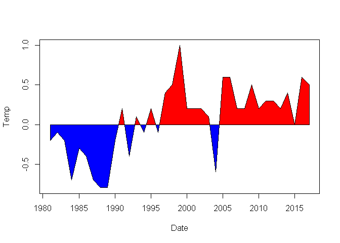
Created on 2019-05-01 by the reprex package (v0.2.1)
Hope this helps.
Thanks a lot Yanakabrina. This is the right graph I want. Is it possible to include a trend line as well?. Its my first time hearing about Base R solutions but I will do some reading.
Well, my username is Yarnabrina ![]()
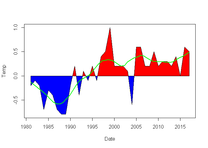
Can you please elaborate? Do you want something like geom_smooth? In that case, you can do something like the following. This can be made better, but I don't know much about loess.
df <- data.frame(Date = c(1981, 1982, 1983, 1984, 1985, 1986, 1987, 1988, 1989, 1990,
                          1991, 1992, 1993, 1994, 1995, 1996, 1997, 1998, 1999, 2000,
                          2001, 2002, 2003, 2004, 2005, 2006, 2007, 2008, 2009, 2010,
                          2011, 2012, 2013, 2014, 2015, 2016, 2017),
                 Temp = c(-0.2, -0.1, -0.2, -0.7, -0.3, -0.4, -0.7, -0.8, -0.8, -0.2,
                          0.2, -0.4, 0.1, -0.1, 0.2, -0.1, 0.4, 0.5, 1.0, 0.2,
                          0.2, 0.2, 0.1, -0.6, 0.6, 0.6, 0.2, 0.2, 0.5, 0.2,
                          0.3, 0.3, 0.2, 0.4, 0.0, 0.6, 0.5))

with(data = df,
     expr = {
       plot(x = Date,
            y = Temp,
            pch = NA_integer_)
       polygon(x = c(min(Date), Date, max(Date)),
               y = c(0, Temp, 0),
               col = "red")
       usr <- par("usr")
       clip(x1 = min(Date),
            x2 = max(Date),
            y1 = min(Temp),
            y2 = 0)
       polygon(x = c(min(Date), Date, max(Date)),
               y = c(0, Temp, 0),
               col = "blue")
       do.call(what = clip,
               args = as.list(x = usr))
       lines(x = loess.smooth(x = Date,
                              y = Temp,
                              span = 0.25),
             col = "green",
             lwd = 2)
     })
For a ggplot solution, you might want to look at this SO post. You'll have to change this for your own data, of course.
This is a tidyverse based solution, is this what you are trying to do?
library(tidyverse)
library(lubridate)

df <- data.frame(stringsAsFactors = FALSE,
                 Date = c(1981, 1982,   1983,   1984,   1985,   1986,   1987,   1988,   1989,   1990,   1991,   1992,   1993,
                          1994, 1995,   1996,   1997,   1998,   1999,   2000,   2001,   2002,   2003,   2004,   2005,   2006,
                          2007, 2008,   2009,   2010,   2011,   2012,   2013,   2014,   2015,   2016,   2017),
                 Temp = c(-0.2, -0.1,   -0.2,   -0.7,   -0.3,   -0.4,   -0.7,   -0.8,   -0.8,   -0.2,   0.2, -0.4,  0.1,
                          -0.1, 0.2,    -0.1,   0.4,    0.5,    1.0,    0.2,    0.2,    0.2,    0.1,    -0.6,   0.6,    0.6,
                          0.2,  0.2, 0.5,   0.2,    0.3,    0.3,    0.2,    0.4,    0.0,    0.6,    0.5))
df %>%
    mutate(Date = dmy(paste("01-01-", Date)),
           Sign = if_else(Temp >= 0, "Positive", "Negative")) %>%
    ggplot(aes(x = Date, y = Temp)) +
    geom_area(aes(fill = Sign), show.legend = FALSE) +
    geom_smooth(method = "lm", se = FALSE) +
    theme_bw() +
    scale_x_date(date_labels = "%Y",
                 date_breaks = "1 year",
                 minor_breaks = "1 year") +
    theme_minimal() +
    theme(axis.text.x = element_text(angle=45, hjust=1, vjust = 1))

Thanks again, this is helpful
Thanks again Andres, this will work for me.
Hi Andres, I realize the polygons overlap between 1991 - 2004 showing both positive and negative values for the years yet each year is to have either a positive or negative value. Can there be a work around this? Thanks
Yeah, I noticed later, I'm thinkng about a solution but I haven't came up with one yet, you can go with Yarnabrina's base R solution, if I figure out a correct ggplot2 solution I will post it later.
Here's a result of shameless copy-paste from the SO thread I mentioned, and hence full credit goes to Henrik, and recursively to kohske.
df <- data.frame(Date = c(1981, 1982, 1983, 1984, 1985, 1986, 1987, 1988, 1989, 1990,
                          1991, 1992, 1993, 1994, 1995, 1996, 1997, 1998, 1999, 2000,
                          2001, 2002, 2003, 2004, 2005, 2006, 2007, 2008, 2009, 2010,
                          2011, 2012, 2013, 2014, 2015, 2016, 2017),
                 Temp = c(-0.2, -0.1, -0.2, -0.7, -0.3, -0.4, -0.7, -0.8, -0.8, -0.2,
                          0.2, -0.4, 0.1, -0.1, 0.2, -0.1, 0.4, 0.5, 1.0, 0.2,
                          0.2, 0.2, 0.1, -0.6, 0.6, 0.6, 0.2, 0.2, 0.5, 0.2,
                          0.3, 0.3, 0.2, 0.4, 0.0, 0.6, 0.5))

df$grp <- "orig"

new_df <- do.call(what = "rbind",
                  args = sapply(X = 1:(nrow(x = df) -1),
                                FUN = function(i)
                                {
                                  f <- lm(formula = (Date ~ Temp),
                                          data = df[i:(i + 1),])
                                  if (f$qr$rank < 2)
                                  {
                                    return(NULL)
                                  }
                                  r <- predict(object = f,
                                               newdata = data.frame(Temp = 0))
                                  if(df[i,]$Date < r & r < df[i+1,]$Date)
                                  {
                                    return(data.frame(Date = r,
                                                      Temp = 0))
                                  } else
                                  {
                                    return(NULL)
                                  }
                                }))

new_df$grp <- "new"

df_mod <- rbind(df, new_df)

library(ggplot2)
#> Registered S3 methods overwritten by 'ggplot2':
#>   method         from
#>   [.quosures     rlang
#>   c.quosures     rlang
#>   print.quosures rlang

ggplot(data = df_mod,
       mapping = aes(x = Date,
                     y = Temp)) +
  geom_area(data = subset(x = df_mod,
                          subset = (Temp <= 0)),
            fill = "red") +
  geom_area(data = subset(x = df_mod,
                          subset = (Temp >= 0)),
            fill = "blue") +
  geom_smooth(se = FALSE,
              colour = "green")
#> `geom_smooth()` using method = 'loess' and formula 'y ~ x'

Created on 2019-05-01 by the reprex package (v0.2.1)
Great thanks once again Yarnabrina for your help. This is a nice graph as well with ggplot. Thank you guys for your effort.
I figured out a simple but not exact or generalizable solution (intersecting values are not exact but I think they are good enough for visualization purposes)
intersection <- df %>%
    mutate(Date = dmy(paste("01-01-", Date))) %>%
    mutate(sign_change = Temp/lead(Temp) < 0) %>%
    filter(sign_change == TRUE) %>%
    mutate(Date = Date + months(6),
           Positive = 0,
           Negative = 0) %>%
    select(-sign_change)

df %>%
    mutate(Date = dmy(paste("01-01-", Date)),
           Positive = ifelse(Temp >= 0, Temp, 0),
           Negative = ifelse(Temp < 0, Temp, 0)) %>%
    bind_rows(intersection) %>%
    gather(Sign, Temp, -Date, -Temp) %>%
    ggplot(aes(x = Date, y = Temp)) +
    geom_area(aes(fill = Sign), show.legend = FALSE, position = "identity") +
    geom_smooth(se = FALSE) +
    theme_bw() +
    scale_x_date(date_labels = "%Y",
                 date_breaks = "1 year",
                 minor_breaks = "1 year",
                 expand = c(0,0)) +
    theme_minimal() +
    theme(axis.text.x = element_text(angle=45, hjust=1, vjust = 1))
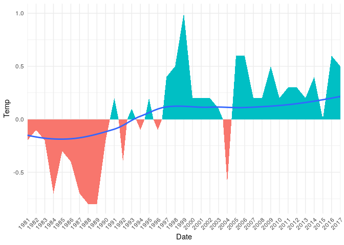
Thanks a lot Andres, this is great work. Thanks for the effort put in
This topic was automatically closed 7 days after the last reply. New replies are no longer allowed.
If you have a query related to it or one of the replies, start a new topic and refer back with a link.