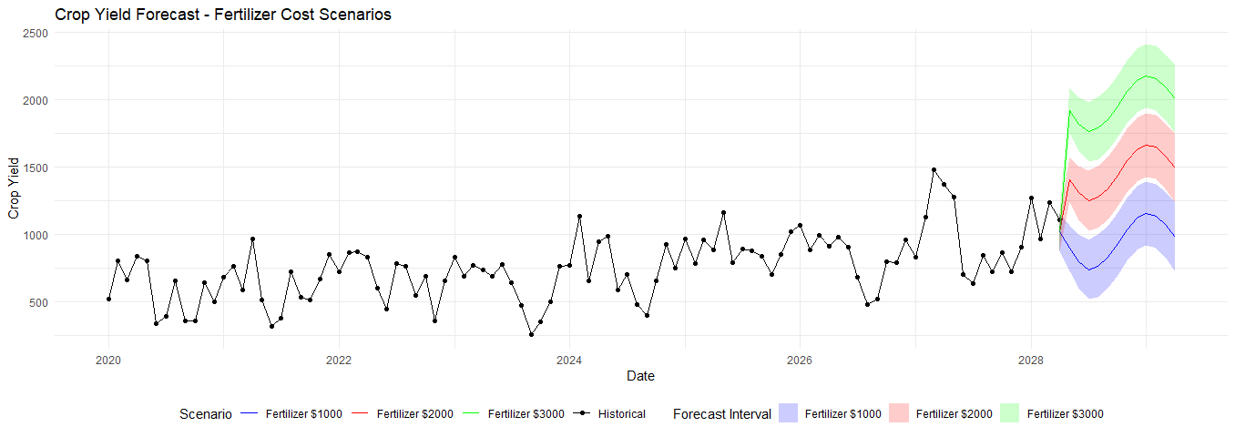
- Suppose there is a farm in which there are two variables: Crop Yield and Fertilizer Cost
- I am interesting in making a time series model to model the relationship between Crop Yield and Fertilizer Cost (I.e how much Fertilizer I choose to buy, assuming I fix the amount of money I am willing to spend on Fertilizer as constant)
- Specifically, I believe that Crop Yield is influenced by the (lag-1) and (lag-2) values of Crop Yield and Fertilizer Cost.
- After doing some research, it seems to me that an ARIMAX model is a good choice for this problem.
- In the end, I want to answer the following questions:
- What is the (estimated) impact of each extra dollar of fertilizer cost on crop yield?
- Suppose I have 3 options over the next 12 months : Invest 1000 dollars each month on fertilizer, Invest 2000 dollars each month on fertilizer, Invest 3000$ each month on fertilizer. Which of these options will result in the largest (estimated) cumulative crop yield over 12 months?
I tried to express this in mathematical terms:
Let Y_t represent the crop yield at time t , and let F_t represent the fertilizer cost at time t . We assume that the price of fertilizer remains constant, so variations in F_t reflect the quantity of fertilizer purchased.
The crop yield Y_t is influenced by:
- The crop yield at lag-1 ( Y_{t-1} ) and lag-2 ( Y_{t-2} ),
- The fertilizer cost at lag-1 ( F_{t-1} ) and lag-2 ( F_{t-2} ).
The relationship between crop yield and fertilizer cost can be modeled using an ARIMAX model as follows:
where: \alpha_0 is the intercept term. \alpha_1, \alpha_2 are the coefficients for the lagged crop yields, \beta_1, \beta_2 are the coefficients for the lagged fertilizer costs, \epsilon_t is the error term.
Thus, it seems to me that \beta would represent the estimated impact of fertilizer on crop yield ... and I could add the estimated 12 month forecasts for each option to find out the net benefit.
I tried to make an R simulation to represent my problem.
First I simulate data:
library(forecast)
library(ggplot2)
library(dplyr)
library(tsibble)

set.seed(123)
n <- 100
dates <- seq(as.Date("2020-01-01"), by = "month", length.out = n)
fertilizer <- runif(n, 500, 1500)
seasonal_effect <- sin(2 * pi * (1:n) / 12) * 200
trend <- seq(0, 500, length.out = n)
crop_yield <- 0.5 * fertilizer + seasonal_effect + trend + arima.sim(list(ar = c(0.7, 0.2)), n) + rnorm(n, 0, 50)

data <- tibble(
    date = dates,
    crop_yield = crop_yield,
    fertilizer = fertilizer
) %>%
    as_tsibble(index = date)
Then, I fit the model:
model <- auto.arima(data$crop_yield, xreg = cbind(data$fertilizer))
From there, I prepared the data for the forecasting:
future_dates <- seq(from = max(dates), by = "month", length.out = 13)

generate_forecast <- function(cost) {
    future_fertilizer <- c(tail(data$fertilizer, 1), rep(cost, 12))
    forecast_result <- forecast(model, xreg = future_fertilizer, h = 13)

    list(
        date = future_dates,
        crop_yield = as.numeric(forecast_result$mean),
        fertilizer = future_fertilizer,
        lower = as.numeric(forecast_result$lower[, 2]),
        upper = as.numeric(forecast_result$upper[, 2]),
        scenario = paste0("Fertilizer $", cost)
    )
}
Then, I fit the forecasts and plotted them:
forecast_1000 <- generate_forecast(1000)
forecast_2000 <- generate_forecast(2000)
forecast_3000 <- generate_forecast(3000)

ggplot() +
    geom_line(data = data, aes(x = date, y = crop_yield, color = "Historical")) +
    geom_point(data = data, aes(x = date, y = crop_yield, color = "Historical")) +
    geom_line(data = tibble(date = forecast_1000$date, crop_yield = forecast_1000$crop_yield), aes(x = date, y = crop_yield, color = "Fertilizer $1000")) +
    geom_line(data = tibble(date = forecast_2000$date, crop_yield = forecast_2000$crop_yield), aes(x = date, y = crop_yield, color = "Fertilizer $2000")) +
    geom_line(data = tibble(date = forecast_3000$date, crop_yield = forecast_3000$crop_yield), aes(x = date, y = crop_yield, color = "Fertilizer $3000")) +
    geom_ribbon(data = tibble(date = forecast_1000$date, ymin = forecast_1000$lower, ymax = forecast_1000$upper), aes(x = date, ymin = ymin, ymax = ymax, fill = "Fertilizer $1000"), alpha = 0.2) +
    geom_ribbon(data = tibble(date = forecast_2000$date, ymin = forecast_2000$lower, ymax = forecast_2000$upper), aes(x = date, ymin = ymin, ymax = ymax, fill = "Fertilizer $2000"), alpha = 0.2) +
    geom_ribbon(data = tibble(date = forecast_3000$date, ymin = forecast_3000$lower, ymax = forecast_3000$upper), aes(x = date, ymin = ymin, ymax = ymax, fill = "Fertilizer $3000"), alpha = 0.2) +
    scale_color_manual(values = c("Historical" = "black",
                                  "Fertilizer $1000" = "blue",
                                  "Fertilizer $2000" = "red",
                                  "Fertilizer $3000" = "green")) +
    scale_fill_manual(values = c("Fertilizer $1000" = "blue",
                                 "Fertilizer $2000" = "red",
                                 "Fertilizer $3000" = "green")) +
    labs(title = "Crop Yield Forecast - Fertilizer Cost Scenarios",
         x = "Date",
         y = "Crop Yield",
         color = "Scenario",
         fill = "Forecast Interval") +
    theme_minimal() +
    theme(legend.position = "bottom")
Does my coding make sense?
