Preliminary
You did again not provide your data in a usable way. Hence I only copy your first three values.
To show your data in a better way, which can be used by all those people willing to help you, use this in the future:
# how to reliably share your data
dput(input)
#> structure(list(chr = c("1p", "1q", "2q"), MEAN = c(2.0644, 1.895831,
#> 1.915312), SD = c(0.1004449, 0.09315114, 0.08752741)), class = "data.frame", row.names = c(NA,
#> -3L))
As you can see from your code, you do indeed get somewhat like a dnorm plot, but it contains all three means and sd (in my case) at once and jumps up and down. Thats your problem and since you define the same plot for all groups, facet_wrap() just prints the same plot for all labels
# load ggplot2
library("ggplot2")

# your code
ggplot(input, aes(x = chr)) +
  # geom_density() + # unnecessary
  stat_function(fun=dnorm, colour='red', args=list(mean=input$MEAN, sd=input$SD)) +
  facet_wrap(~chr)
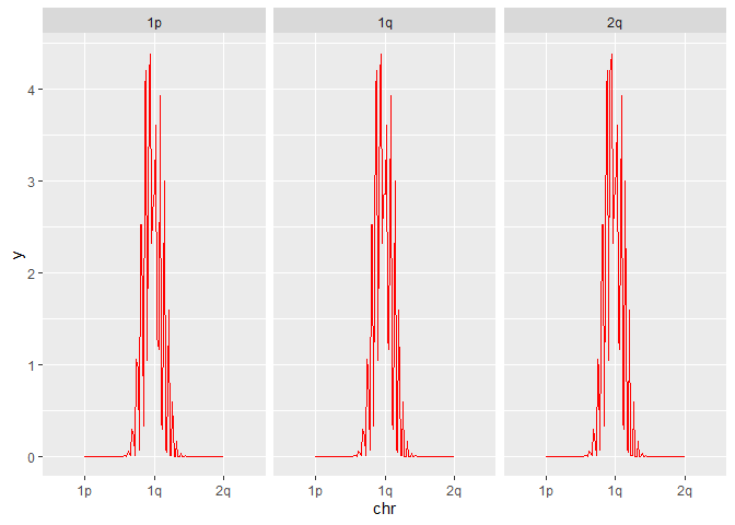
Created on 2022-12-14 by the reprex package (v2.0.1)
As I have shown in my last posting, this is how you actually should do it with facet_wrap():
# again as in my previous post
input |>
  # extract mean and sd rowwise
  dplyr::rowwise() |>
  # add the density and corresponding xvals as list columns
  dplyr::mutate(
    xvals   = list(seq.default(0,3,length.out = 100)),
    density = list(dnorm(seq.default(0,3,length.out = 100),
                         mean = MEAN, sd = SD))) |>
  # unnest the list columns
  tidyr::unnest(cols = 4:5) |>
  ggplot() +
  geom_line(aes(xvals,density, col = chr)) +
  facet_wrap(~ chr)
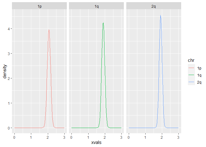
Created on 2022-12-14 by the reprex package (v2.0.1)
Kind regards