Plotting mean and standard error of mean from linear regression

Hi everyone,

I am quite new to R, but I have to use it for data analysis of my bachelor thesis.
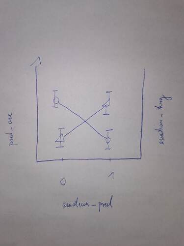
I've run a multiple linear regression where pred_acc is the dependent continuous variable and emotion_pred and emotion_target are two dummy coded independent variables with 0 and 1. Furthermore I am interested in the interaction between the two independent variables.

model <- lm(predic_acc ~ emotion_pred * emotion_target, data = data_almost_final)
summary(model)

Now I wanted to plot the regression with the means of each combination of the independent variables (0,1; 1,0; 1,1; 0,0) and add an errorbar with the standard error of the means. I have literally no idea at all how to do this. Maybe somebody here can help me with this? Thanks a lot!

I attached a sketch of what kind of plot I am trying to get.
Is this the sort of thing you are looking for?

library(dplyr)
library(ggplot2)
#invent some data
DF <- data.frame(emotion_pred = sample(c(0,1), size = 40, replace = TRUE),
                 emotion_target = sample(c(0,1), size = 40, replace = TRUE),
                 predic_acc = runif(40))
head(DF)

#>   emotion_pred emotion_target predic_acc
#> 1            0              1  0.3906500
#> 2            0              1  0.5477801
#> 3            0              0  0.1167041
#> 4            1              1  0.7130423
#> 5            1              0  0.3001842
#> 6            0              1  0.3866334

#Calculate and plot some statistics
DF_stats <- DF |> group_by(emotion_pred,emotion_target) |> 
  summarize(Avg = mean(predic_acc), N = n())
#> `summarise()` has grouped output by 'emotion_pred'. You can override using the
#> `.groups` argument.
DF_stats
#> # A tibble: 4 × 4
#> # Groups:   emotion_pred [2]
#>   emotion_pred emotion_target   Avg     N
#>          <dbl>          <dbl> <dbl> <int>
#> 1            0              0 0.511     9
#> 2            0              1 0.475    11
#> 3            1              0 0.408     7
#> 4            1              1 0.507    13
ggplot(DF_stats,aes(x = factor(emotion_pred), y = Avg, shape = factor(emotion_target))) +
  geom_point()

Created on 2022-09-06 with reprex v2.0.2

1 Like

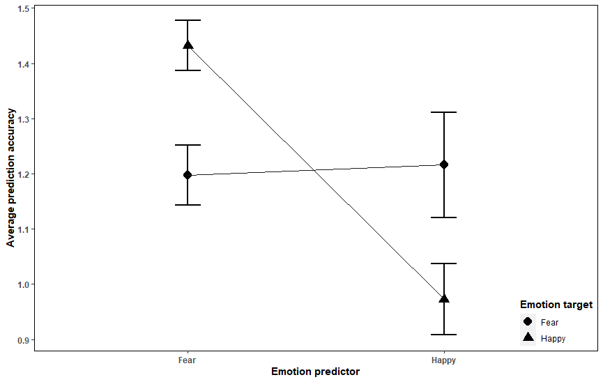
Yes, I think that looks good, thanks! I adapted it for my data and thats how the code and output look like:

visualization_regression %>%
  filter(!is.na(emotion_pred)) %>%
ggplot(aes(x = factor(emotion_pred), y = pred_avg, shape = factor(emotion_target), na.rm = TRUE, group = emotion_target)) + geom_point(size = 4, na.rm = TRUE) +
geom_errorbar(aes(ymin=pred_avg-stand_error, ymax=pred_avg+stand_error), colour="black", width=.1, size = 1) + geom_line(size = 0.7, color = "grey10") +
labs(x= "Emotion predictor", y= "Average prediction accuracy", shape= "Emotion target") +
theme(panel.background = element_blank(), strip.background = element_rect(colour=NA, fill=NA), 
panel.border = element_rect(fill = NA, color = "black"), legend.title = element_text(face="bold"), legend.justification=c(1,0), legend.position=c(1,0), 
strip.text = element_text(face="bold", size=9), axis.text=element_text(face="bold"), axis.title = element_text(face="bold"),
plot.title = element_text(face = "bold", hjust = 0.5, size=13))

I'd like to change the color of the two different point shapes and the lines inbetween. Meaning triangle and their connecting lines should be e.g. red the circle shape and their lines e.g. green. I thought I could use

scale_color_manual(values=c('Green','Yellow'))

however this doesn't seem to change the color of the lines. They both stay black. Any idea what I am doing wrong? Thanks a lot!

to set / modify a ggplot2 scale, you would need to assign an aesthetic (aes) which relates to the scale. example:

library(ggplot2)


iris |> ggplot() +
  aes(x = Species, y = Petal.Length) +
  geom_point() +
  scale_color_manual(values = c("red", "green", "blue"))


iris |> ggplot() +
  aes(
    x = Species, y = Petal.Length,
    color = Species
  ) +
  geom_point() +
  scale_color_manual(values = c("red", "green", "blue"))
1 Like

thank you, I got it now the way I wanted it. Hope my professor approves as well :wink:

This topic was automatically closed 7 days after the last reply. New replies are no longer allowed.

If you have a query related to it or one of the replies, start a new topic and refer back with a link.