mhab
January 31, 2023, 4:30pm
1
Hi,
Could anyone help me to plot lagged data. Say 3 months after current measurement. My example for dataset is:
Date
x
y
01/04/2017
0.188899419
1.37
01/05/2017
0.247572337
1.66
01/06/2017
0.213012986
2.56
01/07/2017
0.368303091
5.15
01/08/2017
0.323418238
2.42
01/09/2017
0.212830817
3.48
So, I want to plot 'y' starting 01/07/2017 - 01/09/2017 against 'x' starting on -01/04/2017-01/06/2017. I would like to see the impact after 3 months. Please anyone help me.
FJCC
January 31, 2023, 5:01pm
2
Would a data frame like JoinedData give you what you want?
library(tidyverse)
DF <- tribble(
  ~Date,    ~x,     ~y,
'01/04/2017',   0.188899419,    1.37,
'01/05/2017',   0.247572337,    1.66,
'01/06/2017',   0.213012986,    2.56,
'01/07/2017',   0.368303091,    5.15,
'01/08/2017',   0.323418238,    2.42,
'01/09/2017',   0.212830817,    3.48)
DF <- DF |> mutate(Date = lubridate::dmy(Date))
LeadData <- DF |> mutate(LeadDate = lead(Date, n = 3))
LeadData
#> # A tibble: 6 × 4
#>   Date           x     y LeadDate
#>   <date>     <dbl> <dbl> <date>
#> 1 2017-04-01 0.189  1.37 2017-07-01
#> 2 2017-05-01 0.248  1.66 2017-08-01
#> 3 2017-06-01 0.213  2.56 2017-09-01
#> 4 2017-07-01 0.368  5.15 NA
#> 5 2017-08-01 0.323  2.42 NA
#> 6 2017-09-01 0.213  3.48 NA
JoinedData <- inner_join(DF, LeadData, by = c(Date = "LeadDate"), suffix = c(".Orig", ".3Mth"))
JoinedData
#> # A tibble: 3 × 6
#>   Date       x.Orig y.Orig Date.3Mth  x.3Mth y.3Mth
#>   <date>      <dbl>  <dbl> <date>      <dbl>  <dbl>
#> 1 2017-07-01  0.368   5.15 2017-04-01  0.189   1.37
#> 2 2017-08-01  0.323   2.42 2017-05-01  0.248   1.66
#> 3 2017-09-01  0.213   3.48 2017-06-01  0.213   2.56
Created on 2023-01-31 with reprex v2.0.2
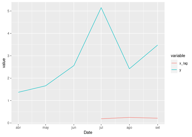
It is not clear how you want the plot to look like, something like this?
library(tidyverse)

sample_df <- data.frame(
  stringsAsFactors = FALSE,
              Date = c("01/04/2017","01/05/2017",
                       "01/06/2017","01/07/2017","01/08/2017","01/09/2017"),
                 x = c(0.188899419,0.247572337,
                       0.213012986,0.368303091,0.323418238,0.212830817),
                 y = c(1.37, 1.66, 2.56, 5.15, 2.42, 3.48)
)


sample_df %>%
    mutate(Date = lubridate::dmy(Date),
           x_lag = lag(x, n = 3)) %>%
    select(-x) %>%
    pivot_longer(cols = c(x_lag, y), names_to = "variable", values_to = "value") %>%
    ggplot(aes(x = Date, y = value, color = variable)) +
    geom_line()
#> Warning: Removed 3 rows containing missing values (`geom_line()`).
Created on 2023-01-31 with reprex v2.0.2
system
February 21, 2023, 5:05pm
4
This topic was automatically closed 21 days after the last reply. New replies are no longer allowed.