Plotting graph from a forloop (Testing Standard Error vs n)

Hi! I'm relatively inexperienced with R so I made this post to seek out help with this problem I'm currently having.

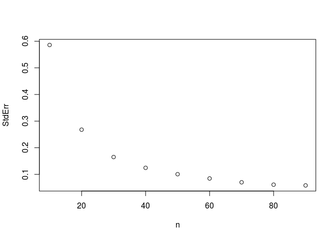
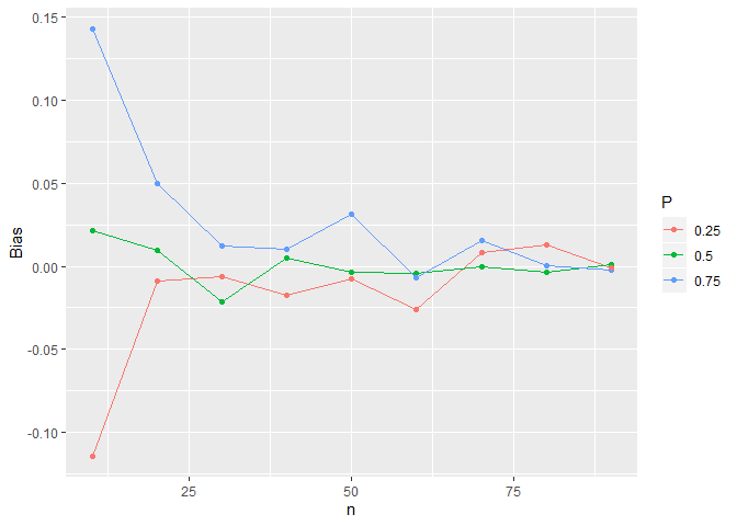
So essentially I've been asked to see how the standard error and bias of a Cauchy distribution vary with n (sample size). I've produced the following code that outputs values of standard error and bias for n varying from 10 to 90 with intervals of 10.
What I now need to do is, instead of just seeing this information as a vector, plot the bias and standard error against n so I can analyse the results. Here is the code I currently have.

p <- 1/2
set.seed(1)
for (n1 in seq(1,9)) {
for (i in 1:1000) {
x<-rcauchy(10n1,0)
estimators[i] = quantile(x,p) - tan(pi
(p-1/2))
}
print(c(mean(estimators), sd(estimators)/sqrt(n)))
biases[n1] = mean(estimators)
}

where mean(estimators) are the biases of each n, and the standard error is sd(estimators)/sqrt(n).

Thank you very much, I hope someone can help

There are many plotting options and I have chosen using the base plot() function.

p <- 1/2
set.seed(1)
biases <- vector("numeric", length = 9)
StdErr <- vector("numeric", length = 9)
estimators <- vector("numeric", length = 1000)
for (n1 in seq(1,9)) {
  for (i in 1:1000) {
    x <- rcauchy(10 * n1, 0)
    estimators[i] = quantile(x,p) - tan(pi * (p-1/2))
  }
  biases[n1] <- mean(estimators)
  StdErr[n1] <- sd(estimators)/sqrt(n1)
}
nVal <- seq(10, 90 , by = 10)

plot(nVal, biases, type = "p", xlab = "n")

plot(nVal, StdErr, type = "p", xlab = "n")

Created on 2019-12-05 by the reprex package (v0.2.1)

1 Like

This is extremely helpful. Thank you very much :slight_smile:

Is there any way of plotting overlapping graphs for varying values of p? I have 3 choices of P.

That is easier to do with the ggplot package.

pVals <- c(1/2, 0.75, 0.25)
set.seed(1)
biases <- vector("numeric", length = 9 * length(pVals))
StdErr <- vector("numeric", length = 9 * length(pVals))
estimators <- vector("numeric", length = 1000)
for (j in seq_along(pVals)) {
  for (n1 in seq(1,9)) {
    indx <- n1 + (j-1) * 9
    for (i in 1:1000) {
      x <- rcauchy(10 * n1, 0)
      estimators[i] = quantile(x,pVals[j]) - tan(pi * (pVals[j]-1/2))
    }
    biases[indx] <- mean(estimators)
    StdErr[indx] <- sd(estimators)/sqrt(n1)
  }
}
nVal <- seq(10, 90 , by = 10)
DF <- data.frame(n = rep(nVal, length(pVals)), 
                 Bias = biases, 
                 StandErr =StdErr,
                 P = factor(rep(pVals, each = 9)))
library(ggplot2)
#> Warning: package 'ggplot2' was built under R version 3.5.3
ggplot(DF, aes(x = n, y = Bias, color = P, group = P)) + geom_point() + geom_line()

Created on 2019-12-06 by the reprex package (v0.3.0.9000)

1 Like

This topic was automatically closed 21 days after the last reply. New replies are no longer allowed.