I was able to create a nice world map, I used this code for my data and I was able to obtain the point plot using the geom_point.
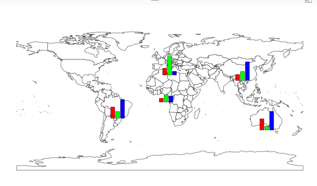
I want to put the data as a bar chart over the map for each country something like this image
(http://radacad.com/wp-content/uploads/2017/04/mapbarchart.png)
Could you help produce the bar chart over the map?
Here is a producible code for my data
{}
#### create the data
df <- data.frame(matrix(ncol = 8, nrow = 4))
colnames(df) <- c( "X.prj", "Y.prj","country", "Region","V1","V2","V3","V4" )
df$X.prj <- c(8649752.0,17359084.9, -744932.8, -5091132.5)
df$Y.prj <- c(5860666.76, -2263969.57,1659622.59,-4391906.10)
df$country <- c("Mongolia","Niue","Mali","Argentina")
df$Region <-  c("Asia","PAC","Africa","GRULAC")
df$V1 <- c(106.4666667,258.8,56.05,1997.55)
df$V2 <- c(1.6,63.4,14.5,0)
df$V3 <- c(205.1333333, 369,169,403)
df$V4 <- c(219.3333333,175,150,247)

###############################################################################
## Create a world cities map using ggplot.

library(rgdal)      # for spTransform() & project()
library(ggplot2)    # for ggplot()
library(ggrepel)    # for geom_text_repel() - repel overlapping text labels
library(data.table)

# =============================================================================
# Load ready to use data from GitHub
# =============================================================================

load(url("https://github.com/valentinitnelav/RandomScripts/blob/master/NaturalEarth.RData?raw=true"))
# This will load 6 objects:
#   xbl.X & lbl.Y are two data.frames that contain labels for graticule lines
#       They can be created with the code at this link:
#       https://gist.github.com/valentinitnelav/8992f09b4c7e206d39d00e813d2bddb1
#   NE_box is a SpatialPolygonsDataFrame object and represents a bounding box for Earth
#   NE_countries is a SpatialPolygonsDataFrame object representing countries
#   NE_graticules is a SpatialLinesDataFrame object that represents 10 dg latitude lines and 20 dg longitude lines
#           (for creating graticules check also the graticule package or gridlines fun. from sp package)
#           (or check this gist: https://gist.github.com/valentinitnelav/a7871128d58097e9d227f7a04e00134f)
#   NE_places - SpatialPointsDataFrame with city and town points
#   NOTE: data downloaded from http://www.naturalearthdata.com/
#         here is a sample script how to download, unzip and read such shapefiles:
#         https://gist.github.com/valentinitnelav/a415f3fbfd90f72ea06b5411fb16df16

# =============================================================================
# Project from long-lat to Eckert IV projection
# =============================================================================

# spTransform() is used for shapefiles and project() in the case of data frame
# for more PROJ.4 strings check the followings
#   http://proj4.org/projections/index.html
#   https://epsg.io/

# __ give the PORJ.4 string for Eckert IV projection
PROJ <- "+proj=eck4 +lon_0=0 +x_0=0 +y_0=0 +ellps=WGS84 +datum=WGS84 +units=m +no_defs"
# or use the short form "+proj=eck4"

# __ project the shapefiles
NE_countries.prj  <- spTransform(NE_countries, CRSobj = PROJ)
NE_graticules.prj <- spTransform(NE_graticules, CRSobj = PROJ)
NE_box.prj        <- spTransform(NE_box, CRSobj = PROJ)

# __ project long-lat coordinates columns for data frames
# (two extra columns with projected XY are created)
prj.coord <- project(cbind(lbl.Y$lon, lbl.Y$lat), proj = PROJ)
lbl.Y.prj <- cbind(prj.coord, lbl.Y)
names(lbl.Y.prj)[1:2] <- c("X.prj","Y.prj")

prj.coord <- project(cbind(lbl.X$lon, lbl.X$lat), proj = PROJ)
lbl.X.prj <- cbind(prj.coord, lbl.X)
names(lbl.X.prj)[1:2] <- c("X.prj","Y.prj")


# =============================================================================
# Prepare the data table for plotting
# =============================================================================

# melt all variable to one column
df.melt <- melt(df, id= c("X.prj","Y.prj","country","Region"),
                     measure.vars = 5:8)


=============================================================================

ggplot() +
  # __ add layers and labels
  # add projected countries
  geom_polygon(data = NE_countries.prj,
               aes(long,lat, group = group),
               colour = "gray70", fill = "gray90", size = .25)+
  # Note: "Regions defined for each Polygons" warning has to do with fortify transformation.
  # fortify might get deprecated in future!
  # alternatively, use use map_data(NE_countries) to transform to data frame and then use project() to change to desired projection.
  # add projected bounding box
  geom_polygon(data = NE_box.prj,
               aes(x = long, y = lat),
               colour = "black", fill = "transparent", size = .25)+
  # add locations (points); add opacity with "alpha" argument&&&&&&&&&&&&&&&&&&&&&&&&&
  geom_point(data = df.melt,
             aes(x = X.prj, y = Y.prj, colour = Region, ),
             alpha = .5)


**## Here I was trying to produce the bar chart which I get a lot of error by using the code below:**

for (i in  1:nrow(df)) %>%  subplot(barplot(dheight=as.numeric(as.character(unlist(df[i, 5:8], use.names=F))), axes=F,
                                                 col=rainbow(4),ylim=range(df[,5:])),
                                         x=df[i, "X.prj"], y=df[i,"Y.prj"], size=c(.6, .6))