And now I'm trying to use ggplot and geom_col to visualize the names by plot and the result is just weird. Can you please help me check what's wrong with my code? Thank you very much!
suppressPackageStartupMessages(library(dplyr))
suppressPackageStartupMessages(library(babynames))
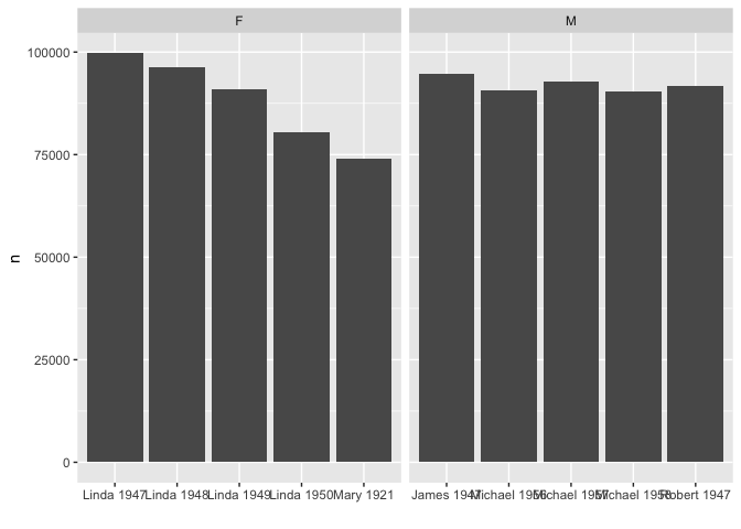
babynames %>%
group_by(sex) %>%
top_n(5,n) %>%
ungroup() %>%
select(sex, name, year, n) %>%
arrange(sex, desc(n))
#> # A tibble: 10 x 4
#> sex name year n
#> <chr> <chr> <dbl> <int>
#> 1 F Linda 1947 99686
#> 2 F Linda 1948 96209
#> 3 F Linda 1949 91016
#> 4 F Linda 1950 80432
#> 5 F Mary 1921 73982
#> 6 M James 1947 94756
#> 7 M Michael 1957 92695
#> 8 M Robert 1947 91642
#> 9 M Michael 1956 90620
#> 10 M Michael 1958 90520
The plot with geom_col() is about as condensed as possible a representation of the data. It does answer the question:
For each name, how many occurrences?
So, the question for the analyst is what else a plot should draw attention to. The rank change over years? Which sex is more consistently in the top five?
As @technocrat says, it really depends on what you're trying to show with the plot. I think the reason your getting unexpected results is that geom_col() is combining all years of each name.
If you just want to plot the number of children with each top name per year, you could create a name_year and do something like this. Also, decided to split this by sex into female and male. You could do a lot more to clean this up, but it should be a good start for you!