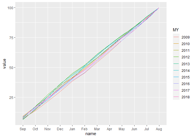
I have data tibble as below.
I wnat to plot this data with Sept-Aug as Month on X- Axis. value of that on Y axis and MY as dffrent line in ggplot 2.
If i make this data using separate that can be done easliy. but want to know is there any direct way.
MY Sep Oct Nov Dec Jan Feb Mar Apr May Jun Jul Aug TOTAL
1 2009 7.43 13.7 21.6 29.9 38.5 45.4 54.4 63.1 72.7 81.4 90.7 100 100
2 2010 9.13 17.0 25.5 35.1 41.4 48.8 57.8 66.1 76.0 83.8 91.3 100 100
3 2011 6.60 14.5 24.3 33.5 41.7 49.7 58.3 66.5 75.1 83.6 92.3 100 100
4 2012 8.22 17.2 27.1 35.9 44.9 52.0 61.2 69.1 76.6 84.2 92.4 100 100
5 2013 6.34 15.0 25.7 36.3 44.1 51.4 59.9 69.0 77.0 83.8 91.7 100 100
6 2014 7.78 17.3 25.6 34.7 43.0 50.4 58.3 67.1 75.2 83.7 92.5 100 100
7 2015 7.06 15.5 22.9 32.4 40.3 51.2 60.6 68.5 75.0 82.4 90.1 100 100
8 2016 8.89 16.0 24.1 31.6 39.2 45.7 55.6 64.0 72.7 81.2 90.4 100 100
9 2017 8.73 16.7 24.2 32.9 40.9 47.4 56.6 66.1 75.1 83.3 91.6 100 100
10 2018 7.07 15.3 24.0 32.6 41.1 48.1 56.6 65.4 74.6 81.2 91.0 100 100