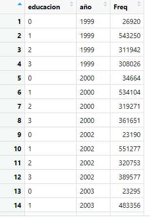
I have a dataframe that looks like this:

Where educacion and año should be factors and i want to create a barplot that shows me the proportion of each category of educacion by year
Any suggestion or help, will be welcome. Thank you in advance
I have a dataframe that looks like this:

Where educacion and año should be factors and i want to create a barplot that shows me the proportion of each category of educacion by year
Any suggestion or help, will be welcome. Thank you in advance
you can study how to visualise data from this wonderful book
Thanks! that was really usefull 
This topic was automatically closed 7 days after the last reply. New replies are no longer allowed.
If you have a query related to it or one of the replies, start a new topic and refer back with a link.