Hi everyone!
I am learning plotly and I am doing some practice using the Covid dataset provided by Our World in Data.
I am having a very basic issue with filtering the data: I am trying to filter European countries with more than 5000000 inhabitants, but that is what I get:
library(readr)
library(dplyr)
library(plotly)
library(crosstalk)
library(forecast)
library(ggplot2)
library(tidyverse)


data <- read.csv(url("https://covid.ourworldindata.org/data/owid-covid-data.csv"))
data$date <- as.Date(data$date)
# Create  a shared data frame
shared_data <- SharedData$new(data, key = ~continent)

col <- shared_data %>%
  plot_ly() %>%
  filter(date == "2020-11-29") %>%
  filter(continent == "Europe" & location != "Russia" & population > 5000000) %>%
  add_bars(x = ~location, y = ~total_cases_per_million, color = ~location)

lines <- shared_data %>%
  plot_ly() %>%
  filter(continent == "Europe" & location != "Russia" & population > 5000000) %>%
  add_lines(x = ~date, y = ~new_cases_smoothed, color = ~location)

subplot(col, lines) %>%
  hide_legend() %>%
  highlight()
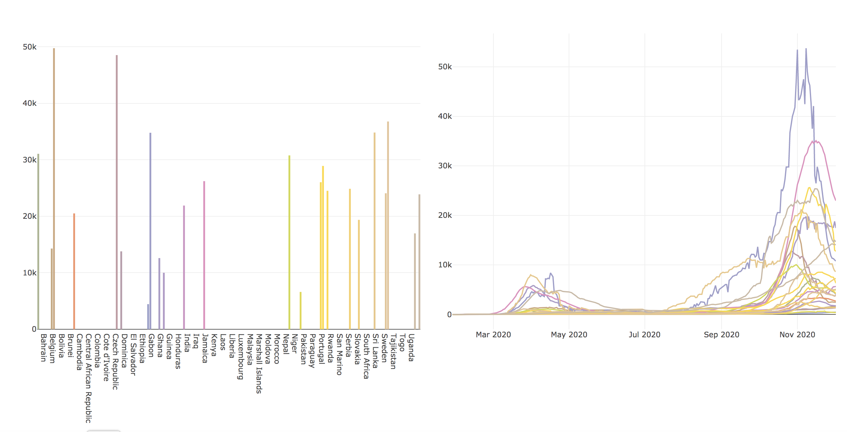
While the line chart seems ok, the bar charts still keeps all the world countries but only display data for the European one.
Moreover if I run:
data_europe <- data %>%
  filter(continent == "Europe" & location != "Russia" & population > 5000000)
str(data_europe)

'data.frame':	7560 obs. of  50 variables:
 $ iso_code                          : Factor w/ 192 levels "","AFG","AGO",..: 11 11 11 11 11 11 11 11 11 11 ...
 $ continent                         : Factor w/ 7 levels "","Africa","Asia",..: 4 4 4 4 4 4 4 4 4 4 ...
 $ location                          : Factor w/ 192 levels "Afghanistan",..: 10 10 10 10 10 10 10 10 10 10 ...
 $ date                              : Date, format: "2020-01-23" "2020-01-24" "2020-01-25" ...
 $ total_cases                       : num  NA NA NA NA NA NA NA NA NA NA ...
 $ new_cases                         : num  0 0 0 0 0 0 0 0 0 0 ...
 $ new_cases_smoothed                : num  NA NA NA NA NA 0 0 0 0 0 ...
why do continent and location have the same levels as before filtering?
... I am probably doing some basic mistake but I am pretty confused..