Plotly Geom Point Geom Line ToolTip Compare

Good morning,

I follow what is happening. However, I can't figure out a way to get it to work. I have a ggplot that I convert to plotly. It has geomline and geompoint because I am tracking change overtime. Everything works great except when I do the compare data on hover. The compare data on hover shows both values for geom line and geom point. I would like to only show values for geompoint. I don't know if it is a bug or not but the first line/shape that is passed into plotly is combined and the rest are separated.


library(ggplot2)
library(plotly)

colorScheme = c("red", "blue", "purple")
shapeScheme = c(
  16 # Filled circle
  , 17 # Filled triangle
  , 25 #Inverted triangle with a border (can be filled with a color)
)

# Sample data
data <- data.frame(
  x = c(1, 2, 3, 2, 3, 1, 3, 1 , 2),
  y1 = c(10, 16, 5, 11, 15, 9, 7, 12, 13),
  grouplbl = c("A", "B", "C", "A", "B", "C", "A", "B", "C"),
  groupIndex= c(3, 2, 1, 3, 2, 1, 3, 2, 1)
  
)

# Create ggplot object
ggPlot <- ggplot(data, aes(
  x = x, y = y1, 
  
  , color = reorder(grouplbl, groupIndex) 
  , shape = reorder(grouplbl, groupIndex)
  , fill = reorder(grouplbl, groupIndex) 
  , group = reorder(grouplbl, groupIndex) 
  , text = paste("Group:", grouplbl, "<br>Value:", y1))) +
  geom_point(size = 3) +
  geom_line(show.legend = FALSE) +
  labs(
    title = "ggplot with Points and Bars",
    x = "X Axis",
    y = "Y Axis",
    color= ""
  ) +
  theme_minimal() +
  ggplot2::scale_color_manual(name = NA, values = colorScheme) +
  ggplot2::scale_fill_manual(name = NA, values = colorScheme) + # Required to fill in some shapes
  ggplot2::scale_shape_manual(name = NA, values = shapeScheme) # Define shapes

# print(ggPlot) 

# Convert to Plotly plot
plotlyPlot <- ggPlot |> ggplotly(tooltip = "text") |> 
  plotly::layout(
    margin = list(
      t=-10 #Moves the top margin of the top facet so the title moves up a little
    )
    , hovermode = "x unified"
    , legend = list(
      orientation = 'h',  # Horizontal orientation
      xanchor = 'center', # Center the legend with respect to the x position
      yanchor = 'bottom', # Anchor the legend at the bottom
      x = 0.5,            # Center the legend on the x-axis
      y = -0.5,           # Position the legend below the x-axis
      bgcolor = "#E2E2E2",
      bordercolor = "#FFFFFF",
      borderwidth = 1
    )
  )

# Display the plot
plotlyPlot
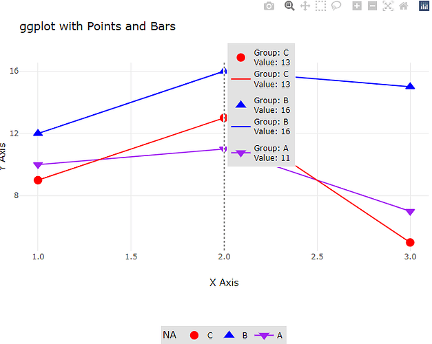
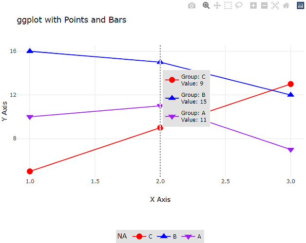
I think I figured it out. The x data has to be ordered correctly. Now I just have to figure out how to hide the line through the shape in the legend like ggplot (geom_line(show.legend = FALSE)).

library(ggplot2)
library(plotly)

colorScheme = c("red", "blue", "purple")
shapeScheme = c(
  16 # Filled circle
  , 17 # Filled triangle
  , 25 #Inverted triangle with a border (can be filled with a color)
)

# Sample data
data <- data.frame(
  x = c(1, 1, 1, 2, 2, 2, 3, 3 , 3),
  y1 = c(10, 16, 5, 11, 15, 9, 7, 12, 13),
  grouplbl = c("A", "B", "C", "A", "B", "C", "A", "B", "C"),
  groupIndex= c(3, 2, 1, 3, 2, 1, 3, 2, 1)
  
)

# Create ggplot object
ggPlot <- ggplot(data, aes(
  x = x, y = y1, 
  
  , color = reorder(grouplbl, groupIndex) 
  , shape = reorder(grouplbl, groupIndex)
  , fill = reorder(grouplbl, groupIndex) 
  , group = reorder(grouplbl, groupIndex) 
  , text = paste("Group:", grouplbl, "<br>Value:", y1))) +
  geom_point(size = 3) +
  geom_line(show.legend = FALSE) +
  labs(
    title = "ggplot with Points and Bars",
    x = "X Axis",
    y = "Y Axis",
    color= ""
  ) +
  theme_minimal() +
  ggplot2::scale_color_manual(name = NA, values = colorScheme) +
  ggplot2::scale_fill_manual(name = NA, values = colorScheme) + # Required to fill in some shapes
  ggplot2::scale_shape_manual(name = NA, values = shapeScheme) # Define shapes

# print(ggPlot) 

# Convert to Plotly plot
plotlyPlot <- ggPlot |> ggplotly(tooltip = "text") |> 
  plotly::layout(
    margin = list(
      t=-10 #Moves the top margin of the top facet so the title moves up a little
    )
    , hovermode = "x unified"
    , legend = list(
      orientation = 'h',  # Horizontal orientation
      xanchor = 'center', # Center the legend with respect to the x position
      yanchor = 'bottom', # Anchor the legend at the bottom
      x = 0.5,            # Center the legend on the x-axis
      y = -0.5,           # Position the legend below the x-axis
      bgcolor = "#E2E2E2",
      bordercolor = "#FFFFFF",
      borderwidth = 1
    )
  )

# Display the plot
plotlyPlot
This topic was automatically closed 7 days after the last reply. New replies are no longer allowed.

If you have a query related to it or one of the replies, start a new topic and refer back with a link.