plotly function not generating desired plot, please help.

Problem: All values of aesthetically mapped variable not displayed, I mapped the variable 'class' of mpg data set of ggplot2, but the plotly function is not displaying all of them.
Here is the code:

library(ggplot2)
library(plotly)

# using mpg data set, already loaded as a part of ggplot2

fig<-plot_ly(mpg,x=~cty, y=~hwy, 
             color=~drv,
             frame = ~class,
             type="scatter",
             mode="markers")
fig

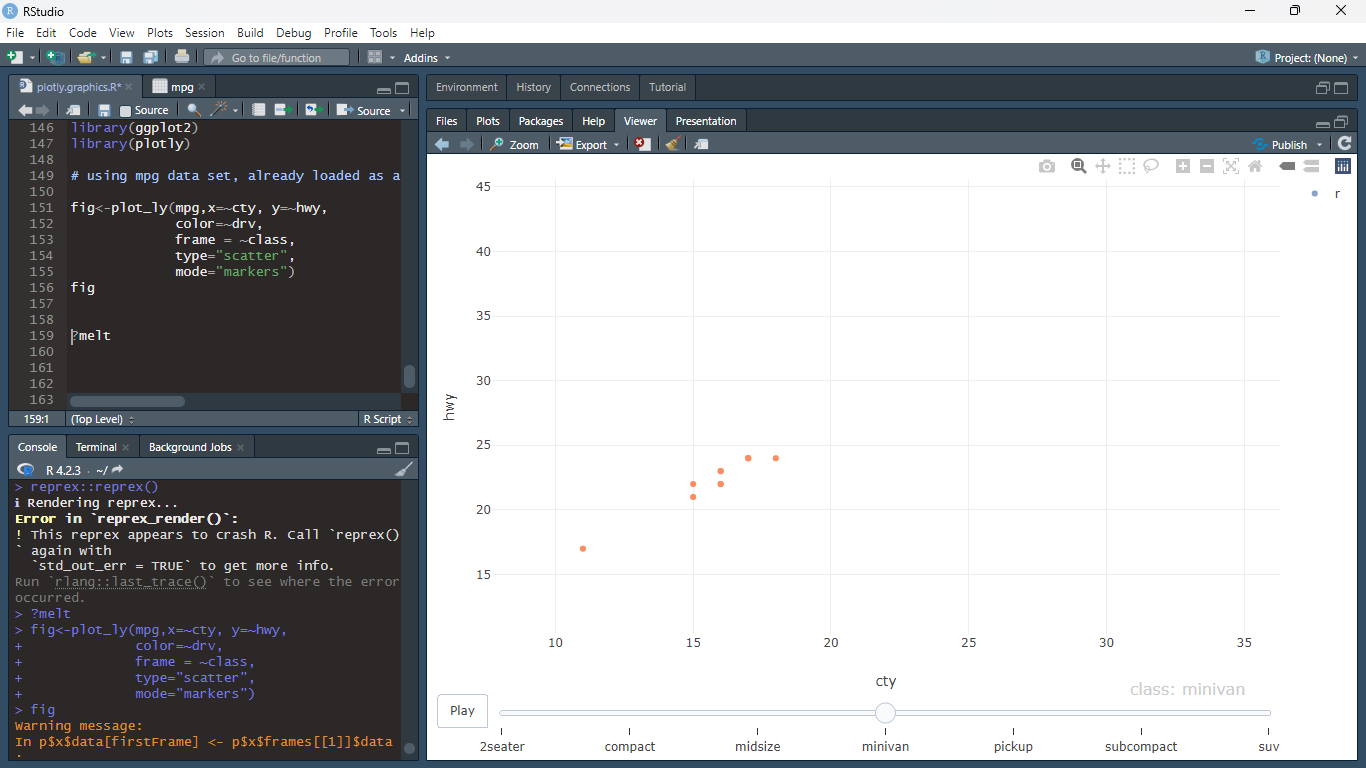
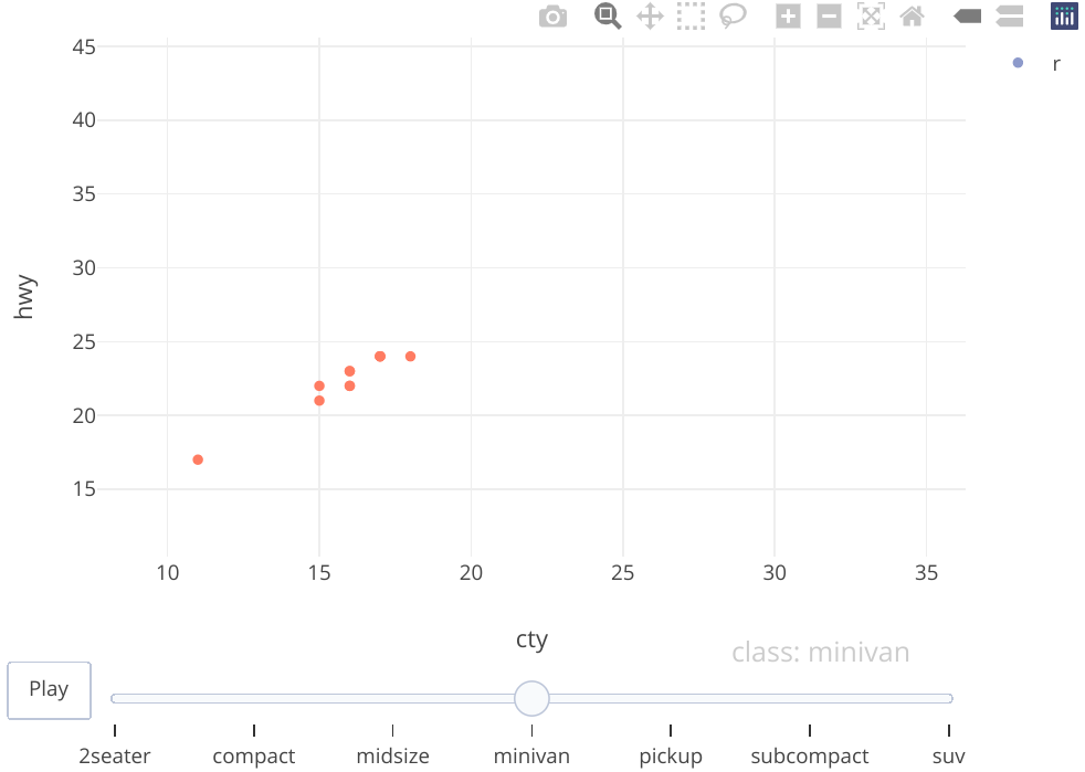
Below is the screenshot, following warning was shown:
Warning message: In p$x$data[firstFrame] <- p$x$frames[[1]]$data : number of items to replace is not a multiple of replacement length


The 'drv ' has three distinct values '4', 'f', 'r' , only r is being shown.

Depends on the tab

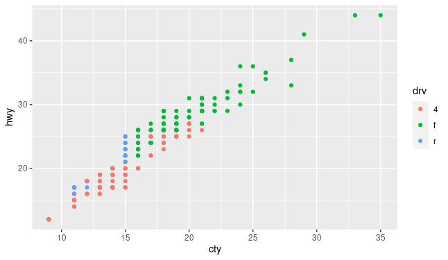
See on the upper right side only r's legend is shown, plus pertaining to the screenshot you have posted, the particular tab is on class: minivan which has all three types of drv so there should be three colors of markers in the plot but there is only one.

Seems like this is a longstanding limitation of plotly in both Python and R :

A framed chart showing all the data seems to be possible if not choosing to color by drv but appreciate that this makes for a less colorfull chart
1 Like

You're right, it's messed. Works in ggplot()

image

Here's the breakdown. Only subcompact has all three

library(ggplot2)
table(mpg[c(7,11)])
#>    class
#> drv 2seater compact midsize minivan pickup subcompact suv
#>   4       0      12       3       0     33          4  51
#>   f       0      35      38      11      0         22   0
#>   r       5       0       0       0      0          9  11

This topic was automatically closed 21 days after the last reply. New replies are no longer allowed.

If you have a query related to it or one of the replies, start a new topic and refer back with a link.