Hi,
I have data with 2 columns (NCORE and PILS).
For the PILS, I want to make a line plot with a filled area. For the NCORE, I want to make only a line plot.
Wavelength	NCORE	PILS
300	         NaN	92.29
350	        18.79	48.20
365	        18.02	39.85
405	        16.24	23.03
430	        15.29	16.94
445	        14.78	13.52
500	        13.15	6.618
532	        12.36	5.262
550	        11.96	1.360
For doing this, I am using code:
wavelength %>%
  slice(1:n()) %>%
  melt(id.vars=1:1) %>%
  ggplot(aes(Wavelength, value, fill=variable)) + geom_area(alpha=0.6)+
  geom_line(size=0.2) +
  xlab(bquote('Wavelength (nm)'))   +
  ylab(bquote('BrC - Absorbance')) +
  labs(title = "29th June")+
  ylim(0,100)+
  theme(legend.text=element_text(size=12)) +
  theme(legend.title=element_blank()) +
  theme(legend.position = c(0.8, 0.8)) +
  theme(axis.title = element_text(face="plain",size=14,color="black"),
        axis.text=element_text(size=12,face="plain", color="black"),
        plot.title = element_text(size=15)) +
  scale_color_brewer(palette="Set1")+
  ylab(bquote('Abs ('*Mm^-1*')'))
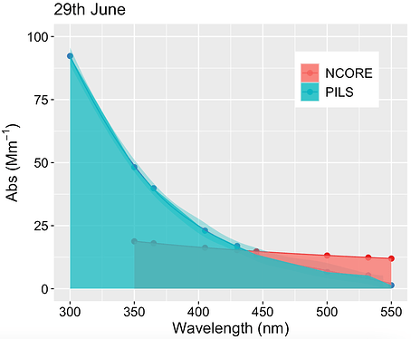
from this code, I am getting plot like
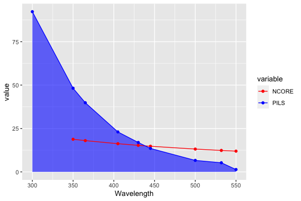
But, in this plot, I want to remove the filled area from NCORE (the red one). I only want a line plot for the NCORE column and on the front side. Right now in this plot, the red points (line) are behind the green that's why all the red points are in shadow. I want to make all the red points more clear.
Please let me know how to do it.
Thanks

