I am trying to plot a line chart with 2 lines but with different scales: the left y axis as a continuous numeric and the right y axis as a percentage. Bellow is a sample:
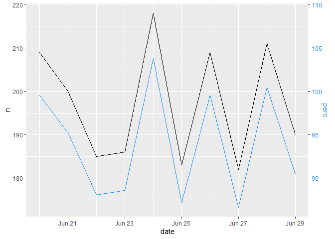
EDIT: Maybe some words on the chart itself. There is a reason why Hadley Wickham did not want to have secondary axes in ggplot2 and it is also not very appreciated in the dataviz community in general. As one can see here it can be very hard to interpret. You may want to switch to a 2-plot-solution anyway.
Hello. Thank you for the solution. I totally agree that secondary axes aren't a good way to visualize data, however sometimes the client just want it. They simply don't care, no matter the discourse about effective plotting. Unfortunately we have to do it anyway