I am looking for way(s) to plot my data for a paper I am about to publish in Nature Cities. I am pointing out the name of the journal to give context regarding the type of plot I am looking to create. Usually, in this journal the plots are magazine-like and usually they contain multiple figures in a single plot. An example of multiple plots in a single plot is shown below:
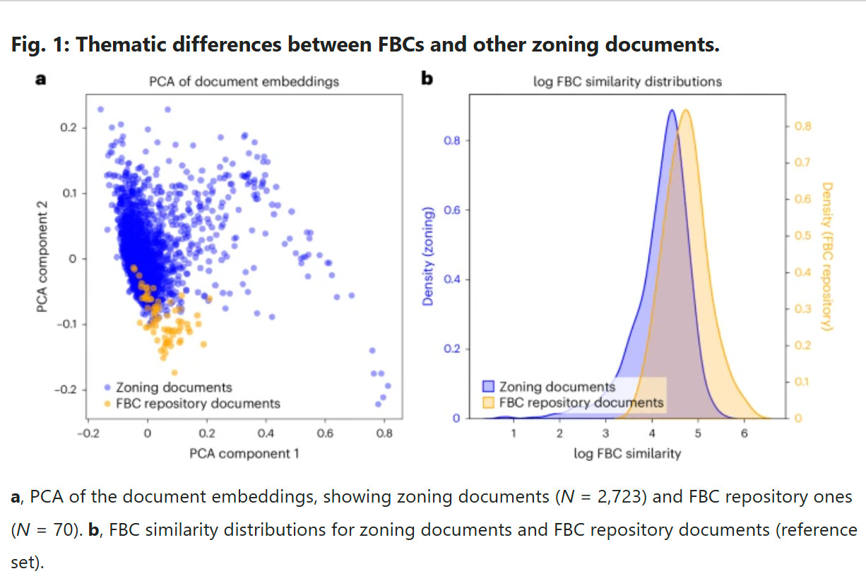
( Source: An AI-based analysis of zoning reforms in US cities)
A little bit about my dataset. I calculated 3 resilience metrics (UR, GI, NI) for several cities for 3 sectors and I classified the cities and their sectors into 4 scenarios based on the metrics performance. Now I am looking for ways to visualize the dataset in such a way that (the plot(s)) will tell a "meaningful" story. The story is urban resilience using nighttime lights data at the sector level. I tried some plots like:
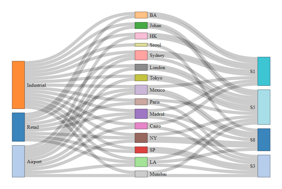
(Sankey diagram)
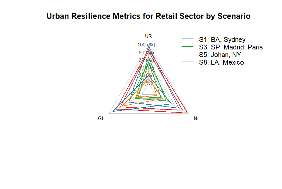
(Spider plot)
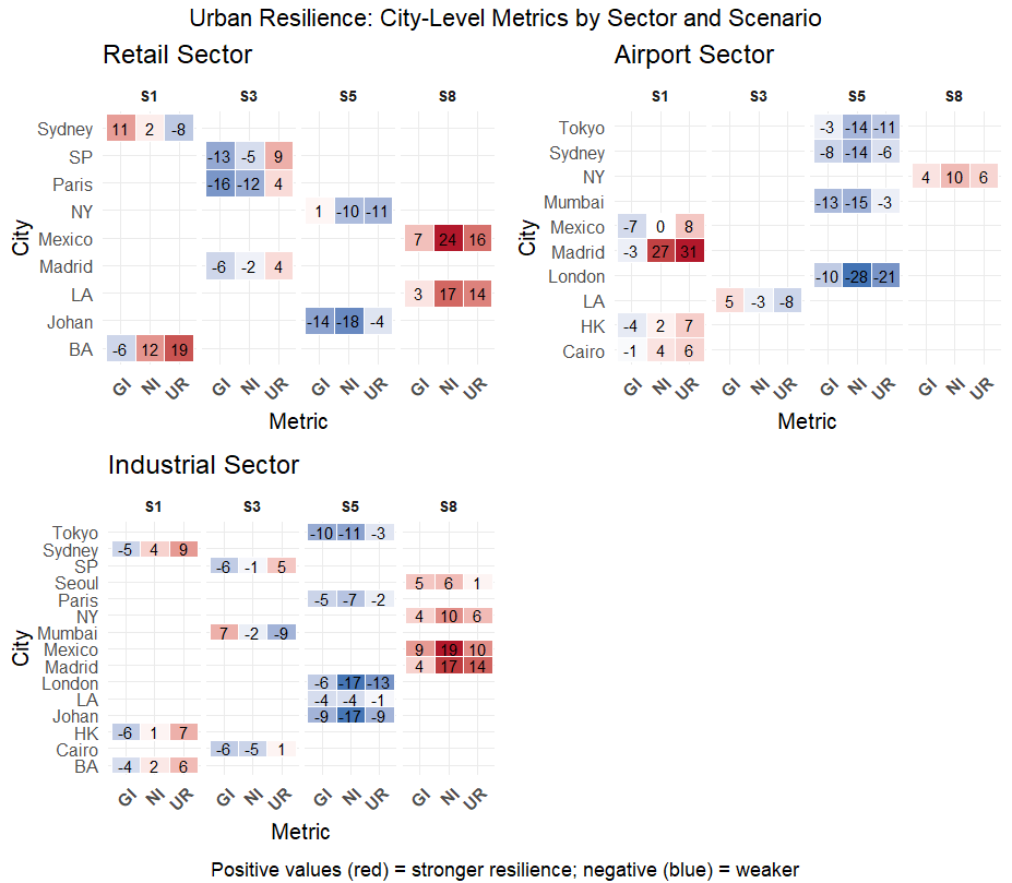
(Heatmap)
I'd like recommendations for other plots that I might missed or don't know. As I see it, I want to highlight which cities belong to which scenario per sector in such a way that will make the intra-urban comparison per sector easy (i.e., for a given city to compare the sector perfomance) as well as the city comparison easy (i.e., for a given sector how the cities performed). Hopefully the way I described my problem make sense.
The dataset:
library(tibble)

######## retail ########
retail <- tibble::tribble(
  ~Sector, ~Metric, ~BA, ~Johan, ~LA, ~SP, ~Sydney, ~Madrid, ~Mexico, ~NY, ~Paris,
  "Retail", "UR", 19, -4, 14, 9, -8, 4, 16, -11, 4,
  "Retail", "GI", -6, -14, 3, -13, 11, -6, 7, 1, -16,
  "Retail", "NI", 12, -18, 17, -5, 2, -2, 24, -10, -12
)

######## airport ########
airport <- tibble::tribble(
  ~Sector, ~Metric, ~Cairo, ~HK, ~LA, ~London, ~Sydney, ~Madrid, ~Mexico, ~Mumbai, ~NY, ~Tokyo,
  "Airport", "UR", 6, 7, -8, -21, -6, 31, 8, -3, 6, -11,
  "Airport", "GI", -1, -4, 5, -10, -8, -3, -7, -13, 4, -3,
  "Airport", "NI", 4, 2, -3, -28, -14, 27, 0, -15, 10, -14
)

######## industrial ########
industrial <- tibble::tribble(
  ~Sector, ~Metric, ~BA, ~Cairo, ~HK, ~Johan, ~LA, ~London, ~SP, ~Seoul, ~Sydney, ~Madrid, ~Mexico, ~Mumbai, ~NY, ~Paris, ~Tokyo,
  "Industrial", "UR", 6, 1, 7, -9, -1, -13, 5, 1, 9, 14, 10, -9, 6, -2, -3,
  "Industrial", "GI", -4, -6, -6, -9, -4, -6, -6, 5, -5, 4, 9, 7, 4, -5, -10,
  "Industrial", "NI", 2, -5, 1, -17, -4, -17, -1, 6, 4, 17, 19, -2, 10, -7, -11
)

########################### scenarios ###########################
######## retail ########
# Create the tibble
scenario_retail <- tibble(
  city = c("BA", "Johan", "LA", "SP", "Sydney", "Madrid", "Mexico", "NY", "Paris"),
  scenario = c("S1", "S5", "S8", "S3", "S1", "S3", "S8", "S5", "S3")
)

######## airport ########
scenario_airport <- tibble(
  city = c("Cairo", "HK", "LA", "London", "Sydney", "Madrid", "Mexico", "Mumbai", "NY", "Tokyo"),
  scenario = c("S1", "S1", "S3", "S5", "S5", "S1", "S1", "S5", "S8", "S5")
)

######## industrial ########
scenario_industrial <- tibble(
  city = c("BA", "Cairo", "HK", "Johan", "LA", "London", "SP", "Seoul", "Sydney", "Madrid", "Mexico", "Mumbai", "NY", "Paris", "Tokyo"),
  scenario = c("S1", "S3", "S1", "S5", "S5", "S5", "S3", "S8", "S1", "S8", "S8", "S3", "S8", "S5", "S5")
)
Session info
R version 4.4.3 (2025-02-28 ucrt)
Platform: x86_64-w64-mingw32/x64
Running under: Windows 11 x64 (build 26100)

Matrix products: default

locale:
[1] LC_COLLATE=English_United States.utf8  LC_CTYPE=English_United States.utf8    LC_MONETARY=English_United States.utf8
[4] LC_NUMERIC=C                           LC_TIME=English_United States.utf8

attached base packages:
[1] grid      stats     graphics  grDevices utils     datasets  methods   base

other attached packages:
 [1] ggpubr_0.6.0      gridExtra_2.3     networkD3_0.4     fmsb_0.7.6        ggsci_3.2.0       data.table_1.17.0 units_0.8-7
 [8] sf_1.0-20         terra_1.8-42      ggrepel_0.9.6     lubridate_1.9.4   forcats_1.0.0     stringr_1.5.1     dplyr_1.1.4
[15] purrr_1.0.4       readr_2.1.5       tidyr_1.3.1       tibble_3.2.1      ggplot2_3.5.1     tidyverse_2.0.0

loaded via a namespace (and not attached):
 [1] gtable_0.3.6       htmlwidgets_1.6.4  rstatix_0.7.2      tzdb_0.5.0         vctrs_0.6.5        tools_4.4.3        generics_0.1.3
 [8] proxy_0.4-27       pacman_0.5.1       pkgconfig_2.0.3    KernSmooth_2.23-26 lifecycle_1.0.4    compiler_4.4.3     farver_2.1.2
[15] munsell_0.5.1      codetools_0.2-20   carData_3.0-5      htmltools_0.5.8.1  class_7.3-23       yaml_2.3.10        Formula_1.2-5
[22] car_3.1-3          pillar_1.10.2      classInt_0.4-11    abind_1.4-8        tidyselect_1.2.1   digest_0.6.37      stringi_1.8.7
[29] labeling_0.4.3     fastmap_1.2.0      colorspace_2.1-1   cli_3.6.4          magrittr_2.0.3     utf8_1.2.4         broom_1.0.8
[36] e1071_1.7-16       withr_3.0.2        scales_1.3.0       backports_1.5.0    timechange_0.3.0   igraph_2.1.4       ggsignif_0.6.4
[43] hms_1.1.3          rlang_1.1.5        Rcpp_1.0.14        glue_1.8.0         DBI_1.2.3          rstudioapi_0.17.1  jsonlite_2.0.0
[50] R6_2.6.1