Hi,
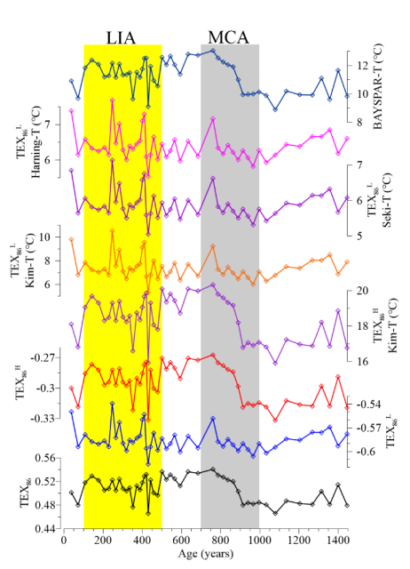
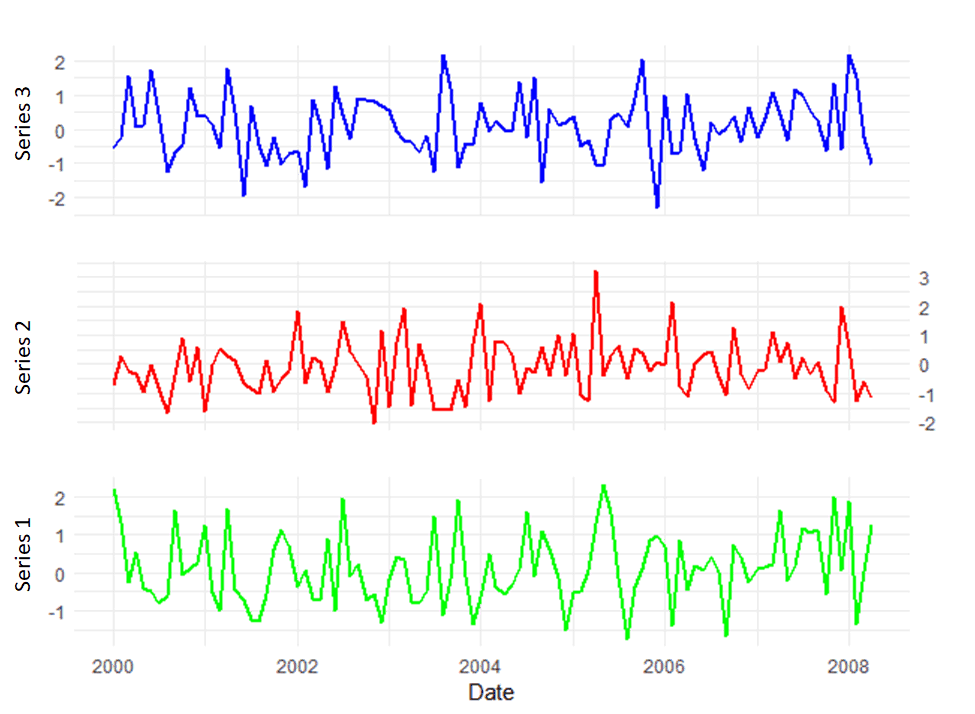
I want to create a similar plot to the one I attached in B. I tried to plot (A) but failed and modified the axis in Paint. Please, I appreciate your support in making a plot like B using ggplot2. Thank you.
Code:
# Load libraries
library(ggplot2)
library(tidyr)
library(ggpubr)
# Example data
set.seed(123)
n_points <- 100
date_seq <- seq.Date(from = as.Date("2000-01-01"), by = "months", length.out = n_points)

ts_data <- data.frame(
  Date = date_seq,
  Series1 = rnorm(n_points, mean = 0, sd = 1),
  Series2 = rnorm(n_points, mean = 0, sd = 1),
  Series3 = rnorm(n_points, mean = 0, sd = 1)
)


data_long <- ts_data %>%
  gather(Series, Value, -Date)

ggplot(data_long, aes(x = Date, y = Value)) +
  geom_line(aes(color = Series), size = 1) +
  facet_wrap(~ Series, scales = "free_y", ncol = 1) +
  labs(x = "Date", y = "") +
  scale_color_manual(values = c("Series1" = "blue", "Series2" = "red", "Series3" = "green")) +
  theme_minimal() +
  theme(legend.position = "none") +
  scale_y_continuous(
    name = "",
    sec.axis = sec_axis(~ ., name = ""),
    breaks = NULL
  )
Plots:
A.
B.