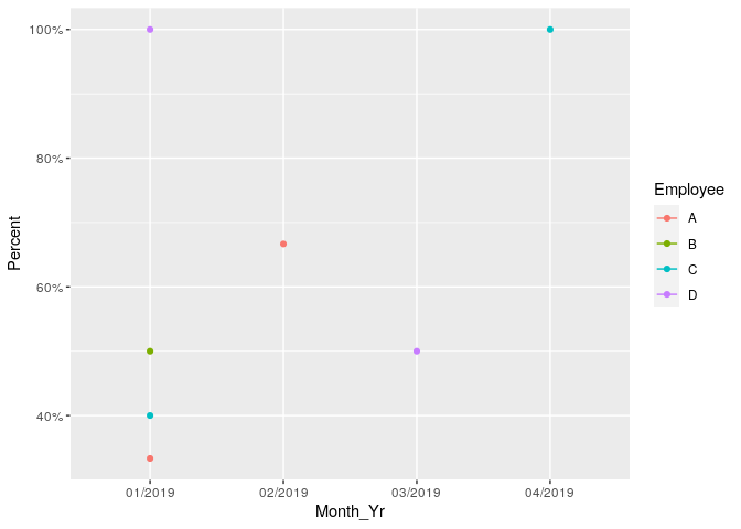
Rshiny: Plot line chart with percentage ratio of EMPLOYEE present and absent count in event by month.
Here is the sample data but in actuality there are 100+ employees,
So result should be required as line colour code by employee name.
Data set like:
Employee		Status			Month_Yr
A				PRESENT			01/2019
C				PRESENT			01/2019
B				PRESENT			01/2019
C				PRESENT			02/2019
D				PRESENT			03/2019
A				PRESENT			01/2019
B				PRESENT			03/2019
C				PRESENT			01/2019
B				ABSENT			01/2019
D				ABSENT			01/2019
A				ABSENT			01/2019
C				PRESENT			02/2019
B				PRESENT			01/2019
A				PRESENT			02/2019
A				ABSENT			02/2019
D				ABSENT			03/2019
C				PRESENT			01/2019
C				ABSENT			01/2019
C				ABSENT			01/2019
A				ABSENT			02/2019
C				ABSENT			04/2019
B				ABSENT			01/2019
Code I tried:
library(rpivotTable)
rpivotTable(sub_data5,  aggregatorName = "Count as Fraction of Rows",  rows = "Employee",  cols = "Month_Yr",  width = "100%",  height = "1200px", rendererName = "Line Chart")
But I want to display a line plot with average present value from total no. of events employees have attended.
Exmp:
Total events for employee A in 01/2019 is 4 where he was only present in 1 then it should display 25% result for that month. ((1/4) * 100) %