Better version with help from COW
note that the problem with the 'getting closer' version was that each row has (by default) equal height - so the figure legend was floating in an overly large vertical space.
Turn out that plot_annotation was designed for this purpose - handles this better.
Does need a tweak for L and R margins, which are inherited (+5/5) from plot above - therefore -5.5 for each L and R margin of the annotation.
# Library calls
library(tidyverse)
library(ggtext)
library(patchwork)
# make dummy figures
d1 <- runif(500)
d2 <- rep(c("Treatment","Control"), each=250)
d3 <- rbeta(500, shape1=100, shape2=3)
d4 <- d3 + rnorm(500, mean=0, sd=0.1)
plotData <- data.frame(d1, d2, d3, d4)
p1 <- ggplot(data=plotData) + geom_point(aes(x=d3, y=d4)) +
theme(plot.background = element_rect(color='black'))
p2 <- ggplot(data=plotData) + geom_boxplot(aes(x=d2,y=d1,fill=d2))+
theme(legend.position="none") +
theme(plot.background = element_rect(color='black'))
p3 <- ggplot(data=plotData) +
geom_histogram(aes(x=d1, color=I("black"),fill=I("orchid"))) +
theme(plot.background = element_rect(color='black'))
p4 <- ggplot(data=plotData) +
geom_histogram(aes(x=d3, color=I("black"),fill=I("goldenrod"))) +
theme(plot.background = element_rect(color='black'))
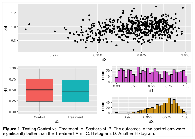
fig_legend <- plot_annotation(
caption = "**Figure 1.** Testing Control vs. Treatment. A. Scatterplot.
B. The outcomes in the control arm were significantly better than
the Treatment Arm. C. Histogram. D. Another Histogram.",
theme = theme(
plot.caption = element_textbox_simple(
size = 11,
box.colour = "black",
linetype = 1,
padding = unit(c(3, 3, 3, 3), "pt"),
margin = unit(c(0, -5.5, 0, -5.5), "pt"), #note negative left and right margins because inherits margins from plots
r = unit(0, "pt")
)
)
)
p1 + {
p2 + {
p3 +
p4 +
plot_layout(ncol=1)
}
} + fig_legend +
plot_layout(ncol=1)
#> `stat_bin()` using `bins = 30`. Pick better value with `binwidth`.
#> `stat_bin()` using `bins = 30`. Pick better value with `binwidth`.
Created on 2020-02-09 by the reprex package (v0.3.0)