Plot every other element on the x and y axis

I have the following data.table:

m <- structure(list(std = c("0.3", "0.4", "0.5", "0.6", "0.7", "0.8", 
"0.9", "1.0", "1.1", "1.2", "1.3", "1.4", "1.5", "1.6", "1.7", 
"1.8", "1.9", "2.0"), r2 = c("0.8035", "0.8289", "0.8379", "0.8414", 
"0.8447", "0.8462", "0.8476", "0.8486", "0.8493", "0.8479", "0.8420", 
"0.8350", "0.8368", "0.8265", "0.8184", "0.8156", "0.8097", "0.7976"
)), row.names = c(NA, -18L), class = c("data.table", "data.frame"
), .internal.selfref = <pointer: 0x00000195b9ea4e40>)

And this code where I create a line graph:

library(dplyr)
library(ggplot2)
library(data.table)

wd <- "path"

m <- fread(paste0(wd, "r2.csv"))
m$r2 <- format(m$r2, digits = 4)
m$std <- format(m$std, digits = 2)

# create the subset (if I want to highlight a specific point in the graph)
g1 <- subset(m, std == "1.1")

# plot the data
ggplot(m, aes(x = std, y = r2)) + 
  geom_line( color = "grey", linewidth = 0.7, group = 1) +
  geom_point(shape = 21, fill = "darkgrey", size = 4, alpha = I(0.5)) +
  geom_point(data = g1, shape = 21, fill = "black", size = 4) +  # this adds a red point
  geom_text(data = g1, label = "1.1", vjust = -0.8, hjust = 0) + # this adds a label for the red point 
  theme(
    plot.title = element_text(color = "black", size = 17, face = "bold", hjust = 0.5),
    plot.subtitle = element_text(size = 10, face = "bold", hjust = 0.5, color = "black"),
    plot.caption = element_text(face = "italic", hjust = 0), 
    panel.background = element_rect(fill = 'transparent'), 
    axis.line.x = element_line(size = 1, linetype = "solid", colour = "lightgrey"),
    axis.line.y = element_line(size = 1, linetype = "solid", colour = "lightgrey"),
  ) +
  xlab("PSF width in units of pixels") + labs(y = expression ("R"^2)) +
  theme(
    axis.title.x = element_text(size = 20),
    axis.title.y = element_text(size = 20),
    axis.text = element_text(size = 17, color = "black")
  )

This code gives me the following plot:

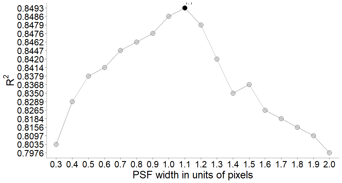
My question is, how can I plot every other number on the x and y axis? For example, I want on the x axis to show only the 0.3, 0.5, 0.7 and so on labels. On the y axis I want the 1st, 3rd, 5th and so on elements.

I have tried to use the scale_x_discrete and other solutions I found online, but depending on the solution I'm getting errors.

R 4.3.2, RStudio 2023.12.1 Build 402, Windows 11.

Your data are all characters and are giving a misleading plot. The spacing on the y axis is not uniform. I made the data numeric to get the following plot. Does that work for you?

library(dplyr)
#> 
#> Attaching package: 'dplyr'
#> The following objects are masked from 'package:stats':
#> 
#>     filter, lag
#> The following objects are masked from 'package:base':
#> 
#>     intersect, setdiff, setequal, union
library(ggplot2)
m <- structure(list(std = c("0.3", "0.4", "0.5", "0.6", "0.7", "0.8", 
                            "0.9", "1.0", "1.1", "1.2", "1.3", "1.4", "1.5", "1.6", "1.7", 
                            "1.8", "1.9", "2.0"), r2 = c("0.8035", "0.8289", "0.8379", "0.8414", 
                                                         "0.8447", "0.8462", "0.8476", "0.8486", "0.8493", "0.8479", "0.8420", 
                                                         "0.8350", "0.8368", "0.8265", "0.8184", "0.8156", "0.8097", "0.7976"
                            )), row.names = c(NA, -18L), class = c("data.table", "data.frame"
                            ))
m <- m |> mutate(across(.cols = everything(), .fns = as.numeric))
# create the subset (if I want to highlight a specific point in the graph)
g1 <- subset(m, std == 1.1)

# plot the data
ggplot(m, aes(x = std, y = r2)) + 
  geom_line( color = "grey", linewidth = 0.7, group = 1) +
  geom_point(shape = 21, fill = "darkgrey", size = 4, alpha = I(0.5)) +
  geom_point(data = g1, shape = 21, fill = "black", size = 4) +  # this adds a red point
  geom_text(data = g1, label = "1.1", vjust = -0.8, hjust = 0) + # this adds a label for the red point 
  scale_x_continuous(breaks = seq(0.3, 2.1, 0.2)) +
  theme(
    plot.title = element_text(color = "black", size = 17, face = "bold", hjust = 0.5),
    plot.subtitle = element_text(size = 10, face = "bold", hjust = 0.5, color = "black"),
    plot.caption = element_text(face = "italic", hjust = 0), 
    panel.background = element_rect(fill = 'transparent'), 
    axis.line.x = element_line(size = 1, linetype = "solid", colour = "lightgrey"),
    axis.line.y = element_line(size = 1, linetype = "solid", colour = "lightgrey"),
  ) +
  xlab("PSF width in units of pixels") + labs(y = expression ("R"^2)) +
  theme(
    axis.title.x = element_text(size = 20),
    axis.title.y = element_text(size = 20),
    axis.text = element_text(size = 17, color = "black")
  )
#> Warning: The `size` argument of `element_line()` is deprecated as of ggplot2 3.4.0.
#> ℹ Please use the `linewidth` argument instead.
#> This warning is displayed once every 8 hours.
#> Call `lifecycle::last_lifecycle_warnings()` to see where this warning was
#> generated.

Created on 2024-02-16 with reprex v2.0.2

1 Like

You seem to have explicitly chosen to be plotting your data as categorics rather than numerics ? so I will just go with that, even though it seems rather odd.

If your question is only about controlling the placement of the tickmarks on the x axis please look at this minimal example

df_ <- data.frame(
  xch = as.character(1:5),
  ych = as.character(c(1:3,2:1))
)

library(tidyverse)

g1 <- ggplot(data=df_) + 
  aes(x=xch,
      y= ych,
      group=1L) + geom_point() + geom_line()

g1

g1 + 
  scale_x_discrete(breaks=as.character(c(1,3,5)))

I didn't notice my data were not numeric as I was copy-pasting them from RStudio to LibreOffice Calc.

str() is your friend!

Since you are using a data.table here is the data.table equivalent oy FJCC's tidyverse command

m <- m |> mutate(across(.cols = everything(), .fns = as.numeric))

data.table version (since we want to convert both variables)

m <- m[, lapply(.SD, as.numeric)]

Thank you, I should have checked the str() of the columns before I run my code you are right. Also, because I just started working with the data.table library, the m <- m[, lapply(.SD, as.numeric)] is very helpful.

If you are thinking of working with {data.table} on a regular basis these may be of some use

data.table

Website

Extension of `data.frame` • data.table


Articles


Tutorial

data.table in R – The Complete Beginners Guide


data.table and tidyverse

A data.table and dplyr tour

https://atrebas.github.io/post/2019-03-03-datatable-dplyr/


data.table and tidyverse

Solve common R problems efficiently with data.table


Great articles, thanks a lot.

This topic was automatically closed 7 days after the last reply. New replies are no longer allowed.

If you have a query related to it or one of the replies, start a new topic and refer back with a link.