Please help me to recreate a figure

Hello people,

as part of my bachelor's thesis, I would like to create a comparable figure (with my own data, of course) to the one shown here: Figure

Unfortunately, the paper does not mention how this figure was created. The supervisor of my bachelor's thesis apparently has an Excel tool for this that I could use, but she also emphasised that the figures would not be as nice with it as the one shown here. Instead of the grades (A+ to B), I would also like to have only "low" and "high" written on the y-axis. In my thesis, I created every other Figure with R, I would love if I could use it for this one too.

Does anyone know anything about this and can tell me which function (or which package) I could use to create a comparable figure? Maybe ggplot2? Honestly I have no idea how to create such a figure completely 'from scratch'. That would help me a lot! English is not my first language, so I would be very grateful if any explanation would not be too complicated to understand. Many thanks in advance!

Christina
A lot is achievable in ggplot.
I'll get you started .


library(tidyverse)
(example_in <- tribble(~cat,~label,~value,~SPP,
"High SOP","Pure SOP",7.75,"Low",
"High SOP","Mixed Perf",6.64,"High",
"Low SOP","Non Perf",6.45,"Low",
"Low SOP","Pure SPP",5.34,"High") |> mutate(
  SPP=factor(SPP,levels=c("Low","High")),
  label_dodge = if_else(SPP=='Low',as.numeric(SPP)-.5,
                        as.numeric(SPP)+.5)
))


(g1 <- ggplot(data=example_in)+
  aes(x=as.numeric(SPP),
      y=value,
      label=paste0(label,"\n",value),
      linetype=cat,
      group=cat)+
     geom_label(aes(x=label_dodge)) +
  geom_line(aes(x=as.numeric(SPP)))+
    geom_point() +
    scale_x_continuous(
      name="SPP",
      breaks = c(1,2),
      labels= c("Low","High"),
      limits = c(0,3)
    ) + 
    scale_y_continuous(
      name="yourchoice",
      breaks=5:8,
      labels=paste("mylab(",5:8,")"),
      limits=c(5,8)
    )
)
  

(g2 <- g1 +
    theme_minimal()+theme(
      legend.position = c(0.8,0.9),
      panel.grid.major = element_line(colour="white"),
      panel.grid.minor = element_line(colour="white"),
      axis.line = element_line(colour="black")
      ))


you might do well to add some arrows programatically via ggarrow extension.
Automation is great if you have many of these to generate; but if you are curating one; consider using ggplot to make the major elements and lay the data out accurately, and you can always go into an image editing tool and add whatever extra labels or content you can type or draw over the top. The y-axis scale break for example. Though there probably is a ggplot extension for that if one was to search.

2 Likes

Thank you so much for the super quick answer! I have just tested your code and think that the figure looks great. I'm no longer sure whether I should include the arrows at all - I really like the way it currently looks! You have really helped me a lot! Thank you very much!

Hello nirgrahamuk,

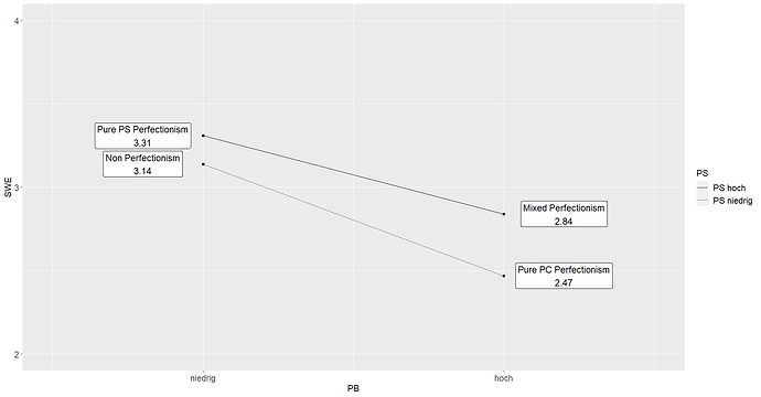
I used the suggested code and came up with a pretty good figure:

Is there an easy way to change the colour of the two lines within the ggplot2-figure? Say, colour the upper one green ("PS hoch") and the lower one ("PS niedrig") red? I tried a few arguments but the lines always remained black (with the normal and the dotted line). It's not super important since it would be completely fine like this but it would be pretty cool to add this.

I'd be very thankful for your help!
Christina

in your aes( add

   color = cat,

alongside linetype=cat

Then next to where we adjust the scales add another

 +  scale_color_manual(values=c("green","red"))
1 Like

Thank you so much!!! Worked perfectly, I bet my supervisor will be very impressed :smile:

This topic was automatically closed 7 days after the last reply. New replies are no longer allowed.

If you have a query related to it or one of the replies, start a new topic and refer back with a link.