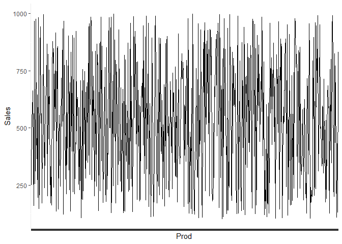
Hello, what would your recommended chart type be for this number of variables? The requirement is to show in terms of quantity ALL products sold in Portugal. I have the below query to pull the results - but do not know the best way to present circa 700 items!
In my experience, not all "requirements" are created equal. I expect poor requirements , even when satisfied to result in unsatisfactory outcomes. I always challenge requirements.
Part of being an expert is reflecting back your expertise to your stakeholders as to why they shouldn't want what they first said they want.
It's actually better to understand the rational and motives behind original requirements, as that allows collaboration towards agreeing fresh requirements that are more likely to satisfy an actual need.
I completely agree and following conversations with the business about exactly how unwieldy this visual will be, we have discussed additional data categories that can be drilled down. However, in order to make the point I have been asked to still create the visual and I am at a loss, except for have a long, long bar chart
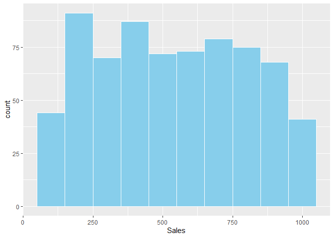
Another idea would be to see if your top most sold products make up the lion share of the sales. For example, you could list your top 25 products individually, and then group everything else into an "other" label.
On a similar line of thought are you aware of any functions that could 'group' items based on common occurrences of a word? For example, 'mug' or 'cake'?
Oh man, I do! @julia 's and @drob 's super-cool tidytext package will let you separate the words in each description into their own record. So you can have a table with a product_id and word variables, that you can then analyze and decide which product IDs you wish to group. 1 The tidy text format | Text Mining with R