**SCATTER PIE **
Hey guys!
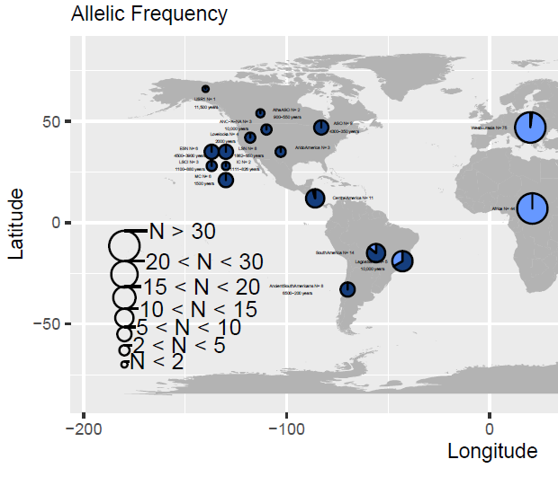
I was able to plot some data into a world map. Specifically some pie charts for different countries in the world, about some rsID (genetics).
The problem I have is about creating a legend for the different pie chart sizes, in order to make it more clear about the sample size regarding the pie chart size [IMAGE 1]. Thas has been succesfully done. BUT the problem I have is that the labels for such 'legends' are to big (pie chart legend font size bigger than other elements in the graphic).
###############################################################################
These are the lines of code regarding such problem:
worldmap<- map_data ("world")
mapplot1<- ggplot(worldmap) +
geom_map(data = worldmap, map = worldmap, aes(x = long, y = lat, map_id = region), fill = "gray70") +

geom_scatterpie(aes(x = x_coord, y = y_coord, r=radius), data = table_pop, cols = c("MAF", "MajAF")) +

coord_fixed() +

 geom_scatterpie_legend((ref$radius), x = -180, y = -50, n=7, labeller= function(a) a = (ref$label))
##########################################################################
So I was wondering if you guys had any idea on what to do or change.
Please consider that 'theme()' only works on the legend below said graph.
So maybe change '(ref$radius)' fontsize??? Or any other thing that I missed.
Thanks in advance.