pie chart using ggplot

I was making apie chart using ggplot. Here is my cord

Anemia %>% mutate(Hb_level = case_when(Hb >= 12 ~ "high", TRUE ~ "low")) %>% group_by(Hb_level) %>% summarize(count=n()) %>%mutate(percentages=percent( round(count/sum(count)*100, 1))) %>% ggplot(aes(x = 1, y=percentages,fill=Hb_level)) + geom_bar(stat="identity") + coord_polar(theta = "y") + theme_void() +geom_label_repel(aes(label = percentages), size=5, show.legend = F, nudge_x = 1) + guides(fill = guide_legend(title = "Hb_level"))

#percent is a user defined function by
percent <- function(x, digits = 2, format = "f", ...) { # Create user-defined function

  • paste0(formatC(x , format = format, digits = digits, ...), "%")
    

but the pie chart has white margins in between

my data

structure(list(Name = c("Jayalath waidyanath", "Nisani Waidyanath",
"jayampahi thennakon", "Nandha thennakon", "Thilak thennakon",
"G.G Fonseka", "G.D.G Fonseka", "Y.R.C Jayakantha", "D.M jayakantha",
"S.N.M Rajabdeeen", "A.S Nishshanka", "A.M.D.S Alagama", "D.Sudagar",
"K.Asitha Silwa", "M.P Noilin", "Ashen Nimsara", "Y.M Umayanga Sadaneth",
"N. Priyadharsani", "A.A.S H. Hansamali", "K.D Rupasinghe", "P. Rupasinghe",
"A.M.S Begam", "W.J.U. Jayawardhana", "M.D.P. Malkanthi", "E.M.A Ekanayaka",
"Gimini Jayawaradhana", "Manel kumari", "Dilani mahesika", "W.Balasoorya",
"C.Priyathunga", "J.karunarathna"), WBC = c(8.1, 5.8, 6.9, 7.9,
12.2, 4.9, 7.4, 5.8, 7.6, 8.1, 8.8, 11.1, 7.1, 7.2, 5.5, 6.3,
9.5, 7.5, 5.5, 5.9, 4.9, 9.7, 6.1, 10.6, 8.6, 10.4, 5.8, 9.9,
10.3, 9.1, 6.8), LYM = c(48, 49.1, 37.9, 48.9, 29.1, 49.7, 52.3,
44, 57.1, 47.9, 38.4, 39.4, 44.4, 58.1, 41.6, 57.7, 37.7, 47.3,
42.1, 55.5, 49.8, 31, 44.6, 44.1, 40.8, 44, 37.2, 39.2, 43.2,
45.6, 46.8), MID = c(11.8, 9.6, 9.4, 12.9, 10.8, 9.4, 8.3, 16.6,
10.7, 12.4, 14, 9.8, 10.3, 6.5, 14.4, 9.2, 10.9, 5.8, 8.6, 5.1,
5.6, 8.6, 7.2, 9.7, 10.1, 7.7, 4.5, 6.8, 6.6, 5.9, 5.5), GRA = c(40.2,
41.3, 52.7, 38.2, 60.1, 40.9, 39.4, 2.3, 32.2, 39.7, 47.6, 50.8,
45.3, 35.4, 44, 33.1, 51.4, 46.9, 49.3, 39.4, 44.6, 60.4, 48.2,
46.2, 49.1, 48.3, 58.3, 54, 50.2, 48.5, 47.7), Hb = c(13.1, 11.7,
13.9, 7.9, 12.5, 13.9, 12.6, 11.7, 11.6, 17.5, 11.3, 12.2, 14.5,
13.2, 10.6, 12.2, 13.5, 10.9, 10.1, 11.4, 11.3, 10.8, 12.7, 11.9,
11.8, 11.1, 11.4, 12, 12.7, 13.3, 10.6), Gamma GT = c(60, 58,
37, 25, 169, 76, 29, 17, 15, 30, 41, 18, 196, 15, 49, 28, 68,
52, 20, 25, 17, 21, 23, 37, 34, 68, 24, 73, 24, 108, 61)), row.names = c(NA,
-31L), class = "data.frame")
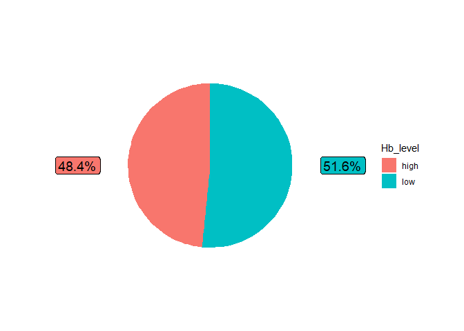
The percent() function returns text so the y values of your plot are not numeric. This code fixes the pie chart, though the labels are not well placed.

anemia %>% mutate(Hb_level = case_when(Hb >= 12 ~ "high", TRUE ~ "low")) %>% 
  group_by(Hb_level) %>% summarize(count=n()) %>%
  mutate(percentages= round(count/sum(count)*100, 1)) %>%
  ggplot(aes(x = 1, y=percentages,fill=Hb_level)) + 
  geom_bar(stat="identity") + 
  coord_polar(theta = "y") + theme_void() +
  geom_label(aes(label = percent(percentages)), size=5, show.legend = F, nudge_x = 1) + guides(fill = guide_legend(title = "Hb_level"))

It does not produce well demarkated labels. Why does it has white margins in my code

Here is one way to place the labels. I never use pie charts, so there may well be better solutions.

library(ggplot2)
library(dplyr)
#> 
#> Attaching package: 'dplyr'
#> The following objects are masked from 'package:stats':
#> 
#>     filter, lag
#> The following objects are masked from 'package:base':
#> 
#>     intersect, setdiff, setequal, union
library(scales)
anemia <- structure(list(Name = c("Jayalath waidyanath", "Nisani Waidyanath",
                        "jayampahi thennakon", "Nandha thennakon", "Thilak thennakon",
                        "G.G Fonseka", "G.D.G Fonseka", "Y.R.C Jayakantha", "D.M jayakantha",
                        "S.N.M Rajabdeeen", "A.S Nishshanka", "A.M.D.S Alagama", "D.Sudagar",
                        "K.Asitha Silwa", "M.P Noilin", "Ashen Nimsara", "Y.M Umayanga Sadaneth",
                        "N. Priyadharsani", "A.A.S H. Hansamali", "K.D Rupasinghe", "P. Rupasinghe",
                        "A.M.S Begam", "W.J.U. Jayawardhana", "M.D.P. Malkanthi", "E.M.A Ekanayaka",
                        "Gimini Jayawaradhana", "Manel kumari", "Dilani mahesika", "W.Balasoorya",
                        "C.Priyathunga", "J.karunarathna"), 
               WBC = c(8.1, 5.8, 6.9, 7.9,
                       12.2, 4.9, 7.4, 5.8, 7.6, 8.1, 8.8, 11.1, 7.1, 7.2, 5.5, 6.3,
                       9.5, 7.5, 5.5, 5.9, 4.9, 9.7, 6.1, 10.6, 8.6, 10.4, 5.8, 9.9,
                       10.3, 9.1, 6.8), 
               LYM = c(48, 49.1, 37.9, 48.9, 29.1, 49.7, 52.3,
                       44, 57.1, 47.9, 38.4, 39.4, 44.4, 58.1, 41.6, 57.7, 37.7, 47.3,
                       42.1, 55.5, 49.8, 31, 44.6, 44.1, 40.8, 44, 37.2, 39.2, 43.2,
                       45.6, 46.8), 
               MID = c(11.8, 9.6, 9.4, 12.9, 10.8, 9.4, 8.3, 16.6,
                       10.7, 12.4, 14, 9.8, 10.3, 6.5, 14.4, 9.2, 10.9, 5.8, 8.6, 5.1,
                       5.6, 8.6, 7.2, 9.7, 10.1, 7.7, 4.5, 6.8, 6.6, 5.9, 5.5), 
               GRA = c(40.2,
                       41.3, 52.7, 38.2, 60.1, 40.9, 39.4, 2.3, 32.2, 39.7, 47.6, 50.8,
                       45.3, 35.4, 44, 33.1, 51.4, 46.9, 49.3, 39.4, 44.6, 60.4, 48.2,
                       46.2, 49.1, 48.3, 58.3, 54, 50.2, 48.5, 47.7), 
               Hb = c(13.1, 11.7,
                      13.9, 7.9, 12.5, 13.9, 12.6, 11.7, 11.6, 17.5, 11.3, 12.2, 14.5,
                      13.2, 10.6, 12.2, 13.5, 10.9, 10.1, 11.4, 11.3, 10.8, 12.7, 11.9,
                      11.8, 11.1, 11.4, 12, 12.7, 13.3, 10.6)),class = "data.frame",row.names = c(NA,-31L))

DF <- anemia %>% mutate(Hb_level = case_when(Hb >= 12 ~ "high", TRUE ~ "low")) %>% 
  group_by(Hb_level) %>% summarize(count=n()) %>%
  mutate(percentages= round(count/sum(count)*100, 1))
DF |> mutate(x=c(1,1),y=c(75,25)) |> 
  ggplot(aes(x = 1, y=percentages,fill=Hb_level)) + 
  geom_bar(stat="identity") + 
  coord_polar(theta = "y") + theme_void() +
  geom_label(aes(x=x, y=y,label = percent(percentages/100)), size=5, show.legend = F, nudge_x = 1) 

Created on 2021-11-17 by the reprex package (v2.0.1)

This topic was automatically closed 21 days after the last reply. New replies are no longer allowed.

If you have a query related to it or one of the replies, start a new topic and refer back with a link.