library(ggplot2)
library(gridExtra)
library(officer)
Read in data from CSV file
data1 <- read.csv("data11.csv")
Create a new Word document
doc <- read_docx()
Get unique primary breeds
data2 <- unique(data1$Primary.Breed)
Define color palette for the pie chart
colors <- c("#E69F00", "#56B4E9", "#009E73", "#F0E442", "#0072B2", "#D55E00", "#CC79A7", "#999999")
Define vector of dates
dates <- as.Date(c("01/01/2010", "01/01/2011", "01/01/2012", "01/01/2013", "01/01/2014", "01/01/2015", "01/01/2016", "01/01/2017", "01/01/2018", "01/01/2019", "01/01/2020", "01/01/2021", "01/01/2022", "01/01/2023"), format = "%m/%d/%Y")
Define age categories and corresponding labels
age_categories <- c("Less than three Months", "Between 3 months and 6 months", "Between 6 months and 12 months", "Greater than 12 months")
AgeCategorySex <- c("Less than three Months M", "Less than three Months F", "Between 3 months and 6 months M", "Between 3 months and 6 months F", "Between 6 months and 12 months M", "Between 6 months and 12 months F", "Greater than 12 months M", "Greater than 12 months F")
Convert DateOfBirth column to Date format
data1$DateOfBirth <- as.Date(data1$DateOfBirth, format = "%m/%d/%Y")
Loop through each breed
for (breed in data2) {
breed_data <- subset(data1, Primary.Breed == breed)
# Initialize vector to store counts for each age category sex
age_counts <- rep(0, length(AgeCategorySex))
# Add AgeCategory column and initialize it
breed_data$AgeCategory <- NA
# Calculate difference in days between each birth date and each date in the vector
for (i in 1:length(dates)) {
date2 <- dates[i]
# Reset age counts for each date
age_counts <- rep(0, length(AgeCategorySex))
# Calculate age category for each record
for (j in 1:nrow(breed_data)) {
diff <- as.numeric(difftime(date2, breed_data$DateOfBirth[j], units = "days"))
if (!is.na(diff) && diff>0)
if (!is.na(diff) && diff < 90 && breed_data$Sex[j] == "M") {
breed_data$AgeCategory[j] <- "Less than three Months M"
age_counts[1] <- age_counts[1] + 1
} else if (!is.na(diff) && diff < 90 && breed_data$Sex[j] == "F") {
breed_data$AgeCategory[j] <- "Less than three Months F"
age_counts[2] <- age_counts[2] + 1
} else if (!is.na(diff) && diff >= 90 && diff < 180 && breed_data$Sex[j] == "M") {
breed_data$AgeCategory[j] <- "Between 3 months and 6 months M"
age_counts[3] <- age_counts[3] + 1
} else if (!is.na(diff) && diff >= 90 && diff < 180 && breed_data$Sex[j] == "F") {
breed_data$AgeCategory[j] <- "Between 3 months and 6 months F"
age_counts[4] <- age_counts[4] + 1
} else if (!is.na(diff) && diff >= 180 && diff < 365 && breed_data$Sex[j] == "M") {
breed_data$AgeCategory[j] <- "Between 6 months and 12 months M"
age_counts[5] <- age_counts[5] + 1
} else if (!is.na(diff) && diff >= 180 && diff < 365 && breed_data$Sex[j] == "F") {
breed_data$AgeCategory[j] <- "Between 6 months and 12 months F"
age_counts[6] <- age_counts[6] + 1
} else if (!is.na(diff) && diff >= 365 && breed_data$Sex[j] == "M") {
breed_data$AgeCategory[j] <- "Greater than 12 months M"
age_counts[7] <- age_counts[7] + 1
} else if (!is.na(diff) && diff >= 365 && breed_data$Sex[j] == "F") {
breed_data$AgeCategory[j] <- "Greater than 12 months F"
age_counts[8] <- age_counts[8] + 1
}
}
# Calculate total count
total_count <- sum(age_counts)
# Calculate percentages
percentages <- paste0(round((age_counts / total_count) * 100, 2), "%")
# Create the pie chart using ggplot2
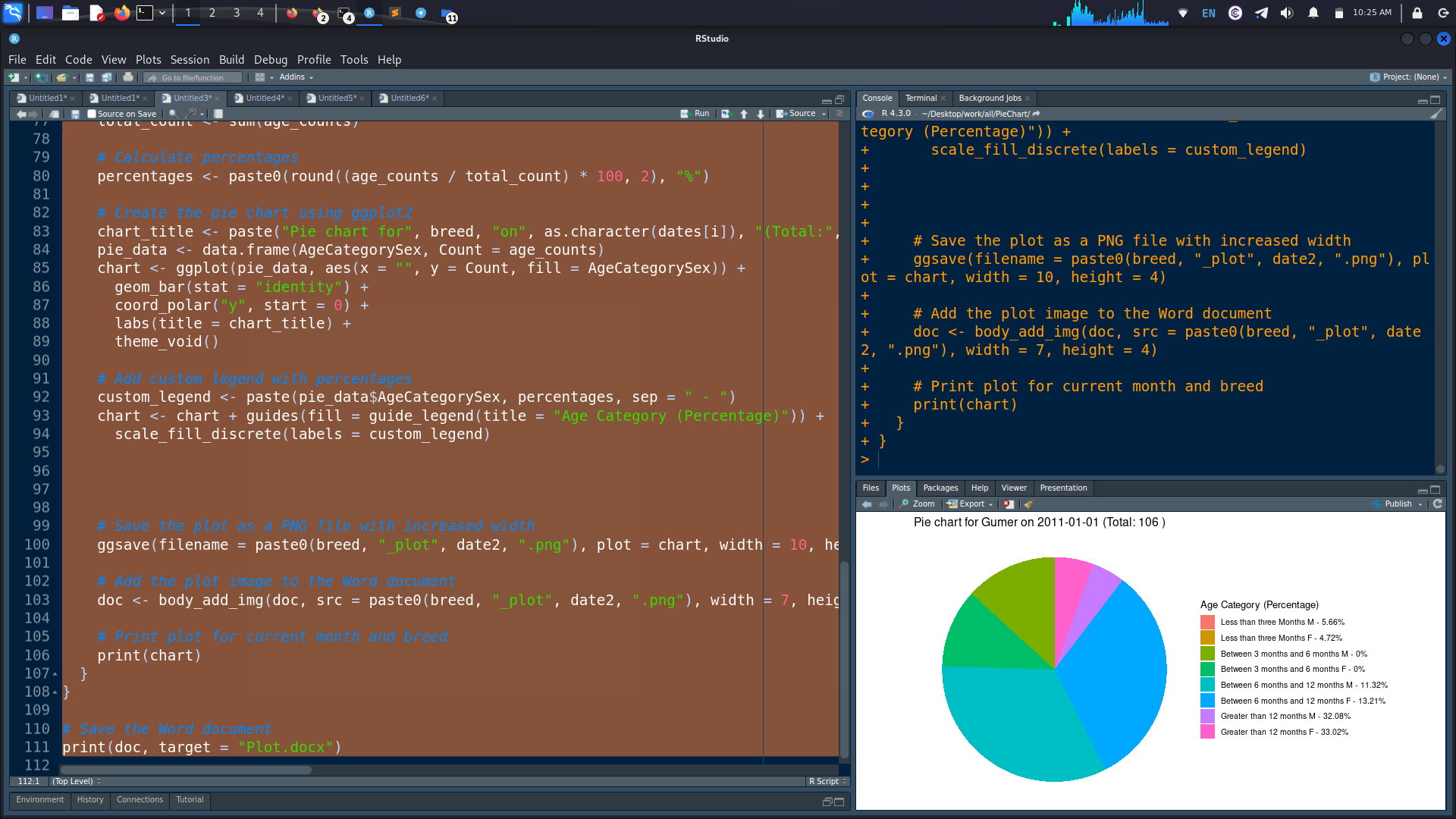
chart_title <- paste("Pie chart for", breed, "on", as.character(dates[i]), "(Total:", total_count, ")")
pie_data <- data.frame(AgeCategorySex, Count = age_counts)
chart <- ggplot(pie_data, aes(x = "", y = Count, fill = AgeCategorySex)) +
geom_bar(stat = "identity") +
coord_polar("y", start = 0) +
labs(title = chart_title) +
theme_void()
# Add custom legend with percentages
custom_legend <- paste(pie_data$AgeCategorySex, percentages, sep = " - ")
chart <- chart + guides(fill = guide_legend(title = "Age Category (Percentage)")) +
scale_fill_discrete(labels = custom_legend)
# Save the plot as a PNG file with increased width
ggsave(filename = paste0(breed, "_plot", date2, ".png"), plot = chart, width = 10, height = 4)
# Add the plot image to the Word document
doc <- body_add_img(doc, src = paste0(breed, "_plot", date2, ".png"), width = 7, height = 4)
# Print plot for current month and breed
print(chart)
}
}
Save the Word document
print(doc, target = "Plot.docx")
Picture attached below. Pie chart slices and legend percentages not matching.