pie chart in ggplot

I was trying to draw a pie chart by recoding Hb levels as low and high using case when

A<- Anemia %>% mutate(Hb_level <- case_when(Hb >= 12 ~ "high",Hb <12 ~ "low"))
A %>% ggplot(aes(Hb_level <- case_when(Hb >= 12 ~ "high", Hb < 12 ~ "low"))) +geom_bar() + coord_polar()

This produces not a pie chart , but an ugly one. Please help
My data
structure(list(Name = c("Jayalath waidyanath", "Nisani Waidyanath",
"jayampahi thennakon", "Nandha thennakon", "Thilak thennakon",
"G.G Fonseka", "G.D.G Fonseka", "Y.R.C Jayakantha", "D.M jayakantha",
"S.N.M Rajabdeeen", "A.S Nishshanka", "A.M.D.S Alagama", "D.Sudagar",
"K.Asitha Silwa", "M.P Noilin", "Ashen Nimsara", "Y.M Umayanga Sadaneth",
"N. Priyadharsani", "A.A.S H. Hansamali", "K.D Rupasinghe", "P. Rupasinghe",
"A.M.S Begam", "W.J.U. Jayawardhana", "M.D.P. Malkanthi", "E.M.A Ekanayaka",
"Gimini Jayawaradhana", "Manel kumari", "Dilani mahesika", "W.Balasoorya",
"C.Priyathunga", "J.karunarathna"), WBC = c(8.1, 5.8, 6.9, 7.9,
12.2, 4.9, 7.4, 5.8, 7.6, 8.1, 8.8, 11.1, 7.1, 7.2, 5.5, 6.3,
9.5, 7.5, 5.5, 5.9, 4.9, 9.7, 6.1, 10.6, 8.6, 10.4, 5.8, 9.9,
10.3, 9.1, 6.8), LYM = c(48, 49.1, 37.9, 48.9, 29.1, 49.7, 52.3,
44, 57.1, 47.9, 38.4, 39.4, 44.4, 58.1, 41.6, 57.7, 37.7, 47.3,
42.1, 55.5, 49.8, 31, 44.6, 44.1, 40.8, 44, 37.2, 39.2, 43.2,
45.6, 46.8), MID = c(11.8, 9.6, 9.4, 12.9, 10.8, 9.4, 8.3, 16.6,
10.7, 12.4, 14, 9.8, 10.3, 6.5, 14.4, 9.2, 10.9, 5.8, 8.6, 5.1,
5.6, 8.6, 7.2, 9.7, 10.1, 7.7, 4.5, 6.8, 6.6, 5.9, 5.5), GRA = c(40.2,
41.3, 52.7, 38.2, 60.1, 40.9, 39.4, 2.3, 32.2, 39.7, 47.6, 50.8,
45.3, 35.4, 44, 33.1, 51.4, 46.9, 49.3, 39.4, 44.6, 60.4, 48.2,
46.2, 49.1, 48.3, 58.3, 54, 50.2, 48.5, 47.7), Hb = c(13.1, 11.7,
13.9, 7.9, 12.5, 13.9, 12.6, 11.7, 11.6, 17.5, 11.3, 12.2, 14.5,
13.2, 10.6, 12.2, 13.5, 10.9, 10.1, 11.4, 11.3, 10.8, 12.7, 11.9,
11.8, 11.1, 11.4, 12, 12.7, 13.3, 10.6), Gamma GT = c(60, 58,
37, 25, 169, 76, 29, 17, 15, 30, 41, 18, 196, 15, 49, 28, 68,
52, 20, 25, 17, 21, 23, 37, 34, 68, 24, 73, 24, 108, 61), Hb_level <- case_when(Hb >= 12 ~ "high", Hb < 12 ~ "low") = c("high",
"low", "high", "low", "high", "high", "high", "low", "low", "high",
"low", "high", "high", "high", "low", "high", "high", "low",
"low", "low", "low", "low", "high", "low", "low", "low", "low",
"high", "high", "high", "low")), row.names = c(NA, -31L), class = "data.frame")
Demodata: Please note Gamma GT throws an error, should be "Gamma GT" or Gamma_GT:

Anemia  = structure(list(
  Name = c("Jayalath waidyanath", "Nisani Waidyanath",
                        "jayampahi thennakon", "Nandha thennakon", "Thilak thennakon",
                        "G.G Fonseka", "G.D.G Fonseka", "Y.R.C Jayakantha", "D.M jayakantha",
                        "S.N.M Rajabdeeen", "A.S Nishshanka", "A.M.D.S Alagama", "D.Sudagar",
                        "K.Asitha Silwa", "M.P Noilin", "Ashen Nimsara", "Y.M Umayanga Sadaneth",
                        "N. Priyadharsani", "A.A.S H. Hansamali", "K.D Rupasinghe", "P. Rupasinghe",
                        "A.M.S Begam", "W.J.U. Jayawardhana", "M.D.P. Malkanthi", "E.M.A Ekanayaka",
                        "Gimini Jayawaradhana", "Manel kumari", "Dilani mahesika", "W.Balasoorya",
                        "C.Priyathunga", "J.karunarathna"), 
  WBC = c(8.1, 5.8, 6.9, 7.9,
          12.2, 4.9, 7.4, 5.8, 7.6, 8.1, 8.8, 11.1, 7.1, 7.2, 5.5, 6.3,
          9.5, 7.5, 5.5, 5.9, 4.9, 9.7, 6.1, 10.6, 8.6, 10.4, 5.8, 9.9,
          10.3, 9.1, 6.8), 
  LYM = c(48, 49.1, 37.9, 48.9, 29.1, 49.7, 52.3,
          44, 57.1, 47.9, 38.4, 39.4, 44.4, 58.1, 41.6, 57.7, 37.7, 47.3,
          42.1, 55.5, 49.8, 31, 44.6, 44.1, 40.8, 44, 37.2, 39.2, 43.2,
          45.6, 46.8), 
  MID = c(11.8, 9.6, 9.4, 12.9, 10.8, 9.4, 8.3, 16.6,
          10.7, 12.4, 14, 9.8, 10.3, 6.5, 14.4, 9.2, 10.9, 5.8, 8.6, 5.1,
          5.6, 8.6, 7.2, 9.7, 10.1, 7.7, 4.5, 6.8, 6.6, 5.9, 5.5), 
  GRA = c(40.2,
          41.3, 52.7, 38.2, 60.1, 40.9, 39.4, 2.3, 32.2, 39.7, 47.6, 50.8,
          45.3, 35.4, 44, 33.1, 51.4, 46.9, 49.3, 39.4, 44.6, 60.4, 48.2,
          46.2, 49.1, 48.3, 58.3, 54, 50.2, 48.5, 47.7), 
  Hb = c(13.1, 11.7,
         13.9, 7.9, 12.5, 13.9, 12.6, 11.7, 11.6, 17.5, 11.3, 12.2, 14.5,
         13.2, 10.6, 12.2, 13.5, 10.9, 10.1, 11.4, 11.3, 10.8, 12.7, 11.9,
         11.8, 11.1, 11.4, 12, 12.7, 13.3, 10.6), 
  Gamma_GT = c(60, 58, 37, 25, 169, 76, 29, 17, 15, 30, 41, 18, 196, 15, 49, 28, 68,
               52, 20, 25, 17, 21, 23, 37, 34, 68, 24, 73, 24, 108, 61)),
  row.names = c(NA, -31L), 
  class = c("tbl_df", "tbl", "data.frame")) 

Calculate HB levels:

Anemia2 = Anemia %>% 
  mutate(Hb_level = case_when(Hb >= 12 ~ "high", 
                              TRUE ~ "low"))

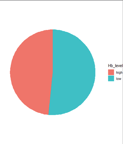
Make the plot. For the x-coordinate we can define 1 as arbitrary value, then Hb_level on the y-axis. With the "fill" we automatically stack the data on top of each other, please also check the plot without the coord_polar() line.

ggplot(Anemia2, aes(x = 1, fill = Hb_level)) +
  geom_bar() +
  coord_polar(theta = "y") + 
  theme_void()

This topic was automatically closed 7 days after the last reply. New replies are no longer allowed.

If you have a query related to it or one of the replies, start a new topic and refer back with a link.