Hi everyone,
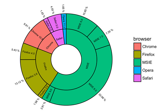
I'm trying to make a donut graph similar to this image:

However, what I would like to do is make the outer circle a different treatment group than the inner one comparing the change in microbial groups between treatments. Specifically, here is my code that I've made another graph for to get the one circle;however, I would like to have a second one on the inside. I have looked at other forms but the code is a bit advanced for me. Does anyone know how to add the second one and could help me with the code. This is as far as I have gotten listed below:
data1 <- data.frame(
category=c("Bacteria1", "Bacteria2", "Bacteria3", "Bacteria4"),
count=c(63.57, 0.53, 0.13,187.93) #pulled from the spreadsheet
)
Compute percentages
data1$fraction = data1$count / sum(data1$count)
Compute the cumulative percentages (top of each rectangle)
data1$ymax = cumsum(data1$fraction)
Compute the bottom of each rectangle
data1$ymin = c(0, head(data1$ymax, n=-1))
#comput label position
data1$labelPosition <- (data1$ymax + data1$ymin) / 2
Compute a good label
data1$label <- paste0(data1$category, "\n value: ", data1$count)
Make the plot for the low nutrient and shade consumption rates
ggplot(data1, aes(ymax=ymax, ymin=ymin, xmax=4, xmin=3, fill=category)) +
geom_rect() +
theme_classic()+
scale_fill_manual(values = my_colors) +
ggtitle("Environmental Changes alter Bacteria") +
theme_void()+
coord_polar(theta="y") + # Try to remove that to understand how the chart is built initially
#xlim(c(2, 4)) # Try to remove that to see how to make a pie chart
xlim(c(-1, 4))