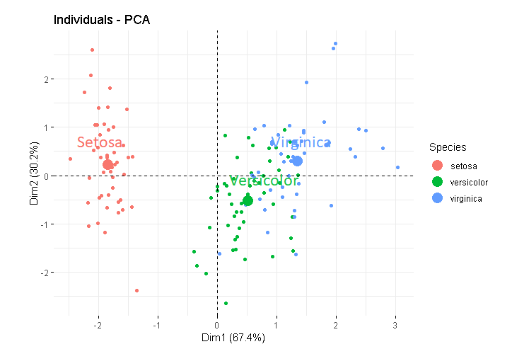
PCA plot mean point

Hello !

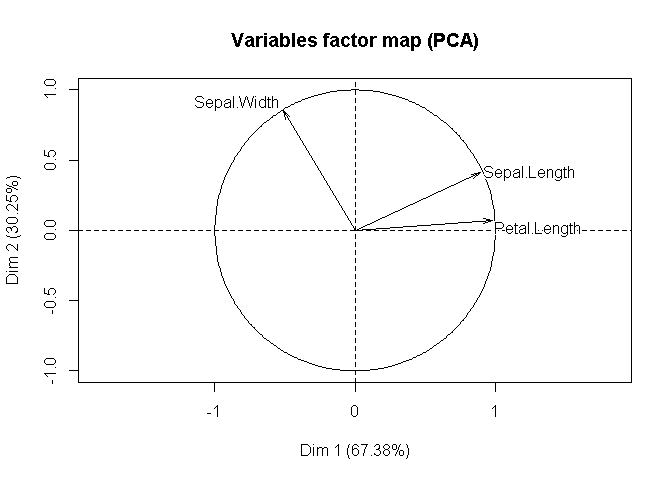
I use the package factoextra to make the plot of my PCA. On my individuals plot, I want to put a label on the mean point. I color my individuals by groups. I know how to represent the mean point of each group on the plot but I don't know how to put the label of wich group each mean point correspond to. Wich functions do I have to use to put a label on each mean point ?

Thanks in advance,
Bérangère

Hi,

Based on what you've described, you might take a look for the addlabel argument, if you're using factoextra::fviz_add(). Is that the function you're using?

It's easier to help you with your specific problem if you include a self-contained reprex (short for reproducible example). It will help us help you if we can be sure we're all working with/looking at the same stuff.

install.packages("reprex")

If you've never heard of a reprex before, you might want to start by reading the tidyverse.org help page. The reprex dos and don'ts are also useful.

There's also a nice FAQ on how to do a minimal reprex for beginners, below:

What to do if you run into clipboard problems

If you run into problems with access to your clipboard, you can specify an outfile for the reprex, and then copy and paste the contents into the forum.

reprex::reprex(input = "fruits_stringdist.R", outfile = "fruits_stringdist.md")

For pointers specific to the community site, check out the reprex FAQ.

1 Like

Thanks for your answer.
I tried the argument addlabel but the value wich can be used are just "all", "none" or the combination of c("ind", "ind.sup", "quali", "var", "quanti.sup","group.sup").

As you advice I try to make a reprex. Hope it will be more clear. On the plot of the indiviuals I want to label the mean point of each colored groups by the name of the species corresponding.

library(FactoMineR)
library(factoextra)
iris
res.ACP<-PCA(iris[,c(1:3)],scale.unit = TRUE,ncp= 5)
fviz_pca_ind(res.ACP,geom.ind=c("point"),point.size=3,pointshape=16 
             ,col.ind=iris$Species,col="Set1",legend.title="Species",addlabel=TRUE,
             axes=c(1,2))

The code you posted is indeed reproducible. But if you had pasted it within a pair of ``` (triple backticks), it would have been more readable. I did this for you now by editing your post. Hopefully, you won't mind.

Now regarding plotting mean points, note the following from the documentation of fviz_pca_ind:

Note that, fviz_pca_xxx() functions are wrapper arround the core function fviz(), whih is also a wrapper arround the function ggscatter() [in ggpubr]. Therfore, further arguments, to be passed to the function fviz() and ggscatter(), can be specified in fviz_pca_ind() and fviz_pca_var().

If you read the documentation of factoextra::fviz, you will find that there's an argument mean.point, which is TRUE by default. See below:

mean.point
logical value. If TRUE (default), group mean points are added to the plot.

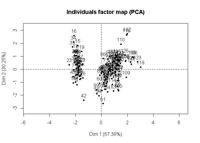
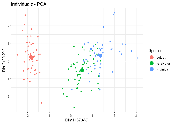
So, the plot contains the mean point by default. In the plot, you'll find that for each group, one point is a little larger than the rest and it is the mean for that group. If you explicitly set mean.point = FALSE, it'll be gone.

But it's hard (at least for me) to distinguish if there are a lot of points. In that case, you may use the mean.point.size argument of the ggpubr::ggscatter package:

mean.point.size
numeric value specifying the size of mean points.

I've added an example below, where in the 1st plot, I've explicitly set the size of the mean points as 5 (so they are easy to locate), and in the 2nd plot, I skipped the mean points. Note that, the mean points, if plotted, are already coloured according to the group.

library(FactoMineR)
library(factoextra)
#> Loading required package: ggplot2
#> Welcome! Related Books: `Practical Guide To Cluster Analysis in R` at https://goo.gl/13EFCZ

res.ACP <- PCA(X = iris[, 1:3],
               scale.unit = TRUE,
               ncp = 5)

fviz_pca_ind(X = res.ACP,
             geom.ind = c("point"),
             point.size = 3,
             pointshape = 16,
             col.ind = iris$Species,
             col = "Set1",
             legend.title = "Species",
             mean.point.size = 5)

fviz_pca_ind(X = res.ACP,
             geom.ind = c("point"),
             point.size = 3,
             pointshape = 16,
             col.ind = iris$Species,
             col = "Set1",
             legend.title = "Species",
             mean.point = FALSE)
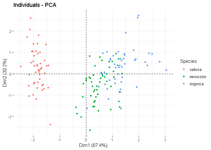
Created on 2019-03-21 by the reprex package (v0.2.1)

Hope this helps.

1 Like

Thanks for your help. Yes it's more clear with bigger mean points.
To more distinguish the mean point , do you think it's possible to put directly near each mean point the name of the species ?
I made it with PowerPoint because I don't know how to do it with R.

I can't say it's impossible, but I don't know how to do it.

To be honest, I don't understand the point of this further labelling, as there's a legend already. If there were more data points, I guess any text will not be much visible.

Also, perhaps more importantly, you may note that where you have written Virginica, some observations for Versicolor are in that location. So, it may not be preferable.

But I'm sure that that if there's a way, someone else will provide that solution. Or, you may find it yourself. Good luck!

The last few plots (based on the iris dataset) appear to be built on ggplot2. Therefore it might be possible to use ggforce here with one of the geom_mark_*() functions under 'Annotation' here:
https://ggforce.data-imaginist.com/reference/index.html

Thanks for your help. I will try with this argument.

Yes,I'm agree with you there is already a legend but it was asking by my teacher for my report.
Thanks for your help, I've discovered new arguments and that functions are wrapper arround other functions.

This topic was automatically closed 21 days after the last reply. New replies are no longer allowed.

If you have a query related to it or one of the replies, start a new topic and refer back with a link.