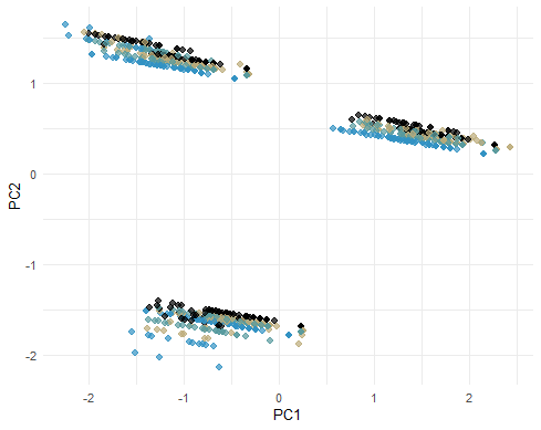
I was visualizing a scatterplot between the PC1 and PC2 of a PCA I've done with tidymodels' step_pca. The results are separated into three cluster like these. What does it mean?
Also, these plot was drawn with geom_point, but I want to know if is there any way I can visualize arrows in the biplot with tidymodels like in FactoMiner?
Also, what's the difference between juice() and bake()? I've seen bake() used to generate altered data set in https://www.tmwr.org and also saw juice() used in PCA and UMAP with tidymodels and #TidyTuesday cocktail recipes | Julia Silge to generate altered data set.