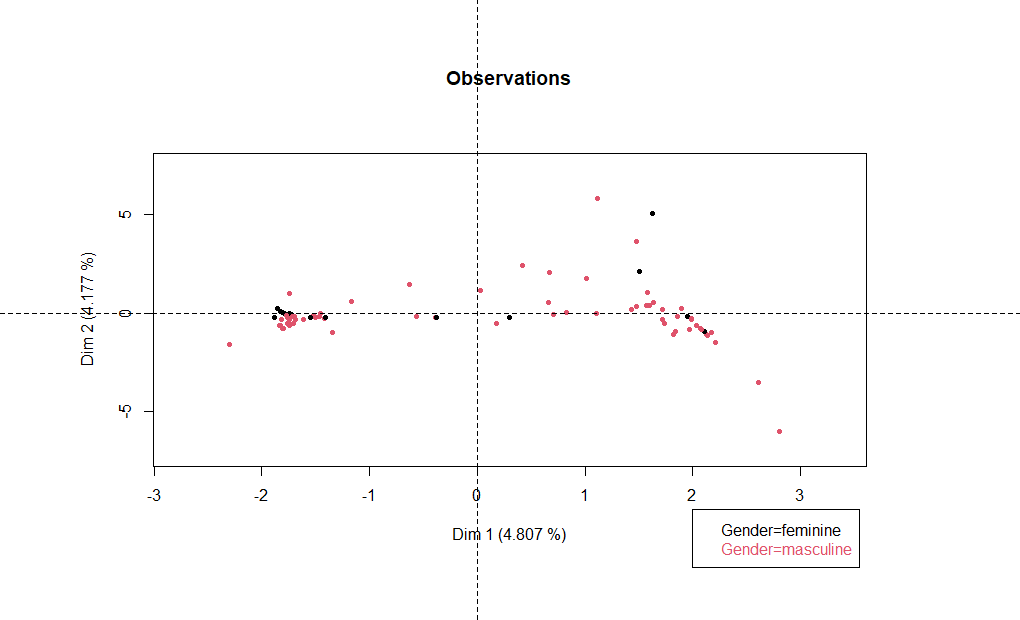
I'm trying to draw a graph for a PCA analysis. This is my example R code:
library(dplyr)
data <- starwars
db_quali <- as.data.frame(starwars[,4:6])
db_quanti <- as.data.frame(starwars[,2:3])

pca_table <- PCAmix(X.quanti = db_quanti,
                      X.quali = db_quali,
                      rename.level=TRUE,
                      graph = TRUE)
plot(pca_table ,choice="ind",label=FALSE,
     posleg="bottomright", main="Observations")
In my output graph data are visualized in black and I want to colour them according to data$gender . It is possible? how can I do?
I assume that you accidently omitted library(PCAmixdata)
if so, PCAMix provides coloring.ind parameter
Gender <- factor(data$gender)

plot(pca_table ,choice="ind",label=FALSE,
     posleg="bottomright", main="Observations", coloring.ind = Gender)
Sorry, I forgot PCAmixdata library.
Fantastic the colors are ok, but is there a way to move the legend outside the graph?
use par to adjust the margin size and disable clipping (xpd)
then you can replace "bottomright" posleg with a coordinate choice
par(xpd=TRUE,mar=rep(8,4))
plot(pca_table ,choice="ind",label=FALSE,
     posleg=xy.coords(2,-10), main="Observations", coloring.ind = Gender)
1 Like
system
Closed
5
This topic was automatically closed 7 days after the last reply. New replies are no longer allowed.
If you have a query related to it or one of the replies, start a new topic and refer back with a link.
