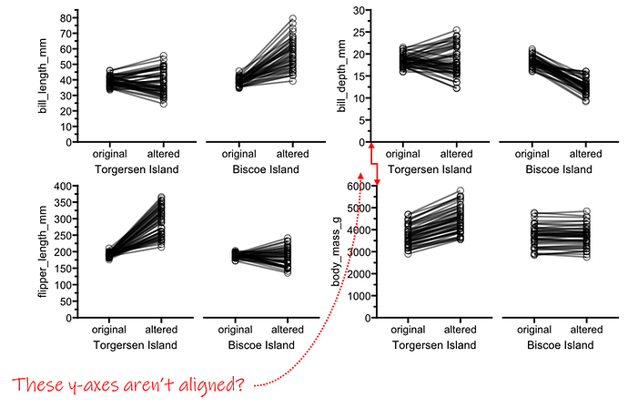
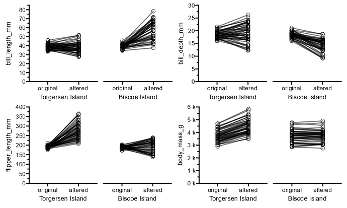
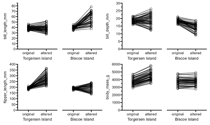
I'm running into some issues trying to put together several panels of patchworks. I can't seem to figure out how to align axes of nested patches with other, or with other ggplots. I think I might just not quite understand nesting patchworks or how free() works, or maybe this is an underlying issue?
Here's a reprex with some of my attempts and fix it.
# make arbitrary paired data

```{r}
penguin_data <- palmerpenguins::penguins %>%
  filter(!is.na(bill_length_mm)) %>%
  mutate(status = "original") %>%
  rowid_to_column("ID")

penguin_alt <- penguin_data %>%
  mutate(bill_length_mm    = jitter(bill_length_mm, amount = 10),
         bill_depth_mm     = jitter(bill_depth_mm, amount = 5),
         flipper_length_mm = jitter(flipper_length_mm, amount = 50),
         body_mass_g       = jitter(body_mass_g, amount = 200),
         status = "altered") %>%
  full_join(penguin_data) %>%
  mutate(status = fct_relevel(as_factor(status), "original", "altered")) %>%
  group_by(ID)
penguin_alt
```

# plot individual data plots
```{r, fig.width=2.35, fig.height=5}
plot_A1 <- penguin_alt %>%
  filter(species == "Adelie" & island == "Torgersen") %>%
  ggplot() +
  geom_line( aes(x = status, y = bill_length_mm, group = ID), linewidth = 1, alpha = 0.5) +
  geom_point(aes(x = status, y = bill_length_mm, group = ID), size = 3.5, alpha = 0.9, show.legend = FALSE, shape = 21) +
  labs(x = "Torgersen Island") +
  scale_y_continuous(breaks = seq(0,100,10), guide = "prism_minor", expand = c(0,0)) +
  coord_cartesian(ylim = c(0,85)) +
  theme_prism(base_size = 14, base_fontface = "plain")
# plot_A1

plot_A2 <- penguin_alt %>%
  filter(species == "Adelie" & island == "Biscoe") %>%
  mutate(bill_length_mm = case_when(status == "original" ~ bill_length_mm, status == "altered" ~ bill_length_mm*1.5)) %>% #add variance
  ggplot() +
  geom_line( aes(x = status, y = bill_length_mm, group = ID), linewidth = 1, alpha = 0.5) +
  geom_point(aes(x = status, y = bill_length_mm, group = ID), size = 3.5, alpha = 0.9, show.legend = FALSE, shape = 21) +
  labs(x = "Biscoe Island") +
  scale_y_continuous(breaks = seq(0,100,10), guide = "prism_minor", expand = c(0,0)) +
  coord_cartesian(ylim = c(0,85)) +
  theme_prism(base_size = 14, base_fontface = "plain")
# plot_A2
```

```{r, fig.width=2.35, fig.height=5}
plot_B1 <- penguin_alt %>%
  filter(species == "Adelie" & island == "Torgersen") %>%
  ggplot() +
  geom_line( aes(x = status, y = bill_depth_mm, group = ID), linewidth = 1, alpha = 0.5) +
  geom_point(aes(x = status, y = bill_depth_mm, group = ID), size = 3.5, alpha = 0.9, show.legend = FALSE, shape = 21) +
  labs(x = "Torgersen Island") +
  scale_y_continuous(breaks = seq(0,30,5), guide = "prism_minor", expand = c(0,0)) +
  coord_cartesian(ylim = c(0,30)) +
  theme_prism(base_size = 14, base_fontface = "plain")
# plot_B1

plot_B2 <- penguin_alt %>%
  filter(species == "Adelie" & island == "Biscoe") %>%
  mutate(bill_depth_mm = case_when(status == "original" ~ bill_depth_mm, status == "altered" ~ bill_depth_mm*0.75)) %>% #add variance
  ggplot() +
  geom_line( aes(x = status, y = bill_depth_mm, group = ID), linewidth = 1, alpha = 0.5) +
  geom_point(aes(x = status, y = bill_depth_mm, group = ID), size = 3.5, alpha = 0.9, show.legend = FALSE, shape = 21) +
  labs(x = "Biscoe Island") +
  scale_y_continuous(breaks = seq(0,40,5), guide = "prism_minor", expand = c(0,0)) +
  coord_cartesian(ylim = c(0,30)) +
  theme_prism(base_size = 14, base_fontface = "plain")
# plot_B2
```

```{r, fig.width=2.35, fig.height=5}
plot_C1 <- penguin_alt %>%
  filter(species == "Adelie" & island == "Torgersen") %>%
  mutate(flipper_length_mm = case_when(status == "original" ~ flipper_length_mm,
                                       status == "altered" ~ flipper_length_mm*1.5)) %>% #add variance
  ggplot() +
  geom_line( aes(x = status, y = flipper_length_mm, group = ID), linewidth = 1, alpha = 0.5) +
  geom_point(aes(x = status, y = flipper_length_mm, group = ID), size = 3.5, alpha = 0.9, show.legend = FALSE, shape = 21) +
  labs(x = "Torgersen Island") +
  scale_y_continuous(breaks = seq(0,400,50), guide = "prism_minor", expand = c(0,0)) +
  coord_cartesian(ylim = c(0,400)) +
  theme_prism(base_size = 14, base_fontface = "plain")
# plot_C1

plot_C2 <- penguin_alt %>%
  filter(species == "Adelie" & island == "Biscoe") %>%
  ggplot() +
  geom_line( aes(x = status, y = flipper_length_mm, group = ID), linewidth = 1, alpha = 0.5) +
  geom_point(aes(x = status, y = flipper_length_mm, group = ID), size = 3.5, alpha = 0.9, show.legend = FALSE, shape = 21) +
  labs(x = "Biscoe Island") +
  scale_y_continuous(breaks = seq(0,400,50), guide = "prism_minor", expand = c(0,0)) +
  coord_cartesian(ylim = c(0,400)) +
  theme_prism(base_size = 14, base_fontface = "plain")
# plot_C2
```

```{r, fig.width=2.35, fig.height=5}
plot_D1 <- penguin_alt %>%
  filter(species == "Adelie" & island == "Torgersen") %>%
  mutate(body_mass_g = case_when(status == "original" ~ body_mass_g, status == "altered" ~ body_mass_g*1.2)) %>% #add variance
  ggplot() +
  geom_line( aes(x = status, y = body_mass_g, group = ID), linewidth = 1, alpha = 0.5) +
  geom_point(aes(x = status, y = body_mass_g, group = ID), size = 3.5, alpha = 0.9, show.legend = FALSE, shape = 21) +
  labs(x = "Torgersen Island") +
  scale_y_continuous(breaks = seq(0,6000,1000), guide = "prism_minor", expand = c(0,0)) +
  coord_cartesian(ylim = c(0,6000)) +
  theme_prism(base_size = 14, base_fontface = "plain")
# plot_D1

plot_D2 <- penguin_alt %>%
  filter(species == "Adelie" & island == "Biscoe") %>%
  ggplot() +
  geom_line( aes(x = status, y = body_mass_g, group = ID), linewidth = 1, alpha = 0.5) +
  geom_point(aes(x = status, y = body_mass_g, group = ID), size = 3.5, alpha = 0.9, show.legend = FALSE, shape = 21) +
  labs(x = "Biscoe Island") +
  scale_y_continuous(breaks = seq(0,6000,1000), guide = "prism_minor", expand = c(0,0)) +
  coord_cartesian(ylim = c(0,6000)) +
  theme_prism(base_size = 14, base_fontface = "plain")
# plot_D2
```


# combine individual plots
NOTE: I have to do this instead of facets because adding p values to faceted plots doesn't work when you have more than 2 variables you're trying to facet with (penguins and island, and year). `gg4hx` used to work, but broke a while ago, so I have to add p values to individual plots and then patchwork them together into pairs.

```{r, fig.width=3.75, fig.height=5}
plotA <- plot_A1 + plot_A2 + plot_layout(axes = "collect_y", axis_titles = "collect_y")
plotB <- plot_B1 + plot_B2 + plot_layout(axes = "collect_y", axis_titles = "collect_y")
plotC <- plot_C1 + plot_C2 + plot_layout(axes = "collect_y", axis_titles = "collect_y")
plotD <- plot_D1 + plot_D2 + plot_layout(axes = "collect_y", axis_titles = "collect_y")
```


# and now make a panel
I know I could do this in adobe or publisher, but I specifically would like the plots to align by the X/Y axes

```{r, fig.width=7.5, fig.height=10}
(plotA | plotB) / (plotC | plotD)
```

But, the right two plots do not align horizontally. Here it's because plotD's y axis has more digits, but I also have had this issue when the X axis labels ("original"/"altered") are too long and overlap for one specific plot.

I tried asking for equal widths, but that doesn't change anything.

```{r, fig.width=7.5, fig.height=10}
(plotA | plotB) / (plotC | plotD) +
  plot_layout(widths = c(1,1))
```


I tried to use `free()` to let the y axis labels adjust, and I just can't seem to get it to work. Various combinations of connecting the `free()` plot with `|` or `+` do move them around, but nothing actually lines it up. Same with adding `wrap_plots()` to the other plots. I think I'm just missing something here but I don't know what else I can try.

```{r, fig.width=7.5, fig.height=10}
(wrap_plots(plotA) | free(plotB, type = "label", side = "l")) / (plotC | wrap_plots(plotD)) +
  plot_layout(widths = c(1,1))
```

My example above is using a whole bunch of nested patches, but the issue persists when trying to align a patch plot to a ggplot:

```{r, fig.width=3, fig.height=5}
plot_E <- penguin_alt %>%
  filter(species == "Adelie") %>%
  ggplot() +
  geom_bar(aes(x = island)) +
  labs(x = "penguins") +
  scale_y_continuous(breaks = seq(0,140,20), guide = "prism_minor", expand = c(0,0)) +
  coord_cartesian(ylim = c(0,120)) +
  theme_prism(base_size = 14, base_fontface = "plain")
# plot_E
```

```{r, fig.width=7.5, fig.height=10}
(plotA | free(plotB, type = "label", side = "l")) / (plotC | plot_E)
```
#> Error in parse(text = input): attempt to use zero-length variable name
Created on 2024-11-14 with reprex v2.1.1


