Hello,
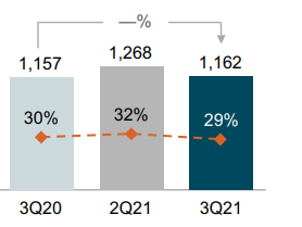
I'm trying to create a bar chart with a point and line overlay. I'm trying to recreate the graph in the picture attached:

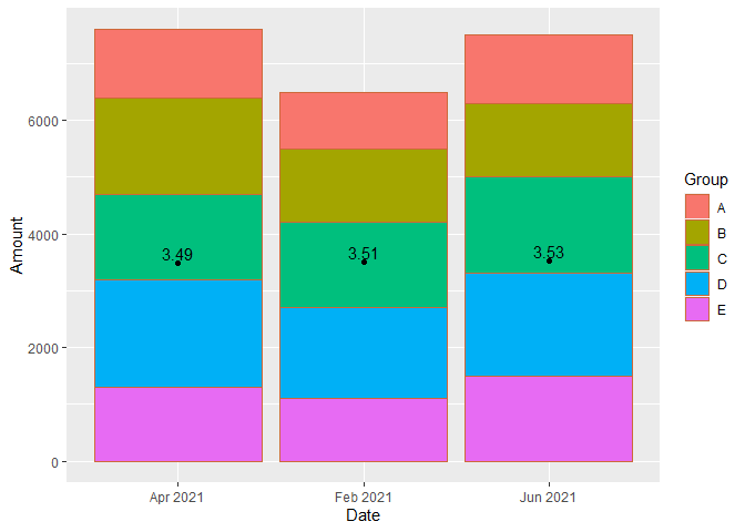
Ideally, I'd like to exclude the secondary axis since the purpose of overlaying the line is to show the sensitivity of the rate with changes in the amount. From the reading I've done, I don't think ggplot2 will allow an overlay without the secondary axis. My code below overlays my bar chart with points but both y axis are scaled incorrectly. Does anyone have a suggestion on how to correctly rescale the y-axis or better yet how to overlay the bar chart without the secondary axis?
df<-data.frame(
    Group=c("A","B","C","D","E","A","B","C","D","E","A","B","C","D","E"),
    Date=c("Feb 2021","Feb 2021","Feb 2021","Feb 2021","Feb 2021","Apr 2021","Apr 2021","Apr 2021","Apr 2021","Apr 2021","Jun 2021","Jun 2021","Jun 2021","Jun 2021","Jun 2021"),
    Amount=c(1000,1300,1500,1600,1100,1200,1700,1500,1900,1300,1200,1300,1700,1800,1500))

df2<-data.frame(Date=c("Feb 2021","Apr 2021","Jun 2021"),Rate=c(3.51,3.49,3.53),Amount=c(6500,7600,7500))

ggplot(df,aes(x=Date, y=Amount, group=Group, fill = Group)) +
    geom_bar(stat="identity", colour="sienna3")+
    geom_point(data=df2,aes(x=Date,y=Rate),inherit.aes = FALSE)+
    geom_text(aes(label = format(round(stat(y),0),big.mark=","), group = factor(Date)),stat = 'summary', fun = sum, vjust = -.25)+
    geom_text(data=df2,aes(label=Rate, x=Date, y=Rate*(Amount)), colour="black")+
    scale_y_continuous(sec.axis = sec_axis(~./max(df$Amount)))
