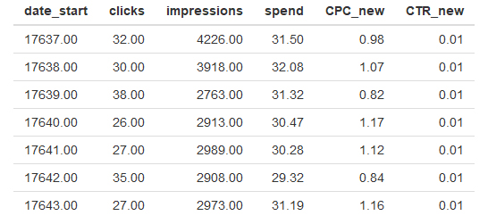
I am trying to ouput my data into a graph. I have looked at a few examples like:
The below code outputs my data into the table that you can see on the attached image.
If I wanted to get "date_start" on the X axis and "clicks" on the Y axis what is the simplest way todo that?
  # Getting the output into a tidy dataframe
  content_result <- content(report)
  content_result[["paging"]] <- NULL
  result_data <- content_result$data
  result_data <- result_data %>% reduce(bind_rows)


  # Setting classes of variables - numerical, data, etc and putting into a frame called 'import'
  result_data$impressions <- as.numeric(result_data$impressions)
  result_data$unique_clicks <- as.numeric(result_data$unique_clicks)
  result_data$clicks <- as.numeric(result_data$clicks)
  result_data$spend <- as.numeric(result_data$spend)
  result_data$date_start <- as.Date(result_data$date_start)
  result_data$date_stop <- as.Date(result_data$date_stop)

  import <- result_data


sum_by_day <- import  %>%
    group_by(date_start) %>%
    summarise(clicks = sum(clicks), impressions = sum(impressions), spend=sum(spend)) %>%
    mutate(CPC_new=spend/clicks) %>%
    mutate(CTR_new=clicks / impressions)
I asumed from the example https://shiny.rstudio.com/gallery/telephones-by-region.html the below would of been ok, but it just throws back errors.
   output$phonePlot <- renderPlot({

    # Render a barplot
    barplot(sum_by_day[,clicks,
            main=clicks,
            ylab="Number of clicks",
            xlab="Year")
  })

Any help much apreciated.