Outliers in Box Plots.

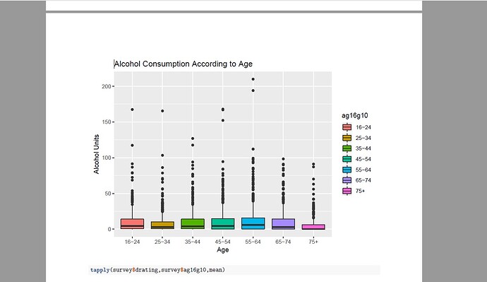
I have failed miserably in a very specific part of my data analysis. It is a project for a Data Analysis Course, and everything went well until a very specific problem came up: Outliers. All of my box plots have some extreme values. The y value is total alcohol units per week, and the x value is Age 16+ in Ten year bands. The dataset which I am using is the 2016 Scottish Heath Survey.
I wish to remove the outliers, but despite my exhaustive search nothing has come up. I do not wish to make them invisible, but rather to find out these extreme values and then remove them from the visualisations. I understand that this question may have been answered before, and the solution could potentially be simple, but I am asking due to lack of experience.
I thank you in advance for your time and help.
Here is the code:

First I Load the Data

survey<-read.delim("C:/Alcohol 2/shes16i_archive_v1.tab")

Then I convert the Age 16 + variable into a factor

survey$ag16g10<-factor(survey$ag16g10,levels=1:7,labels=c("16-24","25-34","35-44","45-54","55-64","65-74", "75+"))

Then the boxplot

agebox<-survey%>%filter(drating>=0)%>%ggplot(aes(x=ag16g10,y=drating,fill=ag16g10))+geom_boxplot()+labs((title ="Alcohol Consumption According to Age",x="Age",y="Alcohol Units" )

After all that I have a boxplot which has some outliers and I wish to remove them. So, how can I find the extreme values within the variables and then remove them from the box plot?

Best regards,
M.
Welcome to the community!

You may take a look at these SO threads:

Also, check the documentation of boxplot, which says:

outline
if outline is not true, the outliers are not drawn (as points whereas S+ uses lines).

If these does not solve your problem, I'm afraid that you'll need to provide more specifics of your problem, preferably with a REPRoducible EXample.

If you've never heard of reprex before, please take a look here:

1 Like

Dear Yarnabrina,
Many thanks for your prompt response and the really useful links which I will look in short order (tomorrow since it is 3 o clock in the evening in the UK).
Unfortunately, the reproducible example would not be very helpful since the data set which I am using has 5638 observations (I am not entirely sure about the number but it is quite large).
I do not have any problem with the code or errors but I observed that there are some extreme values in the visualisations which I would like to remove. Hence, due to my inexperience and also due to being lost in the internet I decided to place my question here. I could post a screenshot of the plot if that would help.
Again, many thanks!
Best regards,
Miltiadis

There is no need to include your whole dataset on a minimal reproducible example, a representative sample (subset) of your data, that reproduces your issue would be enough.

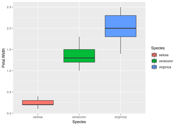
For example, I'm going to make a reprex for my proposed solution using the iris built-in dataset.

library(dplyr)
library(ggplot2)

# Custom outlier function
is_outlier <- function(x) {
    return(x < quantile(x, 0.25) - 1.5 * IQR(x) | x > quantile(x, 0.75) + 1.5 * IQR(x))
}

iris %>% 
    select(Petal.Width, Species) %>% 
    group_by(Species) %>% 
    mutate(outlier = is_outlier(Petal.Width)) %>% 
    filter(outlier == FALSE) %>%
    ggplot(aes(Species, Petal.Width, fill = Species)) +
    geom_boxplot()

3 Likes

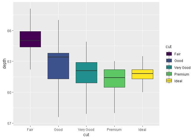
Here's a solution based on this answer on SO:

library(ggplot2)

gbp <- ggplot(data = diamonds,
              mapping = aes(x = cut,
                            y = depth,
                            fill = cut))

# creates boxplot with outliers
gbp_1 <- (gbp + geom_boxplot())

# same boxplot as above, but outliers are not shown
# range of y axis remains unchanged
gbp_2 <- (gbp + geom_boxplot(outlier.shape = NA))
  
# zooming into the above boxplot
whisker_limits <- boxplot.stats(diamonds$depth)$stats[c(1, 5)]
(gbp_3 <- (gbp_2 + coord_cartesian(ylim = (whisker_limits + c(-1.5, 3.5)))))

Created on 2019-04-06 by the reprex package (v0.2.1)

Andres' solution is great, but it removes the outliers and needs another package, namely dplyr. But I suppose that's not really a serious problem, as that's exactly what you want. So, I suppose you can safely ignore the above comment, though in my opinion removing observations is probably not a good idea.

On the other hand, my solution doesn't suffer from these, but it's not automatic. Choice of c(-1.5, 3.5) is completely manual, and fairly subjective.

2 Likes
df<-data.frame(
     drating = c(0, -2, -2, 18.2125, 3.587, 0, -2, 0, 0, 0, -2, -2, 1.7155,
                 0.116, -2, -2, 0.058, 4.5, 0.808, 0.145),
         Sex = as.factor(c("Female", "Male", "Female", "Male", "Female",
                           "Female", "Female", "Male", "Female", "Male",
                           "Male", "Female", "Male", "Female", "Female", "Male",
                           "Female", "Male", "Male", "Female"))
)

Created on 2019-04-08 by the reprex package (v0.2.1)

Alright, first things first. Many thanks to both of you for your invaluable advice. I have made a minimal reproducible example based on the data which I am using. However it does not include any extreme values (and this is before I run mister andresrcs's code)
However I encountered another problem when I tried to utilise the same method on a scatter plot. For a peculiar reason it claims that object 'Sex' could not be found, when I tried to colour the dots based on Sex.
Should I also make another example and Incorporate the scatter plot?
Again, many thanks to both of you.
Best regards,
M

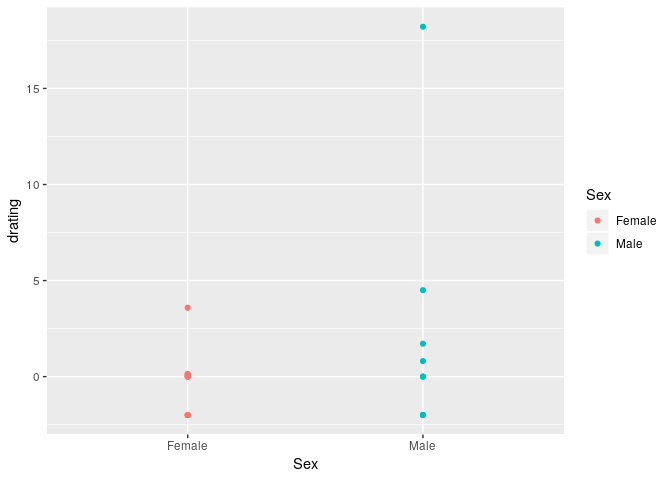
Well, your sample data is not suitable for a scatter plot but I have no problem making one, maybe you are just making a typo, have in mind that R is case sensitive and "sex" is not the same as "Sex".

df <- data.frame(drating = c(0, -2, -2, 18.2125, 3.587, 0, -2, 0, 0, 0, -2, -2, 1.7155,
                             0.116, -2, -2, 0.058, 4.5, 0.808, 0.145),
                 Sex = as.factor(c("Female", "Male", "Female", "Male", "Female",
                                   "Female", "Female", "Male", "Female", "Male",
                                   "Male", "Female", "Male", "Female", "Female", "Male",
                                   "Female", "Male", "Male", "Female"))
)

library(ggplot2)

ggplot(df, aes(x = Sex, y = drating, colour = Sex)) +
    geom_point()

Created on 2019-04-08 by the reprex package (v0.2.1.9000)

1 Like

Alright. I messed up due to lack of sleep. I have made a box plot since the data was not suitable. What I meant to write was that I attempted to make a scatter plot with Alcohol Units and Individual/Couple Income as the variables. When I attempted to run the script is said that 'Sex' could not be found. I made sure that I typed it correctly and that R began to automatically fill the rest of the variable name. Shall I reproduce the error and send it?
Again I thank you and apologise, because you have been really helpful and patient with me.

That sounds like a different question, I think you should ask it in a new topic and include a relevant reproducible example.

Alright! Many thanks!

This topic was automatically closed 7 days after the last reply. New replies are no longer allowed.

If you have a query related to it or one of the replies, start a new topic and refer back with a link.