Optimal graphical representation

Hi everybody,

sorry for my bad english in advance. I hope that I can explain my problem as much as possible.

I am a beginner in R-Studio therefor I need your help :slight_smile:

My records are the following survey:
participants: approx. 1200
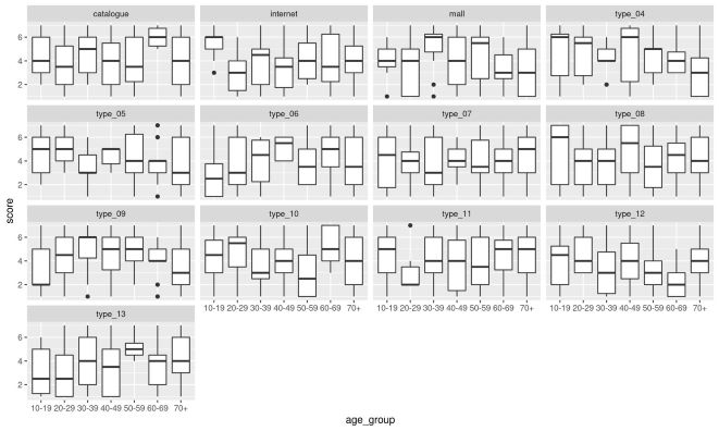
Questions: 13 with a scale of 1 - 7 (1= very unimportant - 7= very important). Different ways to shop (for example: internet, shopping mall, catalogue, discounter etc...
1 with their age from 10 - 95 years.

I have to show that the importance of shopping is based on age. (example: younger people preferred online, older people in city shops.)

Now is my questions.
How can I represent this graphically without it becoming cluttered?

I tried it with:
ggplot(data_xls, aes(x=D1_Age, color=X4.1_online, fill=X4.1_Online)) +
geom_histogram(binwidth = 0.5, position = "stack") +....

But there is just one of the 13 possibilities listed.
Ist there any possibility to show all 13 options in one or two graphic representation?

Thanks for your help and ideas!

If you need further information, I can try to provide it.

I'm not certain I completely understand your data. If my answer doesn't make sense you could try providing some sample data just so it's clear what you're working with - fake values are fine, we just need to see the structure.

Having said that, I think it would help if you had your data in a long format instead of wide. Something like the example below. This often makes it easier to work with ggplot.

The following might work for you once you have your data in long format.

  1. put your ages into groups (10-19, 20-29, etc.)
  2. use boxplots to show the score distributions for the age groups
  3. use facet_wrap() or facet_grid() to see the various shopping types together

Here is an example of what I mean.

library(dplyr)
library(ggplot2)

set.seed(314159)

# FAKE DATA CREATION
dat <- data.frame(score = sample(1:7, 1200, replace = TRUE),
                  type = sample(c("internet", 
                                  "mall", 
                                  "catalogue", 
                                  sprintf("type_%02d", 4:13)), 
                                1200, replace = TRUE),
                  age = sample(10:95, 1200, replace = TRUE))

# turn age into age GROUPS for easier plotting/comparing
dat2 <- dat %>% 
  mutate(age_group = case_when(
    age >= 70 ~ "70+",
    age >= 60 ~ "60-69",
    age >= 50 ~ "50-59",
    age >= 40 ~ "40-49",
    age >= 30 ~ "30-39",
    age >= 20 ~ "20-29",
    age >= 10 ~ "10-19",
    TRUE ~ "--ERROR--"
  ))

ggplot(dat2,
       aes(x = age_group,
           y = score)) +
  geom_boxplot() +
  facet_wrap(.~type)

samplesmall

Thank you for your response. That looks very well.
Ages into groups is an good idea.

But I I have problems to put my datas into your example. I don't have a additional data like "score".
The score is included in the shopping possibility. I try to provide something.

Here you can see my datas as an example. (I hope It works)

X4.1_Online X4.2_Mall X4.3_Discounter X4.4_market X4.5_Outlet X4.6_ X4.7_ X4.8_ X4.9_ X4.10_ X4.11_ X4.12_ X4.13_ D1_Age
7 5 5 6 6 1 1 1 1 5 4 7 7 26
5 4 4 5 1 7 1 1 1 6 2 2 7 40
7 2 2 4 2 3 3 2 1 5 5 4 5 25
7 5 5 5 6 6 5 4 1 5 4 6 7 56
4 1 1 4 6 1 1 1 1 1 2 4 1 28
1 4 4 4 1 1 1 1 5 2 1 1 4 72
2 6 1 7 7 2 4 1 1 1 1 5 4 60
1 3 3 2 2 3 4 5 7 4 7 5 7 60
6 1 1 4 4 1 3 1 1 4 1 3 5 23

X_4.1 - X_4.13 show the different possibilities and the numbers below are the importance for the interviewed person.

How can I get this into your "box plot - overview".

Thank you for your help!!

You can use the pivot_longer() function from the tidyr package.

Starting from the data you provided, you can do something like below.

library(dplyr)
library(tidyr)
library(ggplot2)

raw_data <- data.frame(
      X4.1_Online = c(7L, 5L, 7L, 7L, 4L, 1L, 2L, 1L, 6L),
        X4.2_Mall = c(5L, 4L, 2L, 5L, 1L, 4L, 6L, 3L, 1L),
  X4.3_Discounter = c(5L, 4L, 2L, 5L, 1L, 4L, 1L, 3L, 1L),
      X4.4_market = c(6L, 5L, 4L, 5L, 4L, 4L, 7L, 2L, 4L),
      X4.5_Outlet = c(6L, 1L, 2L, 6L, 6L, 1L, 7L, 2L, 4L),
            X4.6_ = c(1L, 7L, 3L, 6L, 1L, 1L, 2L, 3L, 1L),
            X4.7_ = c(1L, 1L, 3L, 5L, 1L, 1L, 4L, 4L, 3L),
            X4.8_ = c(1L, 1L, 2L, 4L, 1L, 1L, 1L, 5L, 1L),
            X4.9_ = c(1L, 1L, 1L, 1L, 1L, 5L, 1L, 7L, 1L),
           X4.10_ = c(5L, 6L, 5L, 5L, 1L, 2L, 1L, 4L, 4L),
           X4.11_ = c(4L, 2L, 5L, 4L, 2L, 1L, 1L, 7L, 1L),
           X4.12_ = c(7L, 2L, 4L, 6L, 4L, 1L, 5L, 5L, 3L),
           X4.13_ = c(7L, 7L, 5L, 7L, 1L, 4L, 4L, 7L, 5L),
           D1_Age = c(26L, 40L, 25L, 56L, 28L, 72L, 60L, 60L, 23L)
) %>% 
  # add an ID column for clarity when looking at the long data - not technically needed
  mutate(id = 1:n())


long_data <- raw_data %>% 
  # you can list all the relevant columns (the ones that have scores in them) 
  # in a vector of strings or do something like this. I'm grabbing all those 
  # with "X4" since that works for your sample data but you may need to change this. 
  pivot_longer(cols = names(.)[grepl("X4", names(.))],
               names_to = "type",
               values_to = "score") %>% 
  # group the ages
  mutate(age_group = case_when(
    D1_Age >= 70 ~ "70+",
    D1_Age >= 60 ~ "60-69",
    D1_Age >= 50 ~ "50-59",
    D1_Age >= 40 ~ "40-49",
    D1_Age >= 30 ~ "30-39",
    D1_Age >= 20 ~ "20-29",
    D1_Age >= 10 ~ "10-19",
    TRUE ~ "--ERROR--"
  ))

ggplot(long_data,
       aes(x = age_group,
           y = score)) +
  geom_boxplot() +
  facet_wrap(.~type)

This topic was automatically closed 21 days after the last reply. New replies are no longer allowed.

If you have a query related to it or one of the replies, start a new topic and refer back with a link.