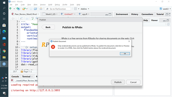
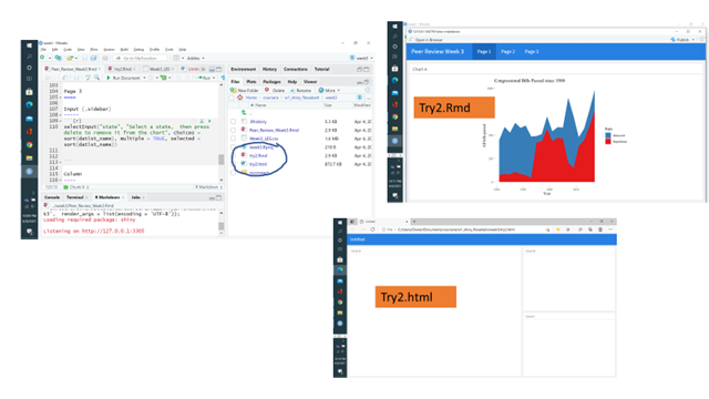
Thanks technocrat for your reply. I'm just a data vizzer and I'm not sure what an R back-end is. I looked at the explainer your posted and I'm still not sure how to fix it. Do I need to remove the Rshiny app from the viz.
Here's the full code
---
title: "Peer Review Week 3"
output:
  flexdashboard::flex_dashboard:
    orientation: columns
    vertical_layout: fill
    runtime: shiny
---

```{r setup, include=FALSE}
library(flexdashboard)
library(shiny)
library(tidyverse)
library(plotly)
library(ggthemes)
dat<-read_csv("Week3_LES.csv")

dat$Party<-recode(dat$dem,`1`="Democrat",`0`="Republican")
Page 1
Column
Chart A
viz1 <- dat %>%
  drop_na() %>%
  filter(year>1979) %>%
  group_by(year,Party) %>%
  summarise(passed=sum(all_pass)) %>%
  ggplot(aes(year, passed, fill = Party)) +
  geom_area() +
  ggtitle("Congressional Bills Passed since 1980") +
  xlab("Year") +
  ylab("All bills passed") +
    scale_fill_brewer(palette = "Set1",
                      direction = -1) +
  theme_tufte()
print(viz1)
Page 2
Column
Bills Passed vs. Voting Percentage in 110th Congress
viz2 <- dat%>%
  drop_na()%>%
  filter(congress==110) %>%
  ggplot(aes(votepct, all_pass, color = Party, fill = Party, group = Party, text = paste("Party: ", Party, "\nName: ", thomas_name, "\nBills Passed: ", all_pass, "\nIdeology: ", votepct))) +
  geom_point(aes(alpha = .5)) +
  geom_smooth() +
  xlab("Vote Percentage") +
  ylab("All Bills Passed") +
  scale_color_brewer(palette = "Set1",
                      direction = -1) +
  scale_fill_brewer(palette = "Set1", direction = -1) +
  theme_tufte()

ggplotly(viz2, tooltip = c("text"))
Column
Bills Passed vs Ideology in 110th Congress
viz3 <- dat%>%
  drop_na()%>%
  filter(congress==110) %>%
ggplot(aes (dwnom1, all_pass, color = Party, fill = Party, group = Party, text = paste("Party: ", Party, "\nName: ", thomas_name, "\nBills Passed: ", all_pass, "\nIdeology: ", dwnom1) )) +
  geom_point(aes(alpha = .5)) +
  geom_smooth() +
  xlab("Ideology: -1.0 = Very Liberal, +1.0 = Very Conservative") +
  ylab("All Bills Passed") +
  scale_color_brewer(palette = "Set1",
                      direction = -1) +
  scale_fill_brewer(palette = "Set1",
                    direction = -1)+
  theme_tufte()

ggplotly(viz3, tooltip = c("text"))
Page 3
Input {.sidebar}
selectInput("state", "Select a state, then press delete to remove it from the chart", choices = sort(dat$st_name), multiple = TRUE, selected = sort(dat$st_name))
Column
Total Bills Passed by State Delegations in 110th Congress
state.rctv <- reactive(c(input$state))
dat1 <- reactive(dat %>%
  filter(st_name %in% state.rctv()) %>%
  group_by(st_name) %>%
  filter(congress==110) %>%
  summarise(passed=sum(all_pass)))
renderPlot({
  ggplot(dat1(), aes(st_name, passed)) +
  geom_bar(stat="identity") +
  coord_flip() +
  xlab("State") +
  ylab("Total Bills Passed by State") +
  theme_tufte() +
  theme(axis.text=element_text(size=6))
})

