Hi, I´m trying to create a plot with 2 different tibbles.
Here is my data:
library (tidyverse)

my_data_2017 <- tibble(Var_1 = c(900, 1500, 350, 1200, 750, 100,125,250,300),
                  Gender = c("W", "W", "W", "M", "M", "W", "W", "M", "W"),
                  my_weights = c(2.2, 3.1, 8.2, 4.2, 5.3, 6.8, 12, 25, 1))

my_data_2018 <- tibble(Var_1 = c(850, 1000, 370, 1000, 600, 50,15,250,300,500,100,15),
                  Gender = c("W", "W", "W", "M", "M", "W", "W", "M", "W", "W", "W", "M"),
                  my_weights = c(2.2, 3.1, 8.2, 4.2, 5.3, 6.8, 12, 25, 1,2.5, 1.2, 1.1))
I usually make the plot this way:
my_data_2017 %>%
  ggplot(aes(Gender, Var_1, weight = my_weights, fill = Gender))+
  geom_violin(color = "black", scale = "count")
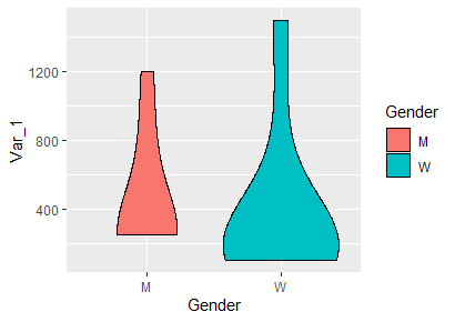
And I obtain this plot

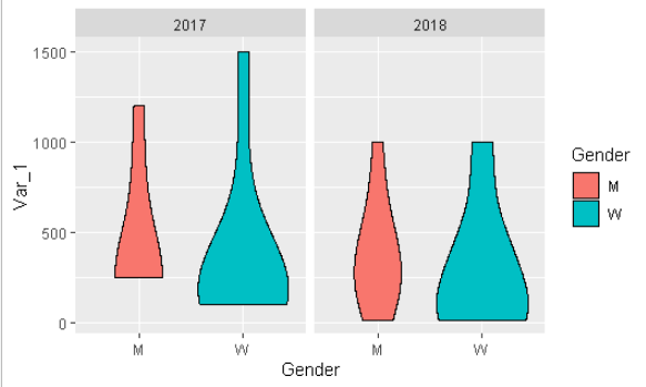
The point is I dont know how to add the data from the year 2018 to compare the data in the same plot.
Any help?
