Odds Ratio Visualization

Need to visualize odds ratio, found a example here:

Made a small modification with my data, code is listed below:

boxLabels = c("Male", "Age1", "Age2", "Underweight", "Overweight", "Obese", 
              "Married", "Married2", "Senior", "Member", "Senior Member", 
              "Alcohol", "Tomato", "E-Cigarettes", "Smokeless", "ES", "Smoke", "SE",
              "SS", "Three", "7-9p", "5-7", "5-7p", "L5", "L5p",
              "MH", "HRL", "PTP", "PT5")

# Enter OR and CI data. boxOdds are the odds ratios, 
# boxCILow is the lower bound of the CI, boxCIHigh is the upper bound.
df <- data.frame(yAxis = length(boxLabels):1, 
                 boxOdds = c(0.632, 0.022, 0.0212, 0.196, 0.069, 0.222, 0.325, 0.321, -0.152, -0.669, -0.583, -0.098, 0.049,
                             0.26, 0.116, 0.398, 0.134, 0.325, 0.216, 0.617, 0.371, 0.131, 0.384, 0.474, 0.764, 0.928,
                             -0.614, 1.586, 0.494), 
                 boxCILow = c(0.609221946, -0.005012542, 0.105260511, -0.012072581, 0.029558802, 0.168898536, 0.223143551,
                              0.277631737, -0.180323554, -0.711311151, -0.632993258, -0.156653810, 0.002995509, 0.146694379,
                              0.015873349, 0.031498667, 0.057325067, 0.152721087, 0.008959741, 0.297879897, 0.200488861,
                              0.083421608, 0.294161039, 0.375692950, 0.651804217, 0.863311807, -0.659712404, 1.549900200,
                              0.430482871), 
                 boxCIHigh = c(0.65492597, 0.04879016, 0.31990722, 0.40279488, 0.10795714, 0.27459683, 0.34995240, 0.36325326,
                               -0.12443008, -0.62548853, -0.53273046, -0.03978087, 0.09531018, 0.37225297, 0.21591751, 0.74668795,
                               0.21107097, 0.49652384, 0.42264993, 0.93687737, 0.54174273, 0.17814619, 0.47436909, 0.57323688,
                               0.87630172, 0.99325177, -0.56739598, 1.62195919,0.55675456))

# Plot
library(ggplot2)

(p <- ggplot(df, aes(x = boxOdds, y = boxLabels)) + 
    geom_vline(aes(xintercept = 0), size = .25, linetype = "dashed") + 
    geom_errorbarh(aes(xmax = boxCIHigh, xmin = boxCILow), size = .5, height = 
                     .2, color = "gray50") +
    geom_point(size = 3.5, color = "orange") +
    coord_trans(x = scales:::exp_trans(10)) +    
    scale_x_continuous(breaks = log10(seq(0.1, 2.5, 0.1)), labels = seq(0.1, 2.5, 0.1),
                       limits = log10(c(0.09,2.5))) +
    theme_bw()+
    theme(panel.grid.minor = element_blank()) +
    ylab("") +
    xlab("Odds ratio")) 

Questions:

  1. How can I make the labels at yaxis be the same order as the string characters are in the vector boxLabels
  2. Some of CI didn't show up, some of them is not in the right site (away from the yellow dot), how can let them display correctly?

Thank you!
I'm showing you a solution, which you can then improve as you require:

library(ggplot2)

df <- data.frame(boxLabels = c("Male", "Age1", "Age2", "Underweight", "Overweight",
                               "Obese", "Married", "Married2", "Senior", "Member",
                               "Senior Member", "Alcohol", "Tomato", "E-Cigarettes",
                               "Smokeless", "ES", "Smoke", "SE", "SS", "Three", "7-9p",
                               "5-7", "5-7p", "L5", "L5p", "MH", "HRL", "PTP", "PT5"), 
                 boxOdds = c(0.632, 0.022, 0.0212, 0.196, 0.069, 0.222, 0.325, 0.321,
                             -0.152, -0.669, -0.583, -0.098, 0.049, 0.26, 0.116, 0.398,
                             0.134, 0.325, 0.216, 0.617, 0.371, 0.131, 0.384, 0.474,
                             0.764, 0.928, -0.614, 1.586, 0.494), 
                 boxCILow = c(0.609221946, -0.005012542, 0.105260511, -0.012072581,
                              0.029558802, 0.168898536, 0.223143551, 0.277631737,
                              -0.180323554, -0.711311151, -0.632993258, -0.156653810,
                              0.002995509, 0.146694379, 0.015873349, 0.031498667,
                              0.057325067, 0.152721087, 0.008959741, 0.297879897,
                              0.200488861, 0.083421608, 0.294161039, 0.375692950,
                              0.651804217, 0.863311807, -0.659712404, 1.549900200,
                              0.430482871), 
                 boxCIHigh = c(0.65492597, 0.04879016, 0.31990722, 0.40279488,
                               0.10795714, 0.27459683, 0.34995240, 0.36325326,
                               -0.12443008, -0.62548853, -0.53273046, -0.03978087,
                               0.09531018, 0.37225297, 0.21591751, 0.74668795,
                               0.21107097, 0.49652384, 0.42264993, 0.93687737,
                               0.54174273, 0.17814619, 0.47436909, 0.57323688,
                               0.87630172, 0.99325177, -0.56739598, 1.62195919,
                               0.55675456))

ggplot(data = df,
       mapping = aes(y = forcats::fct_inorder(f = rev(x = boxLabels)))) +
  geom_vline(xintercept = 1) +
  geom_point(mapping = aes(x = boxOdds)) +
  geom_errorbarh(mapping = aes(xmin = boxCILow,
                               xmax = boxCIHigh)) +
  coord_trans(x = scales::exp_trans()) +
  scale_x_continuous(breaks = log(x = 0.5 * (1:10)),
                     minor_breaks = NULL,
                     labels = (0.5 * (1:10))) +
  labs(x = "Exponentiated Odds Ratio",
       y = "")

Created on 2019-07-07 by the reprex package (v0.3.0)

Note

Check your dataset. Odds ratio for Age2 is 0.0212, where the CI is [0.105260511, 0.31990722]. However, after exponentiation, this is not evident from the graph. Possibly some other base will reveal this pattern.

Another point is that I am surprised to find negative odds ratios. How can it be possible? Is it odds ratio, or log odds ratios? In case it's log of odds ratios, vertical line should not be drawn at 1, rather it should be drawn at 0.

1 Like

Thank you! looks great.

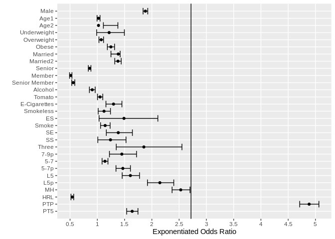
Why the odds ratio of Age1 (the second one) is so high? I checked the original data in log scale, nothing wrong, compared to other value of estimate, it shouldn't be that high in the graph. If change other one to the second position, also displays very high. Could you please take a look about it? Thank you.

Hi @Visiting, you're absolutely right. I was so busy in finding the problems with your data set that I missed my own stupid mistakes. I'm sorry.

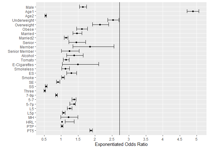
The previous graph is absolutely wrong. The point being shown corresponding to Age1 actually corresponds to PTP, the only label for which the odds ratio is grater than one, and hence it's deviation from the other points in justified (e^{1.586} is approximately 4.9). The problem occurs because of the rev command I used inside fct_inorder. It reversed the order of the labels, but didn't change the ordering of the odds ratios, as I had hoped.

Hopefully, the following graph is alright:

library(ggplot2)

df <- data.frame(boxLabels = c("Male", "Age1", "Age2", "Underweight", "Overweight",
                               "Obese", "Married", "Married2", "Senior", "Member",
                               "Senior Member", "Alcohol", "Tomato", "E-Cigarettes",
                               "Smokeless", "ES", "Smoke", "SE", "SS", "Three", "7-9p",
                               "5-7", "5-7p", "L5", "L5p", "MH", "HRL", "PTP", "PT5"), 
                 boxOdds = c(0.632, 0.022, 0.0212, 0.196, 0.069, 0.222, 0.325, 0.321,
                             -0.152, -0.669, -0.583, -0.098, 0.049, 0.26, 0.116, 0.398,
                             0.134, 0.325, 0.216, 0.617, 0.371, 0.131, 0.384, 0.474,
                             0.764, 0.928, -0.614, 1.586, 0.494), 
                 boxCILow = c(0.609221946, -0.005012542, 0.105260511, -0.012072581,
                              0.029558802, 0.168898536, 0.223143551, 0.277631737,
                              -0.180323554, -0.711311151, -0.632993258, -0.156653810,
                              0.002995509, 0.146694379, 0.015873349, 0.031498667,
                              0.057325067, 0.152721087, 0.008959741, 0.297879897,
                              0.200488861, 0.083421608, 0.294161039, 0.375692950,
                              0.651804217, 0.863311807, -0.659712404, 1.549900200,
                              0.430482871), 
                 boxCIHigh = c(0.65492597, 0.04879016, 0.31990722, 0.40279488,
                               0.10795714, 0.27459683, 0.34995240, 0.36325326,
                               -0.12443008, -0.62548853, -0.53273046, -0.03978087,
                               0.09531018, 0.37225297, 0.21591751, 0.74668795,
                               0.21107097, 0.49652384, 0.42264993, 0.93687737,
                               0.54174273, 0.17814619, 0.47436909, 0.57323688,
                               0.87630172, 0.99325177, -0.56739598, 1.62195919,
                               0.55675456))

ggplot(data = df,
       mapping = aes(y = forcats::fct_rev(f = forcats::fct_inorder(f = boxLabels)))) +
  geom_vline(xintercept = 1) +
  geom_point(mapping = aes(x = boxOdds)) +
  geom_errorbarh(mapping = aes(xmin = boxCILow,
                               xmax = boxCIHigh)) +
  coord_trans(x = scales::exp_trans()) +
  scale_x_continuous(breaks = log(x = 0.5 * (1:10)),
                     minor_breaks = NULL,
                     labels = (0.5 * (1:10))) +
  labs(x = "Exponentiated Odds Ratio",
       y = "")

If you can find some problem here too, let me know. Probably I will delete my earlier solution a day or two later, because it is useless. I'm keeping it for now to help the comparison of two graphs.

Also, I made another mistake saying that the issue of Age2 is not displayed in the graph. That was wrong too, because it was displayed, but was assigned different label (namely HRL) due to the above mistake.

I sincerely apologise.

1 Like

Thank you! @Yarnabrina
You are so nice and always helpful!

This topic was automatically closed 7 days after the last reply. New replies are no longer allowed.