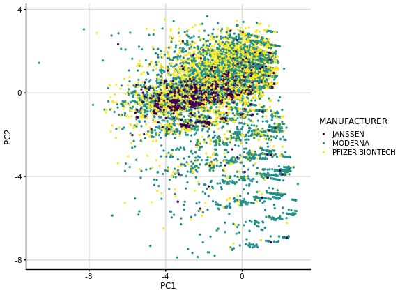
Hello! I'm doing a PCA on a numeric data frame that contains 23 binary variables and 2 discrete ones and the results I get are somewhat different to what I'm used to with PCA. I think it could be due to the fact that I don't have any continuous variables and also because most of my binary variables are negative (0). I was hoping someone could shed some light on why the data points look like they cluster by intervals in the biplot PC1 vs PC2.
This is what the data frame looks like
# A tibble: 30,676 x 25
    DIED HOSPITAL DISABLE ER_ED_VISIT SYMPTOMS_AFTER N_SYMPTOMS DYSPNOEA PAIN_IN_EXTREMITY
   <dbl>    <dbl>   <dbl>       <dbl>          <dbl>      <dbl>    <dbl>             <dbl>
 1     0        0       0           0              2          2        0                 0
 2     0        0       0           0              0          2        1                 0
 3     0        0       0           1              0          4        0                 1
 4     0        0       0           0              0          3        0                 0
 5     0        0       0           0              7          4        0                 0
 6     0        0       0           0              0          1        0                 0
 7     0        0       0           0              1          3        0                 0
 8     0        0       0           0              2          2        0                 0
 9     0        0       0           0              8          3        0                 0
10     0        0       0           0              1          2        0                 0
# … with 30,666 more rows, and 17 more variables: DIZZINESS <dbl>, FATIGUE <dbl>,
#   INJECTION_SITE_ERYTHEMA <dbl>, INJECTION_SITE_PRURITUS <dbl>,
#   INJECTION_SITE_SWELLING <dbl>, CHILLS <dbl>, RASH <dbl>, HEADACHE <dbl>,
#   INJECTION_SITE_PAIN <dbl>, NAUSEA <dbl>, PAIN <dbl>, PYREXIA <dbl>, MYALGIA <dbl>,
#   ARTHRALGIA <dbl>, PRURITUS <dbl>, ASTHENIA <dbl>, VOMITING <dbl>
And this is my code:
# PCA
pca_fit <- numeric_symptoms %>%
  scale() %>% # scale data
  prcomp(center = TRUE) # do PCA

# PC1 vs PC2 biplot
pca_fit %>%
  augment(classes) %>%
  ggplot(aes(.fittedPC1, .fittedPC2, color = VAX_MANU)) +
  geom_point(size = 0.5) +
  labs(x = 'PC1', y = 'PC2') +
  scale_color_viridis_d(name = "MANUFACTURER", option = "D") +
  theme_half_open(font_size = 9, font_family = "Avenir") +
  background_grid()
PS: I know it might not be super meaningful to do a PCA on a data set of these characteristics, but it's for a project where the most important thing is to code in the tidyverse style in a reproducible way. However, I would still like to understand my results.
Thanks a lot!! ![]()