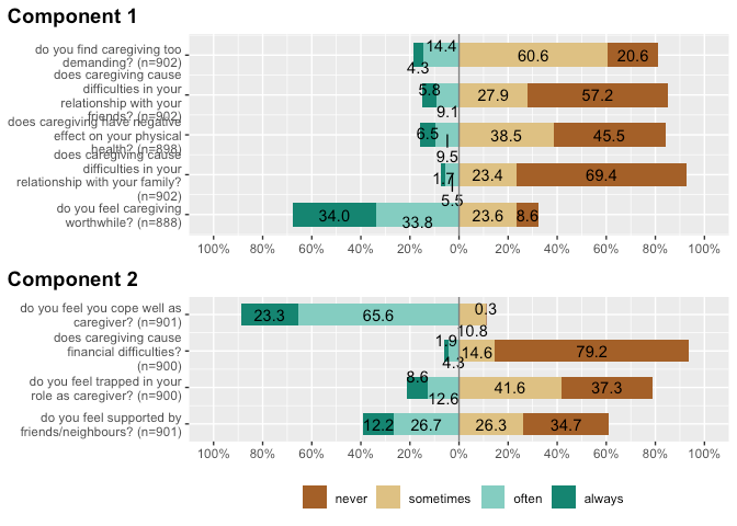
Always values (percents or counts ) are scattered around inside or outside bars. Is there a way to align it "properly" and evenly eg. for publication submit ? Can you advice how to do it using that package, please ? https://www.reddit.com/r/rstats/comments/qq1svc/cant_figure_out_how_to_get_the_percentage_values/
Sometimes numbers are connected with bars by vertical lines, but it looks chaotic and difficult to see where does it belong to ?
How to properly position numbers on bars, establish font size , etc ?
When I use: reverse.scale = TRUE, the cat neutral goes to right hand side. Is it possible to keep it left when reverse.scale = TRUE is used ?
When I run your code and then zoom the plot it looks fine. I am assuming that you are saving the plot using the "export" button. If so the default values are the problem. I played around with these values ' outputting using png() see code below. A width = 750 and height = 600 seems to give a satisfactory output and you can set them in the export window.
The alternating hi-lo numbers appear to be deliberate to prevent the numbers overlaying each other if two adjacent categories are both small.
I do not know and the efc data is only a 4-point scale. Could you mock up a bit of data for a 5 or 7-point scale as you are using it? I am not sure of how you are scoring.
It is getting squashed because of the size of the plot window. Above the plot window there is a button Zoom. It will expand the plot to its "proper" size.