Hi everyone,
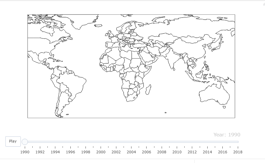
I am working on some data visualisations for a project. I have very limited experience with R so any help will be greatly appreciated. I have run the code below. I have gotten a map but no colours and Co2 Emission data for the countries.
library(readr)
library(plotly)
library(ggplot2)

View(Co2Country3)

Co2_Country_Graph4=plot_geo(Co2Country3,
                            locationmode ="country",
                            frame= ~Year)%>%
  add_trace(location = ~Country,
            z =~Co2_Emissions,
            reversescale =T,
            color=~Co2_Emissions) %>%
  layout(geo = list(showcountries = TRUE, scope ='world'))


Co2_Country_Graph4
Co2_Country_Graph4
My data looks like this.
head(Co2Country3)
 head(Co2Country3)
# A tibble: 6 x 4
  Country        Year Co2_Emissions Codes
  <chr>         <dbl>         <dbl> <chr>
1 China          1990         2874. CHN
2 United States  1990         5543. USA
3 India          1990         1009. IND
4 Russia         1990         2885. ROU
5 Indonesia      1990         1257. IDN
6 Brazil         1990         1642. BRA
