Normality Assessment Research Survey
Authors: Sam Bacon
Abstract: This Shiny app augments ongoing research regarding the effectiveness of Q-Q Plots to assess normality. Users view Q-Q plots from various datasets and comment on the normality of the parent population. Responses are saved anonymously in Google Sheets.
Full Description: The validity of any sound statistical analysis is predicated on the fact that the relevant dataset meets certain criteria. These prerequisites ensure that different features of the data, such as its shape, are suitable for parametric statistical methods. Ideally, the data will mimic a Normal distribution, a bell-shaped curve centered at the mean with most values falling within three standard deviations of the center.
Currently, there are a variety of ways to evaluate the shape of a distribution. Formal methods, such as the Shapiro-Wilk test or the Anderson-Darling test, are quite accurate at determining the distribution of large data sets, but their accuracy decreases significantly with smaller sample sizes. With this in mind, I wanted to analyze if certain variations of Q-Q plots (a popular informal method) enable viewers to accurately determine the distribution of a small data set (n = 20). This Shiny app extends the work of Follett et al. (2016), who performed a comparative study in which they asked participants to identify Q-Q Plots with non-Normal data out of lineups of 20 plots each.
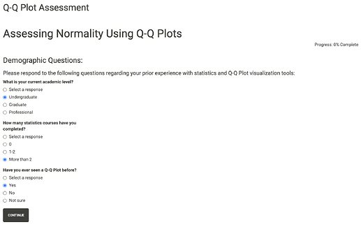
First, participants are asked a series of demographic questions regarding their prior experience with statistics and Q-Q Plot visualizations. Respondents must select a response for all questions throughout the survey before advancing. Conditional panels are used to ensure that participants answer each question before they are permitted to continue.
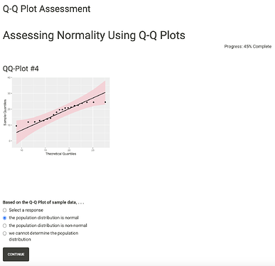
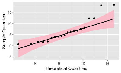
Then, respondents are shown a series of Q-Q plots. The first is a “practice” question that is not recorded. The remaining 8 visualizations represent 8 different data that follow Normal, F, or Uniform distributions. Each of these plots may have one of three possible variations: 1) no reference line and no confidence bands, 2) reference line only, 3) reference line and confidence bands. The order of these variations are randomly generated for each new participant. For each visualization, respondents are simply asked whether the data set comes from a Normal population.
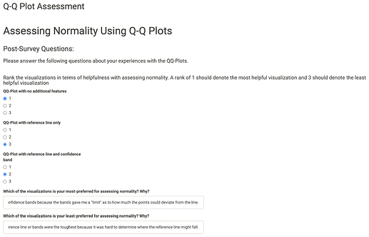
Finally, participants are asked a few post-survey questions. They rate the types of Q-Q plots in terms of difficulty and are able to add comments regarding which versions made the Normality assessment easier or more difficult.
All participants are assigned a unique user ID. Upon completion, the responses and uniquely generated user ID's are appended to a Google Sheet. This process is facilitated using the 'googlesheets4' package.
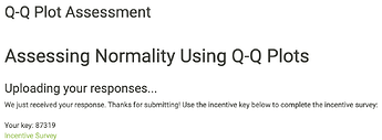
The application also randomly generates a personalized key that can be used to receive a survey incentive. These 'sent' keys are appended to a separate Google Sheet. If a respondent decides to complete the incentive survey, they simply click on the link and must enter their email address and their unique key. The key value is checked against the keys that the survey has administered. This process preserves confidentiality by keeping email addresses separate from survey responses.
References:
Follett, L., Hofman, H., & Loy, A. (2016). Variations of Q–Q Plots: The Power of Our Eyes! The American Statistician, 70:2, 202-214. 10.1080/00031305.2015.1077728.
Keywords: Survey, Normality, Visualization, Q-Q Plot, googlesheets4
Shiny app: https://sbacon3.shinyapps.io/normality_assessment_survey/
Repo: Posit Cloud
RStudio Cloud: Posit Cloud
Thumbnail:
Full image:
