I have the following signal recording made for 24 hours every one second. It could be longer, 48, 72 ... hours!
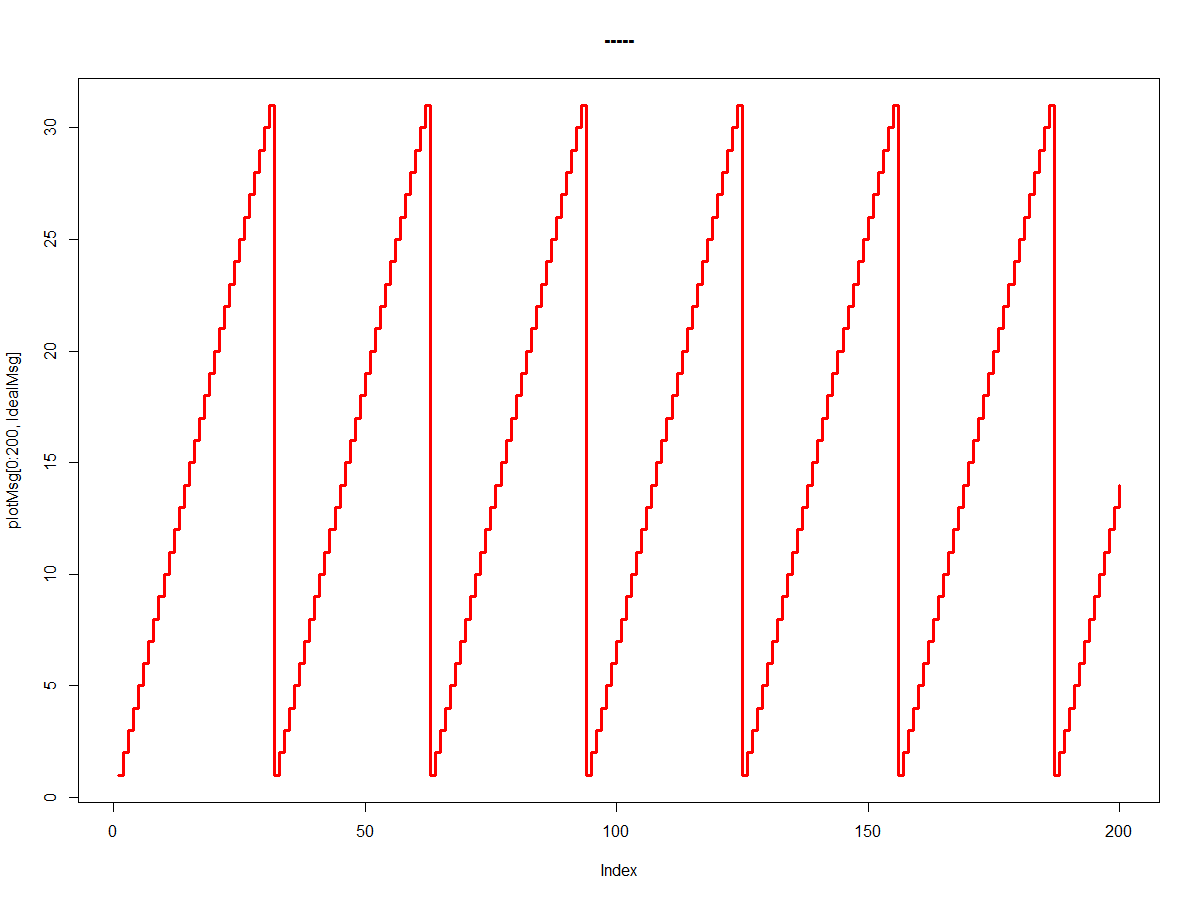
The signal has a 31 second period and exhibits a staggered behavior.
The expected behavior would be the following:
library(data.table)
library(ggplot2)

plotMsg=fread("plotMsgvsIdeal.csv")
str(plotMsg)
Classes ‘data.table’ and 'data.frame':	65534 obs. of  3 variables:
 $ Time    : POSIXct, format: "2020-06-05 02:41:31" "2020-06-05 02:41:45" "2020-06-05 02:41:45" "2020-06-05 02:41:46" ...
 $ Msg     : int  1 2 3 4 6 9 9 11 13 15 ...
 $ IdealMsg: int  1 2 3 4 5 6 7 8 9 10 ...
 - attr(*, ".internal.selfref")=<externalptr>
summary(plotMsg)
      Time                          Msg           IdealMsg
 Min.   :2020-06-05 02:41:31   Min.   : 0.00   Min.   : 1
 1st Qu.:2020-06-05 07:18:37   1st Qu.: 7.00   1st Qu.: 8
 Median :2020-06-05 11:55:29   Median :15.00   Median :16
 Mean   :2020-06-05 11:55:29   Mean   :15.41   Mean   :16
 3rd Qu.:2020-06-05 16:32:22   3rd Qu.:23.00   3rd Qu.:24
 Max.   :2020-06-05 21:09:15   Max.   :31.00   Max.   :31

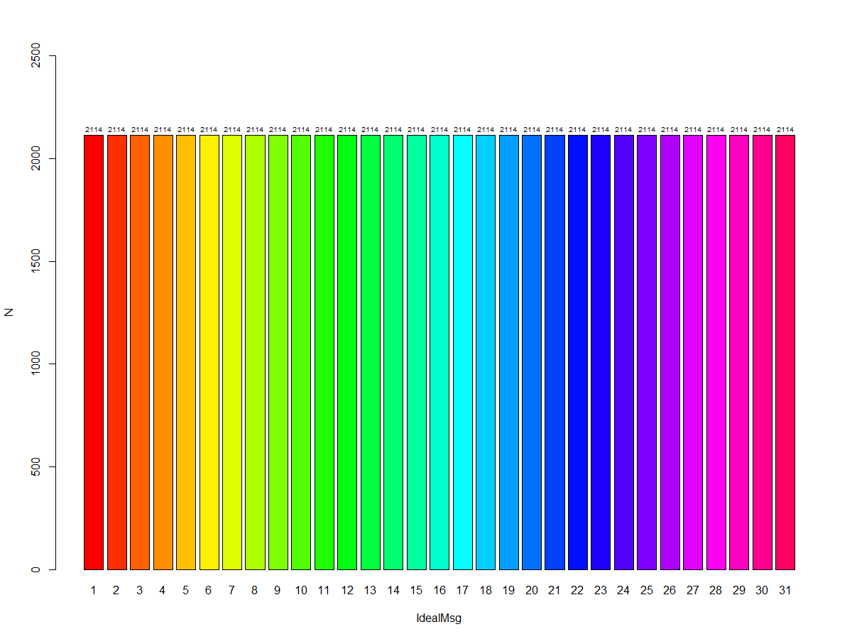
table(plotMsg[,3])
   1    2    3    4    5    6    7    8    9   10   11   12   13   14   15   16   17   18   19   20   21   22   23   24   25   26
2114 2114 2114 2114 2114 2114 2114 2114 2114 2114 2114 2114 2114 2114 2114 2114 2114 2114 2114 2114 2114 2114 2114 2114 2114 2114
  27   28   29   30   31
2114 2114 2114 2114 2114

> barmsg<-MsgStatI[,barplot(N~IdealMsg,col=rainbow(32),ylim = c(0,2500))]
> text(barmsg, MsgStatI$N+30 , paste("", MsgStatI$N, sep="") ,cex=0.6)

>plot(plotMsg[0:200,IdealMsg], type = "s", col = rainbow(5), lwd =3, main = "-----")
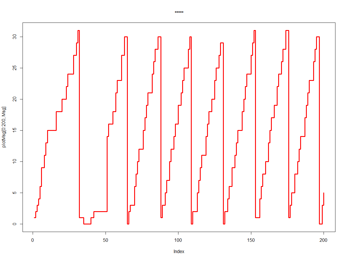
But the real behavior is another. And in this case the difference is well marked, in almost all, the recording:
table(plotMsg[,2])

   0    1    2    3    4    5    6    7    8    9   10   11   12   13   14   15   16   17   18   19   20   21   22   23   24   25
2188 2077 2293 1989 2069 2016 2005 2057 2031 1997 2017 2012 2021 2013 2062 2020 2011 2078 2065 2082 2044 2061 2064 2060 2054 1984
  26   27   28   29   30   31
2015 2074 2033 2026 2027 1989

> barmsg<-MsgStat[,barplot(N~Msg,col=rainbow(32),ylim = c(0,2500))]
> text(barmsg, MsgStat$N+30 , paste("", MsgStat$N, sep="") ,cex=0.6)
> plot(plotMsg[0:200,Msg], type = "s", col = rainbow(5), lwd =3, main = "-----")
The anomalies are significant; when a consecutive step is held for more than two seconds, or when more than two consecutive steps are skipped. this behavior can be seen in the graph of the real record (Msg)
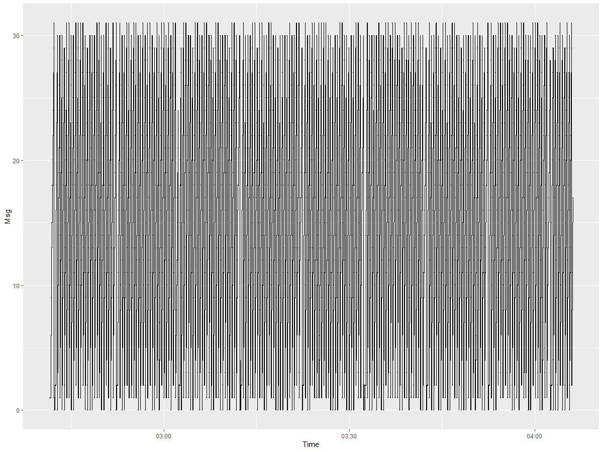
> pp<-ggplot(plotMsg[1:5000], aes(x=Time, y=Msg))
> pp+ geom_step()+geom_point(shape = ".") # Pixel sized
By graphing the entire record, I lose the chance to see all the anomalies present, and something similar happens with summary () and barplot (...,)
I must locate these anomalies on the recording, and quantify them by the consecutive and the time it started and how long it lasted (more than 2 seconds). And the same should be done when there are signal jumps (example: Msg10 is expected in the second 10, but Msg 14 was received)
I have the following signal recording made for 24 hours every one second. It could be longer, 48, 72 ... hours!
is it possible to attach a csv file with the data?
How to proceed?
PLEASE ORIENT ME: SOME PACKAGE, SCRIPT, ARTICLE, WEB. THAT WILL SERVE ME TO APPROACH A SOLUTION !!!!


